In this year’s IIID Awards, three of our projects have been recognised for outstanding work.
We have been members of International Institute of Information Design (IIID) since 2014 and engage in a range of the activities as part of a passionate community. Every three years the IIID calls for submissions for their awards to recognise outstanding work in the field of information design.
This year we entered six projects across four out of the 14 categories. Late last week we were notified that three of our projects received recognition!
You can read a little more about each of the projects we submitted below.
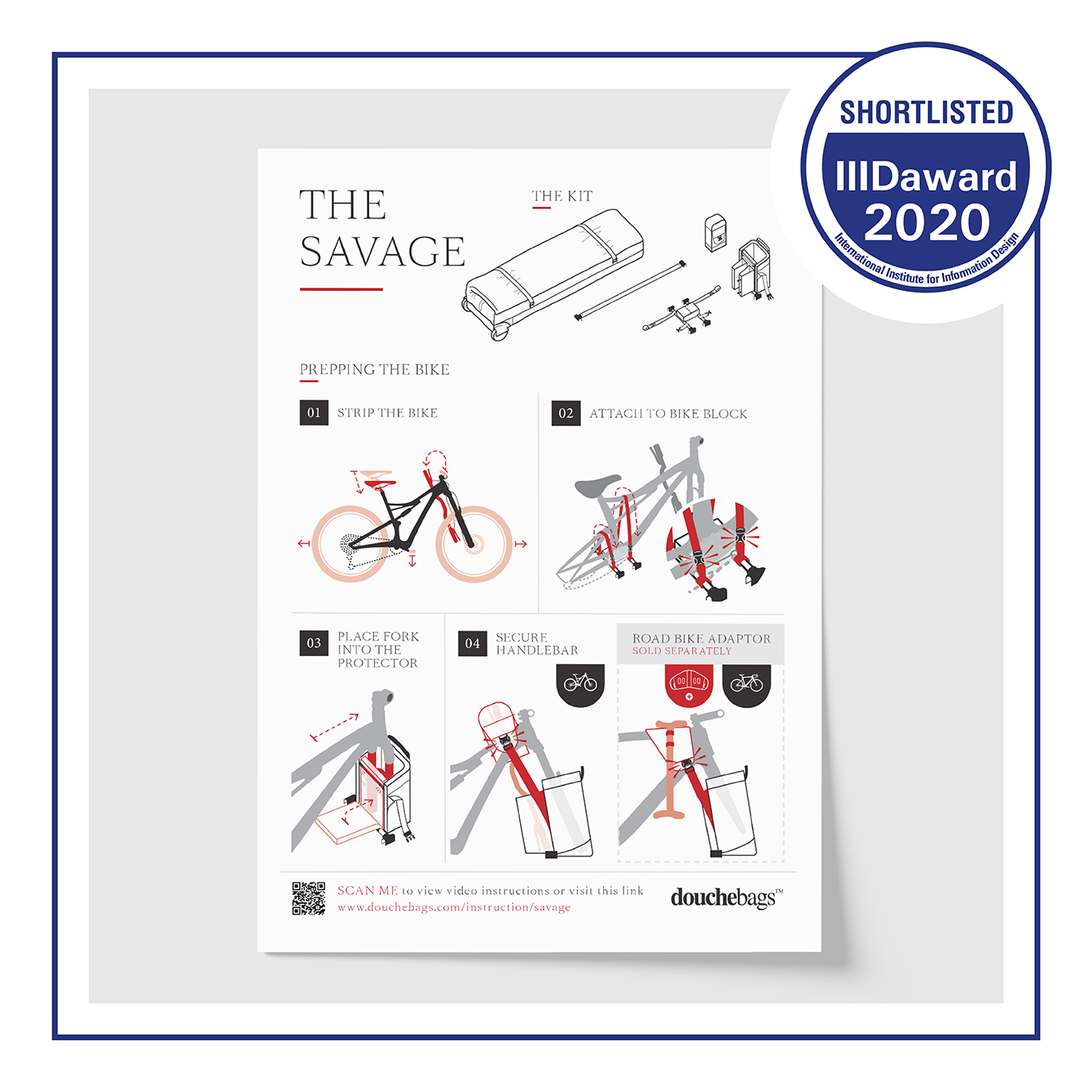
Bike Bag User Instructions: Shortlisted
Category: Products and Services
Douchebags, a company that specialises in travel gear and bags, approached TDL about creating a set of user instructions for one of their more unique solutions. As lead on the project Sammi used photography and videos provided by the client to pinpoint key steps, analysing the process in depth. Together we designed an informative guide on how to use their bike bag, featuring strong use of their brand accompanied by bespoke instructional illustrations.
You can see our shortlisted submission here.
For more information about the project you can read our blog post, or portfolio piece.
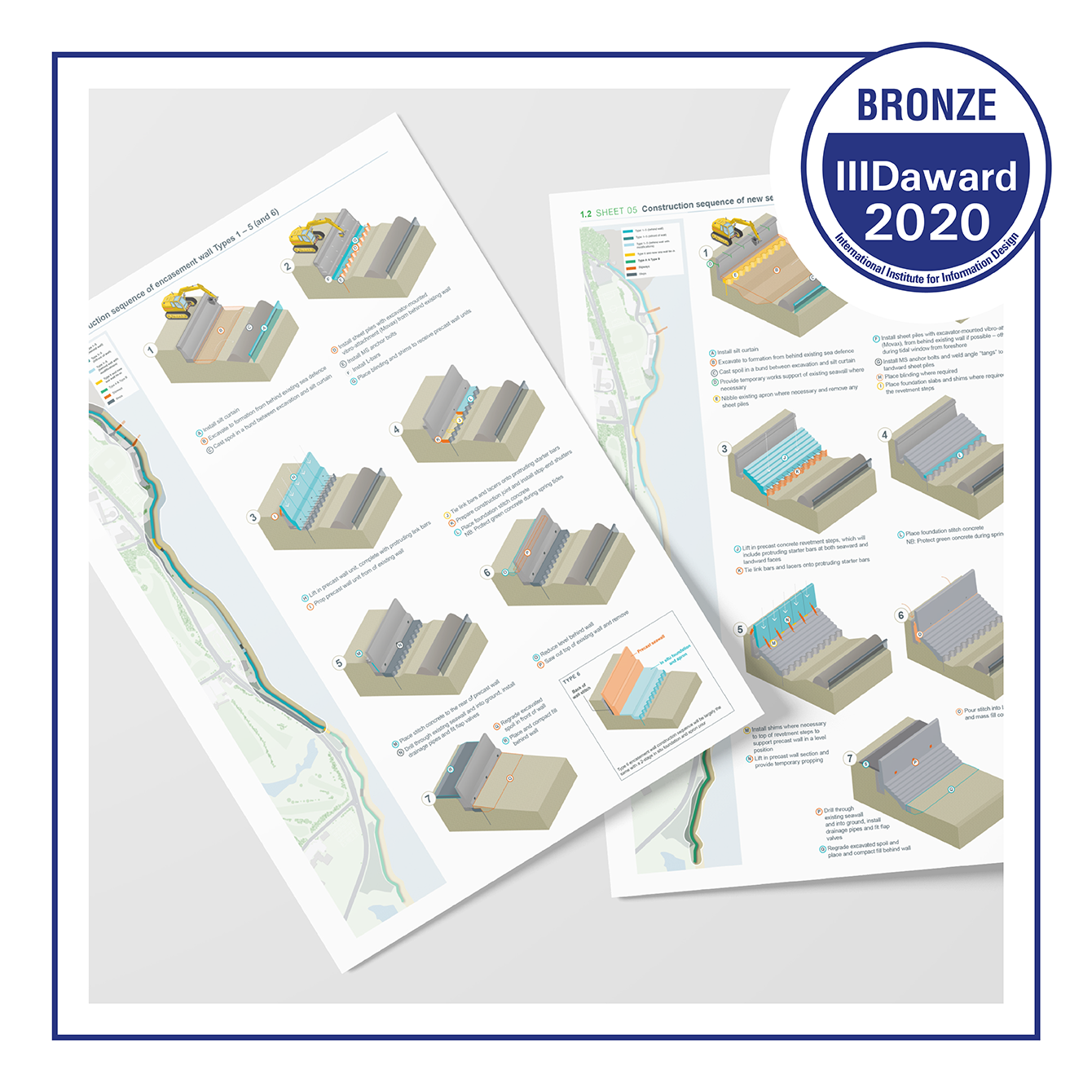
Sea Wall Construction Methods: Bronze Award
Category: Corporate Design and Communication
A construction company asked us to help them design a set of step-by-step guides as part of a tender submission. Using technical drawings and hand sketches, Tom created isometric blocks which would allow the viewer to better understand the construction sequences. Employing a number of information design techniques to create a consistent style which highlighted key elements meant the series of sketches could be transformed with support from the team.
You can see our bronze award winning submission here.
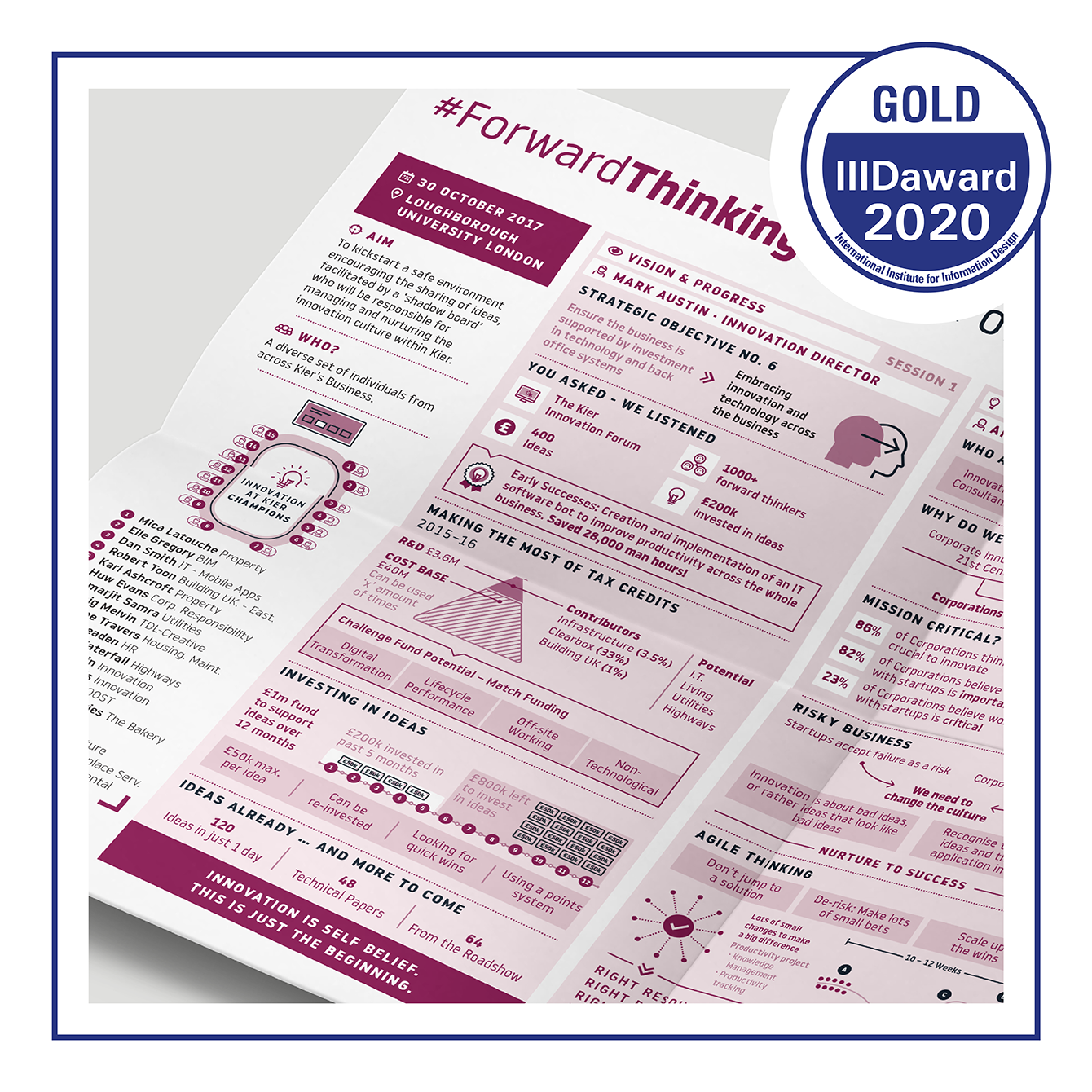
ForwardThinking Visual Summaries: Gold Award
Category: Future Concepts
As part of Kier’s ForwardThinking initiative we helped them with a range of assets. One of the most significant challenges we were posed with was to create a new way of communicating meeting notes. Every quarter a group of innovation champions would meet to discuss potential ideas and areas for investment. To better understand how to visualise this information, we placed Craig in the meeting, allowing him to understand the flow of conversation and craft a one page infographic summary as a replacement for the standard minutes. The team went on to create a series of these infographic notes and helped to build a visual language for use across other associated communications.
You can see our gold award winning submission here.
For more information about the project you can read our portfolio piece.
Outer Suburban Arterial Roads (OSARS)
Category: Corporate Design and Communication
On this project we supported an Australian division of the Ferrovial Group with visualising four key tasks as part of a tender submission. Working closely with the subject matter experts, Dave transformed a numbered list in an excel spreadsheet into illustrated narratives printed as A0 posters. The posters utilised techniques such as chunking, isometric diagrams and colour coding to bring clarity and creativity to the data.
You can read our submission here.
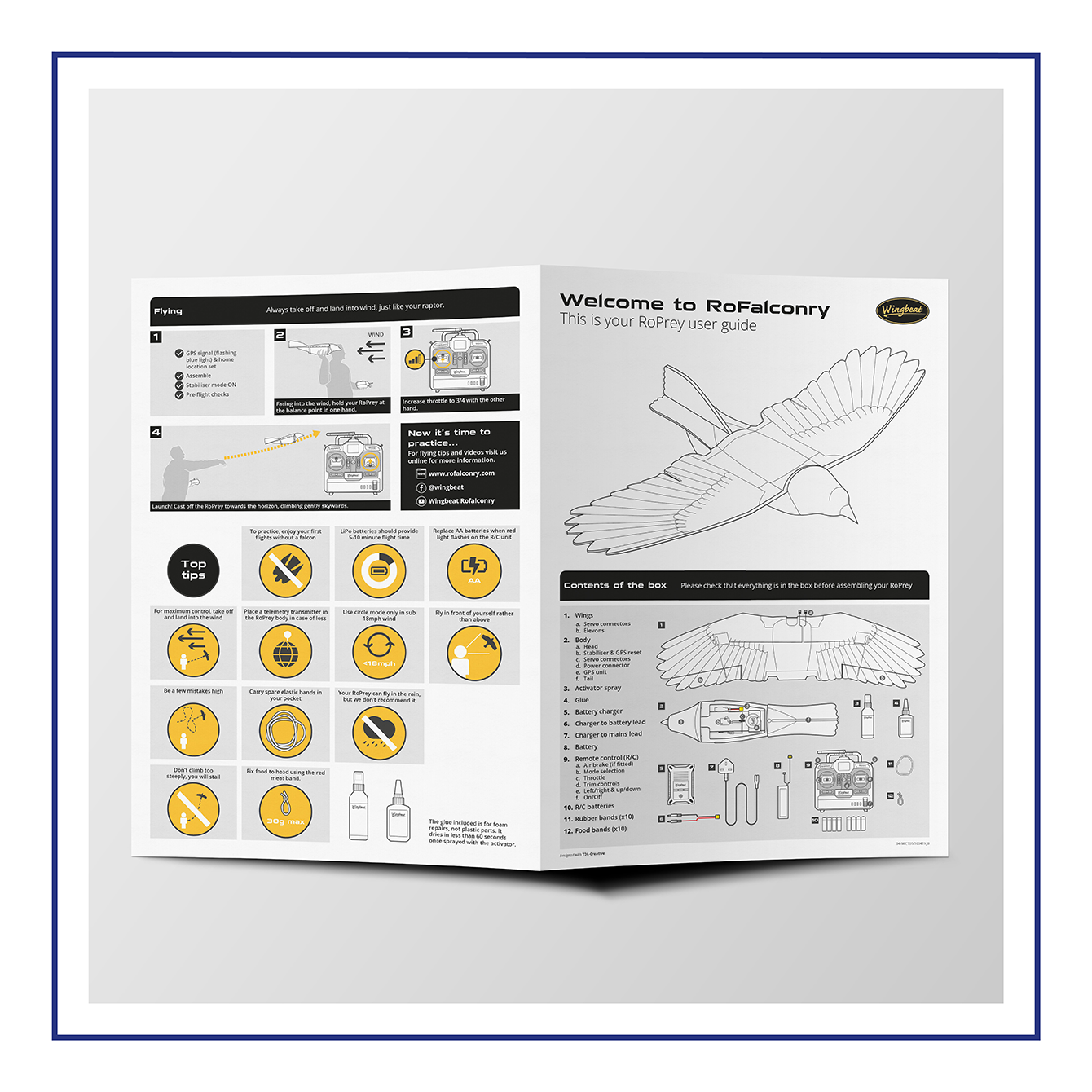
RoCrow User Guide
Category: Products and Services
Wingbeat were producing instructions for their ‘RoCrow’, a radio-controlled crow used to train birds used in falconry and asked us to help with promoting user understanding. Through task analysis, rapid prototyping and the application of information design principles we created a user-friendly set of instructions, reducing the number of customers contacting Wingbeat for advice. Oliver’s passion for falconry was a definite advantage, helping the client to understand their users in more depth, providing feedback on ‘not just on the instructions but the way the product is designed and packaged.’
You can read our submission here.
And you can read more about the project here.
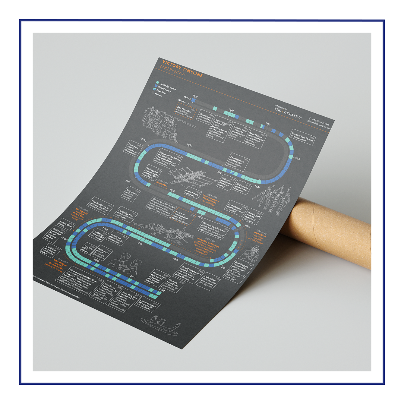
Boat Race Infographic
Category: Editorial
This project started as one of our self-directed projects. As a keen rower, Amber was tasked with creating an editorial infographic about The Boat Race. Using a range of data Amber composed a three-part infographic about the route, the history and general facts on the race, combining them into an engaging set of posters. The final design was shared with the media team for The Boat Race who loved it so much that they asked to use it in the Media Centre.
You can read our submission here.
And you can find out more about the project here.