Early last year CARE International put together two emergency shelter repair kits for distribution to conflict affected areas in the Middle East. TDL were asked to design an A4 leaflet to accompany each shelter kit. These were to act as a quick guide with recommendations on how to use the materials provided. This blog explores our process, and how we dealt with the extremely tight deadline!
Understanding context
Before even looking at the shelter kits, we asked questions about the context; who are these for, why was it being made, what problem did it aim to solve?
These kits were intended not for building new shelters from scratch, but to help people in conflict zones to repair or reinforce their existing shelters. Most of the recipients were not necessarily homeless or displaced: they had homes already, but these were suffering from problems like holes in walls or missing parts caused by the effects of war and poverty.
Research
Now we had an understanding of the context, we looked at other designs with similar requirements, constraints, and users. These were shown to the client to gauge initial reactions to different ways of approaching the problem.
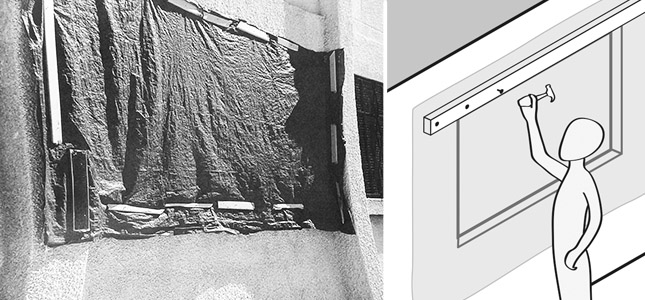
We listed the contents of the shelter kits and spoke to the client about what each item was for. Some of the items, for example the tarpaulin, had existing instructions taken from the internet: these we picked apart for useful bits for potential inclusion. Importantly, we looked at the ways the contents of the shelter kits were already being used by recipients, and how we could work with this. The example below shows how a tarpaulin is being used to cover up a missing window, with scraps of wood to hold it in place without causing too much strain on the tarp. This was used directly as one of the examples in the user guide TDL produced.
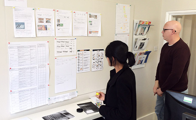
All these findings were mapped out on a board so everything could be seen side by side. There were over 20 pages of content that needed to fit onto four A4 sides! Seeing everything in one place helped us consolidate, prioritise, and organise the information.
Storyboarding
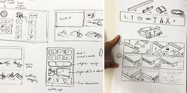
Thumbnailing was helpful in gauging how much space was required for the various processes, how much space was actually available, and how we might arrange the frames on the page so that the right things were grouped. Grouping was particularly important for this to make sense, as this was more of a collection of ‘dos and don’ts’ rather then a prescribed sequential process: it wasn’t a simple matter of reading left to right, top to bottom. On that note, we also took into account the fact that most of the people reading this were from primarily Arabic speaking countries, so we designed everything to be read from right to left.
Illustration
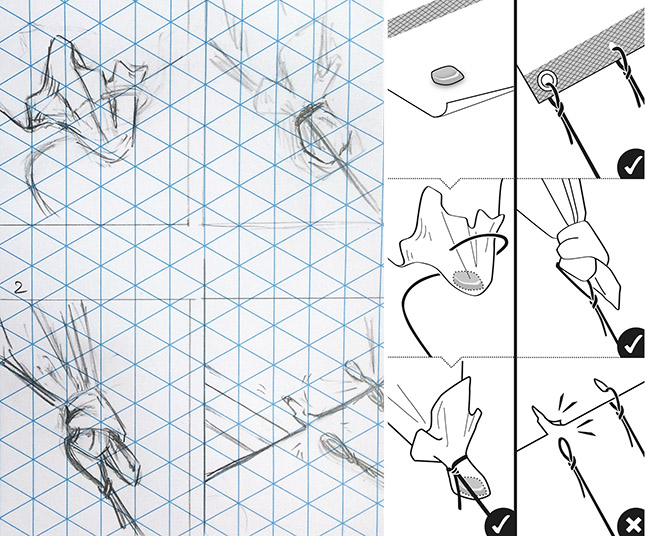
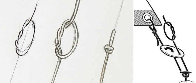
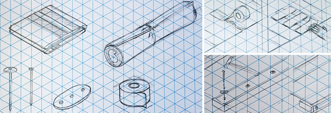
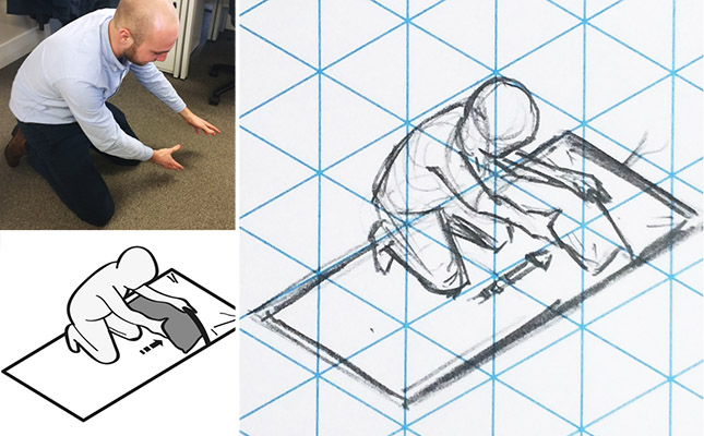
These thumbnails gradually grew into more detailed drawings. They were hand drawn with pencil and pen on paper as the quickest, most intuitive way of resolving visual ideas.
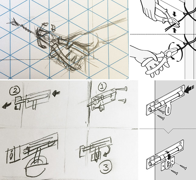
Combining, digitising and finalising
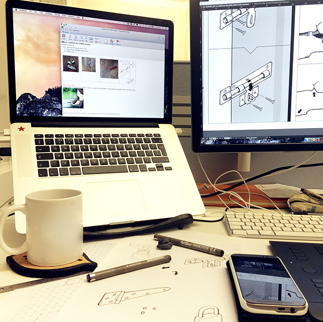
Finally we photographed the drawings to be vectorised and cleaned up in Adobe Illustrator. Apart from arranging and combining the separate elements on the page, this is the stage where we tweaked line thickness, added symbols, shades and textures.
If you’d like to see more images from this project, visit our portfolio. You can also read about another instruction manual we designed for CARE International to help Syrain refugees here.
CARE International are a global organisation that run “poverty-fighting programmes and deliver life-saving aid in 79 developing countries, supported by global policy and advocacy work, fundraising, and programme management.”
If you enjoyed reading this blog post then you may enjoy our newsletter; TDL Quarterly! We will send you information on our team, latest projects and exciting initiatives every 3 months. You can sign up by clicking this link.
