Here at TDL-Creative, we know how important information design is in everyday life, even in places where you least expect it.
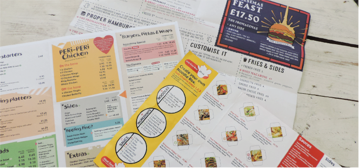
Menus are a great example of this and we have taken the time to research how menus can benefit restaurants when they are designed to their full potential. After collecting take-out menus from popular London chains near our Richmond studio, we selected three examples to share how they used the recommended approaches we found in our research, and to see if there are any more tips they could benefit from.
Examining Layout
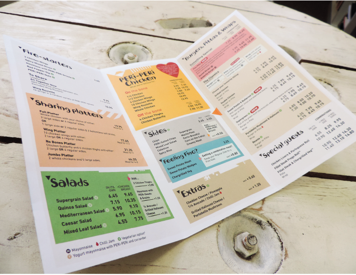
Menus contribute to a first impression of any restaurant, and this all begins with the layout. Aesthetic matters, but it’s more important that the design is functional by not overwhelming the customer with too much information when they first pick it up. We noticed how Nando’s does this by breaking up their menu items into sections to make it easier to read. Studies show that most adults can only store about 7 items at a time in their short-term memory, so restaurants are generally advised to keep each section between 5 and 9 items. However, it’s important to recognize that this model may not work for every restaurant and removing items from a menu may not be realistic. We would ideally approach this by splitting up information into more digestible chunks when given a brief by our clients. Nando’s cleverly breaks up the particularly lengthy list of sides into two columns to make scanning much easier.
Typically, menus take layout inspiration from newspapers by placing the important items, usually the most profitable and popular ones in the top right. This helps because this is where the eyes are usually drawn to, as opposed to the bottom left where the least profitable and popular items are often found. Next time you’re out for a meal, pay attention to where the item you immediately go for is located and you may be surprised.
Colour Counts
We could tell that Nando’s also thought about colour when designing this menu. Even though red is one of their primary branding colours, the impact red has probably influenced why certain elements like the ‘new’ icons appear in this colour. You might not realize, but studies suggest that red increases heart rate, blood pressure, and impulse eating. Considering this, does this use of colour make customers go for that extra side they wouldn’t have before? In addition, the salads are in a green box. Research suggests that people universally consider health and natural produce when they see green. As a result, Nando’s can communicate health through this colour selection without adding more text. It was interesting how the other takeaway menus had different focuses.
Focus on Food
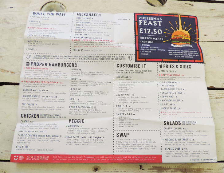
After doing our research, it didn’t take long before the team noticed how Byron uses their menu to make the experience more about the food and less about spending money. Similar to the Nando’s menu, Byron doesn’t make use of the pound sign, which our research found makes people less fixated on costs, and more focused on the choice of burgers. It can also be noted that the prices are not perfectly aligned with one another. According to author, William Poundstone, this distracts guests who would normally compare prices just to get a cheap deal.
The focus is then firmly placed on the food by giving the titles a bold and capitalised type that guides customers to engage with the appetizing descriptions. By being more aware of factors like ingredient descriptions, customers will be less price conscious and instead be more inclined to purchase the option that sounds the tastiest to them.
Visual Values
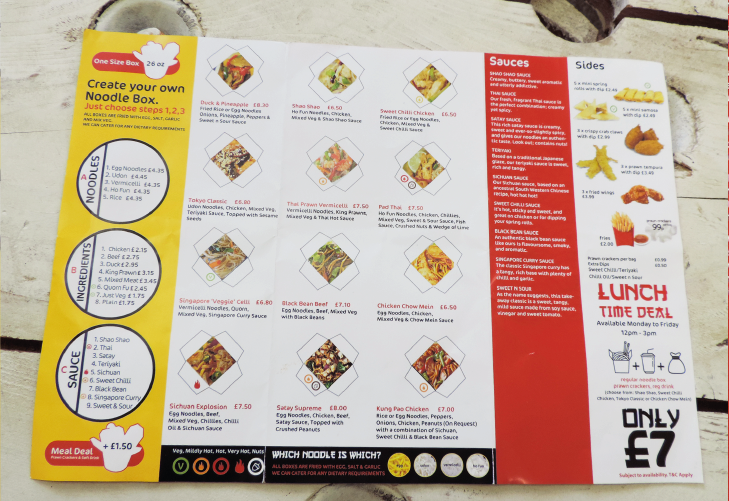
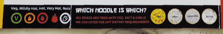
The final restaurant take-out menu that we reviewed was from YoYo Noodle where we were struck by the more visual elements used to illustrate their dishes. Some studies argue against photography on menus because it can suggest that an establishment offers lower quality food, but we think it is more important to understand what a client needs to inform their customers about and customising the tactics to get the best result. Customers may be more familiar with the appearance than the actual names of the noodles they like. As a result, the provided images help clarify this and give them a better expectation of what they will be receiving. We also felt that the “Which Noodle is Which?” feature at the bottom is a great tool to answer questions the customer may have about this.
Most people rely on iconography to quickly obtain more information from a menu, but have you ever considered the consequences of not adding these elements? Iconography is often used to help customers with allergies and dietary restrictions better understand the ingredients. If menus do not label this information, customers may assume that there is a negative reason for this absence. If that is the case, they may be less likely to return to this restaurant compared to a restaurant they trust more because the proper labelling techniques make them better informed. Icons also allow for some creativity since restaurants are able to design their own iconography depending on the customers’ needs. Each menu we looked at had a unique style of iconography that further demonstrated this.
Nando’s uses small icons to communicate which items are vegetarian, new, or contain specific condiments. Each icon is also assigned a specific colour to make recognition quicker, in addition to having some influence over the guest as we discussed earlier. Byron has taken a simpler approach and also employs colours by using a small green “V” or “N” to communicate if an item is vegetarian or contains peanuts. YoYo Noodle distinguishes symbols from one another with the use of colour like Nando’s, but instead uses it to focus on how spicy their items are to help guide customers. Icons can also be used to communicate whether it is vegan, under a specific amount of calories, part of a season menu, and more. Customers like to be aware of what they are eating, and icons are a way to convey this without taking up too much space.
Last Thoughts
It was interesting to see how the findings of studies were utilised differently depending on the specific chain. Each menu applies these elements to carefully guide the customer through the menu, instead of being purely aesthetic. As information designers, we care about this subject because menu design improvements can help our clients improve their sales, customer loyalty, and efficiency. This is only going to become more important as time goes on because people are choosing to be more conscious of what they eat. Successful menu design uses these design tools to simultaneously help the business while making customers more informed and at ease when dining. Next time you’re in a restaurant, we recommend taking a moment to analyse the menu. We think you may be intrigued after considering how these and other strategies may improve or weaken the overall experience you have in the restaurant.
About the Author
Felicia was as an intern at TDL this winter, she was over from Elon University, North Carolina where she studies Strategic Communications and minors in Digital Art.