When Douchebags came to us needing user instructions for a new bike bag they were developing, we knew it would be a fun project. From the name alone, you get the sense they are going to be a brand with a lot of personality.
The Brief
To produce a set of user instructions that enable the customer to quickly and easily assemble the bag in an efficient way. Douchebags also had an inspiring company mission they wanted to influence the design solution of the instructions.
“Make better journeys through smarter travel gear”
Our Process
Research
Before getting stuck-in on analysis of the bag, we familiarised ourselves with the Douchebag brand; how they present themselves and who their target audience was. This is a crucial stage as it influences the entire design approach, from aesthetics and tone of voice to level of information given. Being aware of the user’s product knowledge, is really important when it comes to deciding how to display information, impacting on:
- Terminology
- Illustration style
- Number of steps / the breakdown of information
- Iconography
Drafting
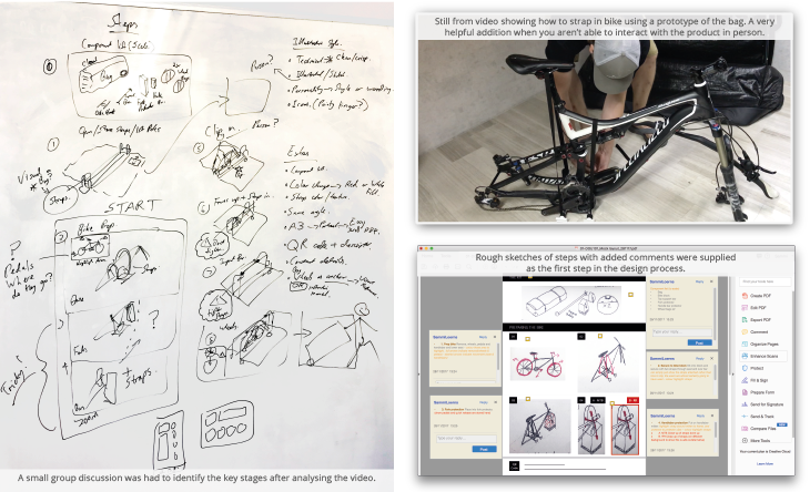
This started with thorough analysis of the product and assembly process. Due to the product being under development in Sweden we were unable to have face-to-face meetings or hands-on interaction with the product. This wasn’t an issue for us though as the team at DB and their sport design partners Fearless Design were really engaged with the project. Through helpful communication including video calls, photos and sketches we were able to gather all the information needed.
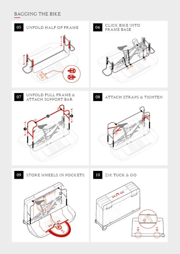
Alongside photographs, the designers at Fearless Design recorded a really helpful video of them assembling the bag with commentary. From this, we sketched out the steps and identified key stages. The brief restricted the format to two A4s-sized panels that were to be stitched directly into the bag, therefore a minimal number of steps was essential.
Illustrated steps
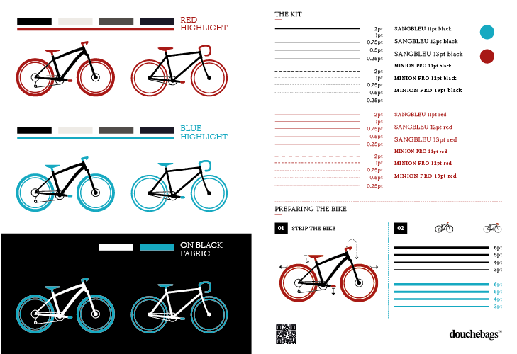
Before illustrating the instructions we developed a style and arranged for a test print on the label fabric to check colours, line weights and font sizes for any readability issues.
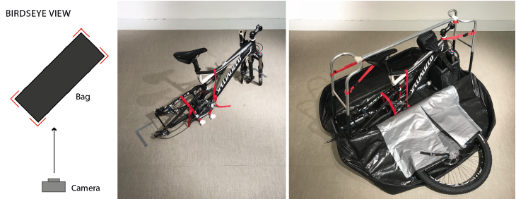
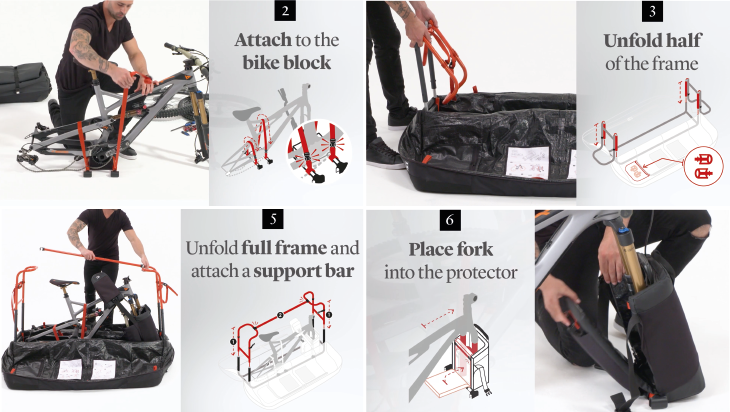
The next stage was to source accurate photos for each step. To ensure these were consistent, and captured everything we needed, we sent across a simple guide on how to set up the product and angle the camera. It was then time to get all the steps drawn up!
Finalising the assembly instruction design
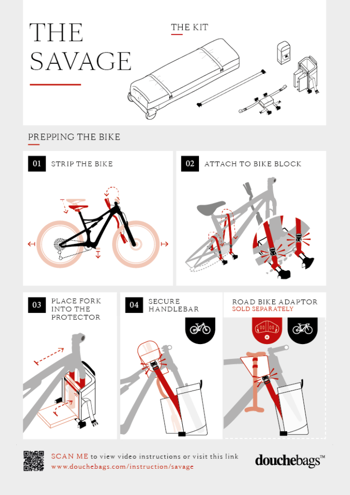
The final stage is about adding directional markers and text. For these instructions’ red was used to highlight action areas so the user can quickly identify where their focus needs to be. It was decided that we didn’t need to go into detail of buckle mechanisms, instead simple ‘click’ markers are used throughout. We also added a muted grey background to frame each step.
Launch
Seeing the project launch has been great and not only are the instructions used within the bag, but elements have been extracted to create an instructional video on the DB website. We absolutely love their styling and photography of the product and fallen for the Douchebags brand. We have since kitted our team out with their ‘Proper Laptop Sleeves’.

Challenges
As is often the case with new product development, deciding when to commission instruction manual design can be tricky. We have found in the past that we can be called in too early, which can result in a lot of extra time being spent on a project therefore stretching budgets to their limits. New products are often constantly developing right up until they go into manufacture, at which point instructions also need to be printed/sewn into products. So, finding the magic window for the instruction design with the client is important.
Alongside Douchebags and their specialist manufacturing partners we were all aware of this potential challenge and through good communication and time management kept the process as streamlined as possible.
The TDL approach to instruction manual design:
- Understand your audience and create user scenarios: Are they likely to have knowledge of the product? Where, when and how they will be viewing and using the instructions?
- Keep initial drafts as simple and time efficient as possible (basic sketches, a collection of photos or even written steps). At this early stage it’s all about making sure we have understood the process rather than refining the design details. A few rounds at this stage will prove much more helpful than realising you could cut three steps or need to change the viewing angle after putting the time into detailed illustrations.
Animating the instructions
After completing the project, we felt there was a great opportunity to bring the instructions to life by animating them. We were so keen to see this happen that we decided to take it on as a self-initiated project. Using the illustration assets Ryan produced the below instructional video.
If you would like to know more about other instruction manual designs we have designed, please head on over to the following post about some very interesting projects we worked on with CARE International to help Syrian refugees to repair shelters. You can also find all of these projects on our portfolio page.