Through 2022 we will publish a series of ‘TDL Explains' design projects, with the designers exploring new topics in areas where people need to understand information. Each output is designed with the intention to improve the lives of people around us through better design, helping to make decisions, understand hazards, or enable people to do things. We welcome feedback from experts in each particular field who can help to improve and evolve the designs.
Design for understanding
Information is everywhere. From the ingredients on your cereal box to the care label on your jumper. From live sports scores to managing a fantasy football team. Your favourite city hangouts, your daily step count, even your sleep quality are now all meticulously tracked. Thanks to the invention of mobile phones, information is at our fingertips, 24/7. We absorb it, store it, delete it, or (attempt to) ignore it. But what happens when this data and information drives important decisions, such as predicting the course of a hurricane, designing a bridge or treating a patient?
TDL Explains was born out of the desire to answer these questions by designing for positive change. It emerged as a self-directed passion project, giving our talented designers the opportunity to flex their problem solving skills as well as showcase their technical design talents – in other words, a ‘left’ and ‘right’ brain task!

Keep reading to discover how our very first TDL Explains – Avalanche Awareness – was created, from the initial idea all the way through to the final piece. You’ll also have an opportunity to deep dive into particular elements of the design such as the colour selection and typography, and hear our lead designer, Chris, reflect on producing his solution for keeping thrill seekers safe on the slopes.
The idea
The first port of call for any TDL Explains is to consider which timely and seasonal topics will be relevant when the edition is launched. In the case of our first project, which we wanted to release in February 2022, the Winter Olympics was an obvious choice, and a theme which the team was keen to explore.
After a quick Google search, it became clear there was an abundance of infographics related to statistics from the Winter Olympics, but these designs often visualised broad topics, and focused on high-level information. Instead of simply regurgitating statistics and facts, we were interested in communicating information about a single sport, so initially proposed a visual explainer on the scoring system for snowboarding.
We quickly hit a stumbling block – the scoring method for snowboarding can be subjective and hard to quantify, therefore difficult to translate into a diagram. Additionally, although it would be a visually compelling topic, it didn’t align with the overall objective of TDL Explains; creating a piece of design that would serve a wider audience, with the potential to improve understanding through better design. We decided instead to explore a niche area that was still inspired by the Winter Olympics, but would provide a more practical and beneficial final output.
With the Winter Olympics and ski season underway, plus school half term around the corner, we anticipated a surge of thrill-seekers rushing to hit the slopes themselves. With this came risks, as for many people this could be their first adventure for many years (thanks to the travel restrictions during the Covid-19 pandemic) and their safety awareness knowledge would definitely need a refresher.
The team agreed this was the time to provide people with the information they need to keep safe on the slopes, specifically regarding avalanche awareness.
The research
Not surprisingly, we couldn’t find an ‘avalanche expert’ amongst the TDL team, with Chris having never even donned skis himself! The research required a meticulous approach, in order to ensure facts were correct and the output would be suitable for its intended audience.
Our first step was ‘macro’ researching. This meant casting our net far and wide, exploring the wider topic of visual explainers for safety – such as airplane safety cards. This provided us with an understanding of how existing materials across various industries use elements such as colour, iconography and step-by-step visuals to communicate complex information, as well as helping us identify some of the industry standards and conventions that users may already be familiar with.
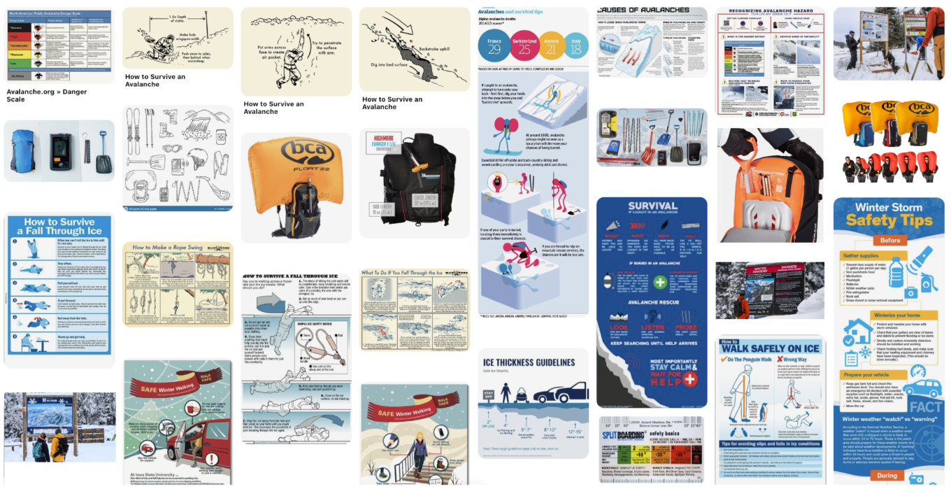
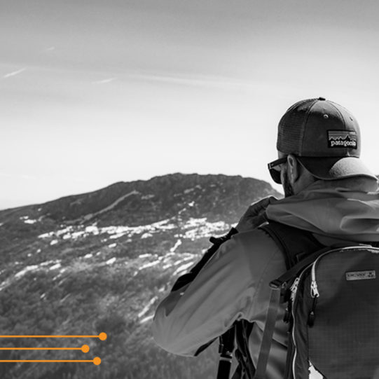
We then focused our attentions on our niche topic, moving to ‘micro’ researching and understanding the profile of the user. We found that most of the existing avalanche materials were incredibly text heavy with a lot of onus put on the reader to identify the most important risk factors of mountain exploration. Very few examples included all the crucial elements to understanding how to be safe on the slopes: the physics behind avalanches, a list of safety equipment and key risk factors.
With so much information out there, we saw this project as an opportunity to do the hard work for the user and provide them with all the information they need in a comprehensive yet compact guide that can physically fit in a pocket, presented on a poster or be accessed anywhere digitally.
Poor Chris ended up with a pile of over 100 diagrams and videos to audit and condense into one output. Coffee, anyone?

Deep dive
The graphic style
During our research, we found there was a fine balance between creating imagery that was minimal yet still realistic. In terms of the diagrammatic illustrations, it was important to create realistic depictions of the setting, while also using graphic devices to visualise abstract ideas and, in some cases, concealed areas (such as cross sections of slopes).
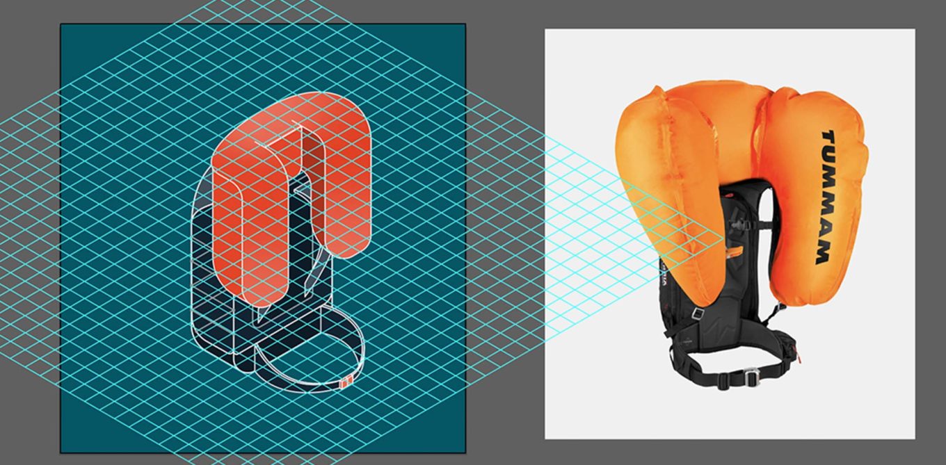
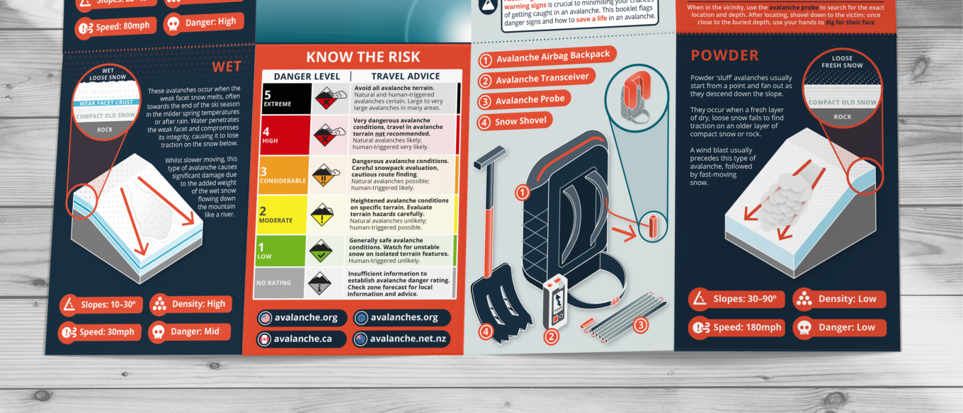
We decided that isometric ‘wedge’ illustrations would be the best way to demonstrate the structure of different avalanches. They could also be slotted together like building blocks to form a larger design. We coupled this with flat, cross-sectional pull-outs to further illustrate components that would benefit from using a 2-dimensional plane, as well as utilising textured patterns to visualise elements invisible to the naked eye – such as density of snow / water particles and the direction of force stresses.
Colour palette
When first considering potential colour palettes, we had to imagine the conditions the infographic would be displayed in as well as the medium it would be viewed on.
Many of the illustrations on the poster would be of snow; meaning they would be depicted in white and other very pale tones. The background and accent colours would need to be bold and high in contrast to help the snow illustrations pop. Similarly, if the infographic was to be displayed on a poster board outside in the mountains, the colours would have to stand out against a predominantly white, bright backdrop.
We created a range of colour palettes by colour picking from relevant photography and decided to use highlights selected from the image below (that would subsequently become the leaflet cover).
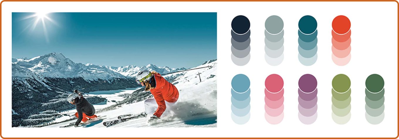
We named this palette ‘adrenaline’, inspired by the action-filled photograph with its range of deep and vibrant colours. We picked a navy blue from the mountains to act as the primary background colour for placing the snow illustrations on. The bright orange jacket was chosen as the primary accent colour for highlighting key information, as it was high in contrast to both the dark blue background swatch, as well as the white/grey tones on the intended snow illustrations. Fluorescent orange is also a colour frequently used for attracting attention and representing safety professionals – for example, it’s often applied on life jackets, life rings, RNLI lifeboats, high-vis construction clothing and other PPE.
Typography
When designing a piece of safety material, the highest priority of font choice is legibility. With the intention to make the guide as accessible as possible to a wide range of users, the type needed to be easily legible when printed as well as transfer well onto screen. We decided the best choice of typeface for this application was an open sans serif which translates well at a range of sizes and is widely available for web.
While we knew the principal output would be a professionally printed A3 leaflet, we had to consider the potential for home printing – most likely this would result in it being shrunk down to print on A4. A digital version would also have to be legible on different screen sizes. To account for this, we designed for the primary A3 output but also frequently test printed at A4 and viewed on mobile devices to ensure legibility was retained at smaller sizes.
The final design
The audience
The Avalanche Awareness safety guide is intended for anyone interested in snowsports, however, it is particularly relevant for individuals who are looking to ski or snowboard off-piste (riding slopes that are not governed by a resort). These individuals must have the knowledge and confidence to judge the safety of their surroundings and identify any red flags for themselves and their party.
Distribution
We intend the design to be distributed in advance of travel (by tourism boards and specialised publications, for example) and then displayed again at the ski resorts themselves. Ideally, the user should not be seeing the infographic for the first time when they are at the slopes, but instead it should act as a reaffirming device to jog the memory of the reader before they venture into the mountains.
Format
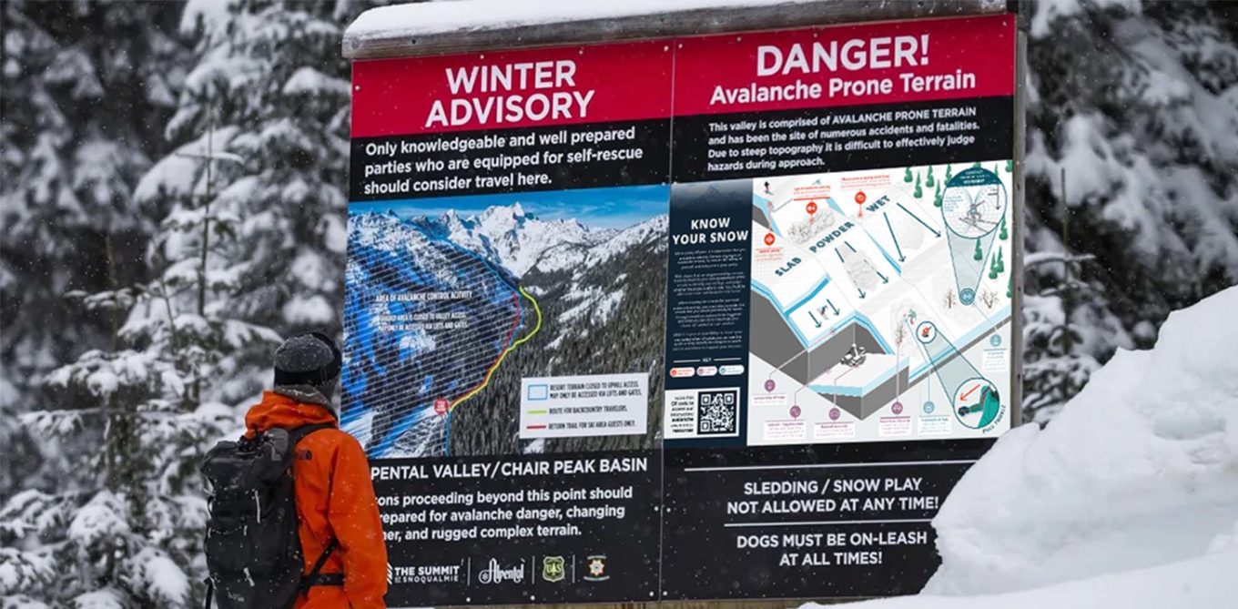
Our decision was to create a compact leaflet, folding out to a double-sided A3. One side is a folding modular design (of which pages can be isolated to work as an accessible digital version on the scrolling screens of mobile devices), while on the reverse is a full-page, poster-style graphic (which can be enlarged and displayed as a poster on notice boards at the slopes). Using a fold-out exposes the reader to the information in a staged way, helping them not to get information overload, and giving a hierarchy to what bits matter most.
The modular leaflet side highlights the top take-aways for avalanche preparation and provides an understanding of how they occur; while the full-page poster further emphasises and draws attention to the other dangers to be aware of on the slopes when assessing the terrain for avalanche warning signs.

The last word
Our lead designer, Chris, reflects on his time working on the inaugural edition of TDL Explains.
What skills did you build upon when creating TDL Explains: Avalanche Awareness?
From a design perspective, this project required me to learn new practical skills by proficiently applying a style of illustration (isometric) that I’d not worked with before. More broadly speaking, this project gave me the space to interrogate and explore a new topic. Not only will I now be much more prepared when I go skiing for the first time, but I would like to think that I have also created a guide that will educate, inform and help to save a life.
What was the biggest challenge to overcome?
Probably the sheer amount of data that we had to source, categorise and prioritise. A design project is often similar to an iceberg – most people only see the final piece, but underneath the surface is a huge chunk of research and understanding that goes into it! I’d be keen to hear from sports professionals and experts on mountain safety to see if we could develop the content further.
How will you apply this to your other work at TDL going forward?
There are a lot of parallels that can be drawn and useful lessons to be learned for future work. With many of TDL’s clients operating in the construction and humanitarian sectors, understanding how to visually articulate safety information is essential. For example, this topic has similarities to the safety around large piles of loose material such as asphalt or the pouring of dense fluids like concrete. There are also direct similarities between avalanches and the dangers of natural disasters such as mud slides and flooding.
To take a lighter look at the final design this project, please see our
TDL Explains: Avalanche Awareness portfolio piece
