We frequently work on transport bids, from tube line extensions to cycle hire schemes, but less often do we work on the customer-facing information design once our clients win the work. Keen to find out more about transport information systems we spoke to Doug Rose from FWT, an expert in public transport information design.
A major talking point and something that Doug feels is the key to producing quality information design is the requirement of understanding the context experienced by user. This is also something we talk about a lot at TDL! It can be easy to slip into patterns or comfort zones when designing similar outputs on a regular basis, so it’s essential to be remind ourselves to always keep the end user in mind.
“I believe an awful lot of very well-intentioned material produced, fails, simply because user needs are not understood by providers and designers alike.”
Here Doug describes public transport users in way that you might not initially think of them:
“When people make journeys their personal needs for information vary enormously and without understanding this, most solutions fail. Different people will have different requirements depending on individual trips. An expert traveller will tackle an unfamiliar journey very differently from a novice traveller, though their needs are probably similar. Information acquisition is a skill that needs learning and ‘expert’ travellers start from a higher level than novices from experience already gained. We can also add into the melting pot the wide disparity of human intelligence and cognitive reasoning abilities.
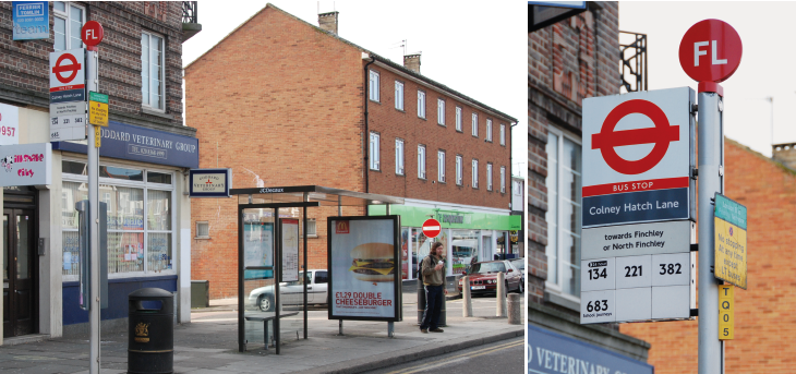
Lettered bus stop schemes started in London in the 1950s, though there is still weak cognitive connection between flag and map (in the shelter). Furthermore, to the uninitiated, what is ‘FL’?
Doug also spoke about the importance of having multiple sources of facts having co-ordinated design (internet, journey planners, bus stop flags, timetables, directional signs etc.) for passengers to consult so they can easily navigate a journey. With people being so reliant on mobile/portable devices to get themselves around you could be fooled into thinking the rest of the wayfinding kit is less significant, but how wrong you would be!
“ These should not be dismissed, they are all part of the information chain and ignore some of them and it is akin to doing a jig-saw puzzle without the picture and some pieces missing…In an unfamiliar town, would you wait at a bus stop displaying no route numbers and no places served, and then board a bus with no route number or destination display? Real-time, static and pocket information provide the reassurance that the correct choices have been made and that we are going to continue your journey as planned.
These navigation principles can be used outside the context of just physical journeys and thought about within design in general. If you are making an interactive document or PowerPoint it’s not just about including the ability to jump chapters, and include pop-ups etc, but it’s how well these are signposted.
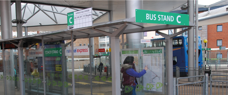
Joining all parts of the information chain. From a distance the signs draw attention and on arrival what is inside the shelter co-ordinates with it.
Beyond Doug’s general thoughts on various products in the public transport information chain, he directed us to an illustrated written report, and a talk he gave, on bus destination blinds in London. We found these gave a really interesting insight into a perhaps mundane and as such neglected aspect of actually boarding the right bus; we wanted to share these with you here.
Bus signage?
By Doug Rose
Fundamentally, I believe in reducing information ambiguity to an absolute minimum. Bus route numbers are actually a shorthand code to replace a great long list or roads the bus takes; bus stops and bus station stands are a means of identifying a correct boarding point and these identities are also codes – in these instances for a series of locations.
I believe the two coding systems should be created differently to avoid conflict and confusion like: ‘was I told to get a 12 from stand 11 or an 11 from stand 12?’ As bus routes are almost always identified with numbers, I always use letters for boarding points, though it can get a lot more complicated than that if there are more than 24 of them on a map (I never use I or O). I had to deal with over 60 street stops in Leicester as well as two large bus stations – over one hundred locations. I wanted all to have a unique identity.
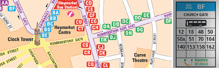
In Doug’s cities the flags actually say ‘Bus Stop BF’, rather than leaving the user to guess (or ignore) what ‘BF’ is. The coherence of the parts is neither strong nor obvious in London.
The problem on timetables is compounded of course by departure times being numbers as well. Plenty of scope for confusion and mostly completely misunderstood and usually not even thought about by operators, authorities and designers, on the basis that ‘we haven’t had any complaints’. Of course you haven’t. Most people don’t complain and most people blame themselves for ‘not understanding maps’. Most people give up very quickly if they can’t find what they are looking for. How many passengers are lost to the operators through poor information? Why don’t they take this far more seriously?
There is a lot more to information design than meets the eye and the outcomes are usually poor on usability. I have been involved in psychological user studies and you would be surprised at some of the findings. Even London hasn’t cracked it – though they think they have.
Furthermore, most designer’s just copy what someone else has already done without thinking; something that works in one place may not work somewhere else. The solution required is always the same but the application of it has to be adapted to the local geography, the bus network and the overall context.
If you want to know more about this topic you can do some further reading at Doug’s company’s website on Doug’s personal website.