In the bidding environment choosing a typeface can be an important subject, but what is the right way to go through this process?
The Usual Suspects
Fonts are often decided during an early stage of the tendering process, either specified by the client or up to the bidder. While the typeface is not generally the focal point of any submission, it is nevertheless present throughout all aspects of the bid. An intelligent and informed font choice can provide multiple benefits from the physical, such as increased word space and more legible text, to the more emotional; a demonstration of professionalism and personality. We often see the usual suspects, such as Calibri or Arial, which are chosen primarily for convenience. When you have the potential for change, why not take the opportunity to improve the look and feel of your submission?
Who wants what?
There are often rules or restrictions that might influence your font choice. These can be split into practical and opinion.
The customer usually decides the practical aspects. These may include;
- the type of submission – printed or electronic
- the font size
- the leading (space between each line)
- page restrictions
- the font to use
- software restrictions (having to submit in Word 2003 etc)
When the client specifies any of these aspects, it’s obviously a good idea to take on their choice. If anything stands out, it’s best to get those tender queries in as soon as possible. Changes to any of these things can drastically affect your submission.
Opinion comes more to the fore when less of the practical aspects are decided in advance. At this point, the various parties in the process all have an opinion on the best choices to make.

Customer
Font choice isn’t likely to be at the top of the list for the customer. From this perspective, typefaces are decided with the practical aspects in mind. Usually, they will specify something like Arial, which is easy for everyone to use, is a standard across most software, and is fairly easy to read on screen and in print with a neutral appearance. The customer sometimes allows the tenderer a choice of typeface, and it is on those occasions where you can use a good choice to your advantage.
Tenderer
As a tenderer there are a few key points that should influence typeface choice; customer specifications, page restrictions, identity, and the impression you want to leave.
There are 4 main directions in which to take your choice.
- First of all, if the client has specified a typeface then go with it! It’s an easy way to make sure the client is on your side early in the process.
The next three options should all be considered if you are given the option to choose your typeface.
- You could choose to adopt the client’s style. This could be seen in one of two ways – either flattering, putting them at ease with a style they are used to, or over-confident, with the risk of incorrectly using their brand. It’s best to avoid this option; there’s too much risk involved and it doesn’t show any initiative.
- You could use your own company brand to influence your typeface choice. It is a representation of your company and the values that you are trying to promote in your response. Something easily recognisable, and which your team is familiar with using could be a good choice, but still not the best. The client may be negatively influenced by your brand, or it may not align with some of their aims.
- The final choice, and probably the one most designers would recommend, is to go with a fresh, new typeface. Choosing a new typeface gives you the freedom to pick something relevant and flexible, and there are plenty of options. It can also give your bid an identity of its own, whilst adding consistency and coherence across all of your subsequent submissions.
Designer
As a designer, it’s our job to take all parties into consideration when giving advice. In addition, we also have to think about a typeface that is going to be flexible enough to work across all media and situations.
The designer should use their experience to give advice to the tenderer taking into account legibility, requirements and aesthetics. Most of the time we have to work with client requirements, and hence are restricted in font choice. For elements such as diagrams, some of these choices can impact the designs.
Selecting a typeface
When you have the option to choose a typeface to use there are lots of variables to consider. To help with that we’ve put together a list of points to look out for:
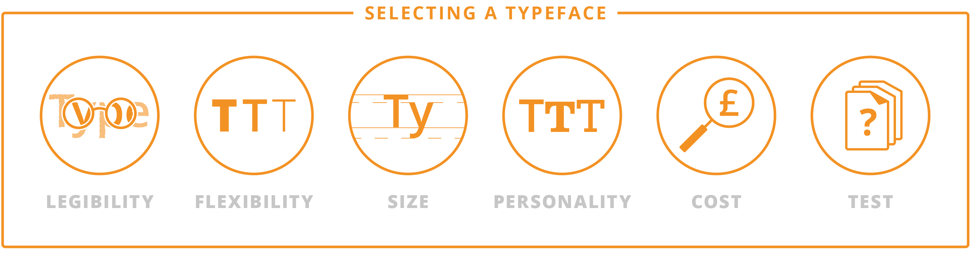
1. Legibility
First and foremost you need your content to be read. That’s the most important aspect of any submission. If something is difficult or time-consuming to read it can induce negative connotations towards the content. Legibility is how easy it can be to distinguish between one letter and another. The most legible typefaces tend to be those that are simpler in appearance and don’t draw too much attention to themselves. Look out for a typeface that doesn’t have too many stylistic elements.
2. Flexibility
Bid documents can be extremely complex and multiple weights can be a key attribute. Having a variety of options to choose from can making structuring the document simpler and improve the hierarchy. Look for a typeface that’s part of a larger family. Correctly implemented, a family of typefaces can result in a document that’s easier to navigate, looks cohesive and retains a consistent identity.
3. Character / Letter size
When a tender is page limited, getting more words onto a line can be important. Different typefaces have a number of characteristics that can impact the space taken up by each word. Choosing a typeface with a smaller character width can allow you to squeeze in those few extra words. However, take care and make sure this doesn’t impact the readability of your documents.
For more on this topic, read our insightful blogpost on typesize here.
4. Personality and Identity
Choosing your typefaces offers the chance to do something unique or different. Typefaces have personality and incorporating that into your bid design can help to put your message across in an unexpected way. The right choice can make you come across as more professional, or more approachable. Think about how the typeface makes you feel, and how it will come across to the client.
In addition to the personality of the typeface, it can also help to reinforce your brand identity. Using a company typeface can sometimes be a subtle way to show your confidence without going overboard.
5. Cost and Availability
With often a large number of people working on a bid it’s important to think about how easy it will be for everyone to use the typeface; and whether the client will see your submission as they should.
First of all, if you’re using a new typeface make sure you distribute to the rest of the team or direct them on where to source it. It’s important for everyone to see how his or her content will be seen and that it can be installed on their computer. You should also make sure whatever typeface you’ve chosen has a license for commercial use.
Secondly, consider how it will look for the client. If you’ve picked a unique typeface but have to submit a copy in Microsoft Word it is likely they won’t get to see all your hard work. If it’s not a Microsoft standard, these are often changed by the system to a more generic font. However, if you are submitting a printed or PDF version, there should be nothing to worry about.
Finally, typefaces come in a variety of costs – from free to thousands of pounds. It might seem drastic, but some typefaces are worth the investment. However, there are a variety of great free type families out there. We’ve compiled a quick list of where you can find both options; free and paid:
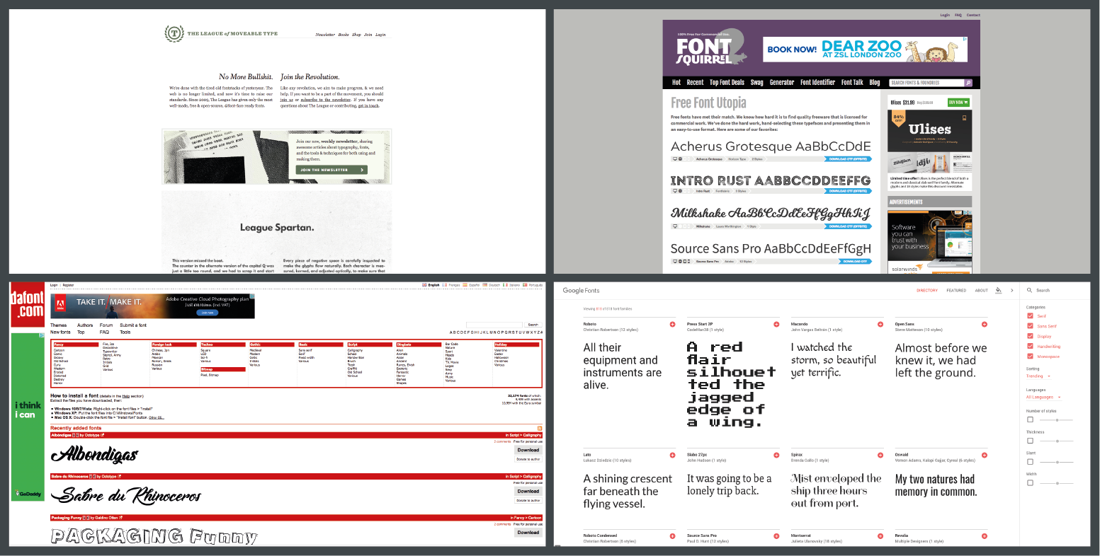
Free
- Google Fonts
- Font Squirrel
- League of moveable type
- DaFont (check the quality first)
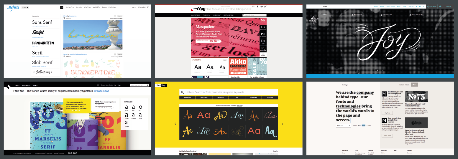
Paid
- Font shop
- Font Font
- My Fonts
- Foundries (Direct to type foundries): Check out Linotype, Monotype, Dalton Maag
6. Test!
The most important aspect of picking a typeface is to test it. Use sample documents and as many of the potential situations as possible (your submission document, diagrams, tables, title pages, presentations) so you can to see how the typeface will work and if it looks how you would like it to.
Final Words
Picking the right typeface for a tender can be a difficult experience, but it doesn’t have to be. The best choices come from experience and an understanding of how you are going to use the typeface. We hope this blog post provides some guidance on how to pick the right typeface or at least what to consider. Next time, maybe you can pick something different from the usual suspects and add a new exciting element to your submission.
For professional design advice on your next proposal, please get in touch by emailing info@tdl-creative.com