Don’t just rely on point size, use your eyes.
As a designer working on bid submissions, I am often tasked with setting my diagrams, illustrations and explanations to a minimum point size; bid documents themselves tend to be 11pt, with diagrams being 8pt (if you’re lucky!)
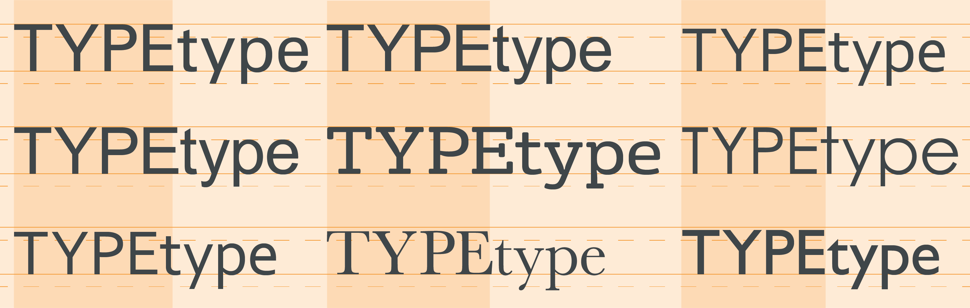
Point size is the standard measurement of type, dating back to the eighteenth century and is measuring based on the height of typeface. A typeface is measured from the top of the capital letter to the bottom of the lowest descender, plus some small buffering space.
This being said, letters also have a horizontal measurement, a set width, which can make typefaces take up more space than others, regardless of the vertical point measurement.
It is not just the often forgotten width that makes a different to the appearance of different typefaces at the same point, but also the thickness of the lines in the typeface, with slab typefaces taking up a lot more space than the other extreme, condensed type.
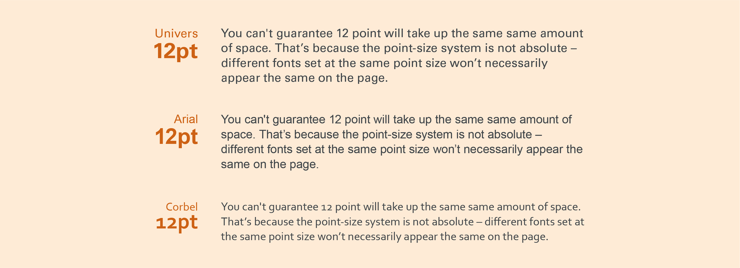
As an example of differentiation between different typefaces and size, below shows Univers, Arial and Corbel all in 12pt, but as you can see, Univers is a wider typeface with a higher x-height, making the same paragraph take up an additional half a line.
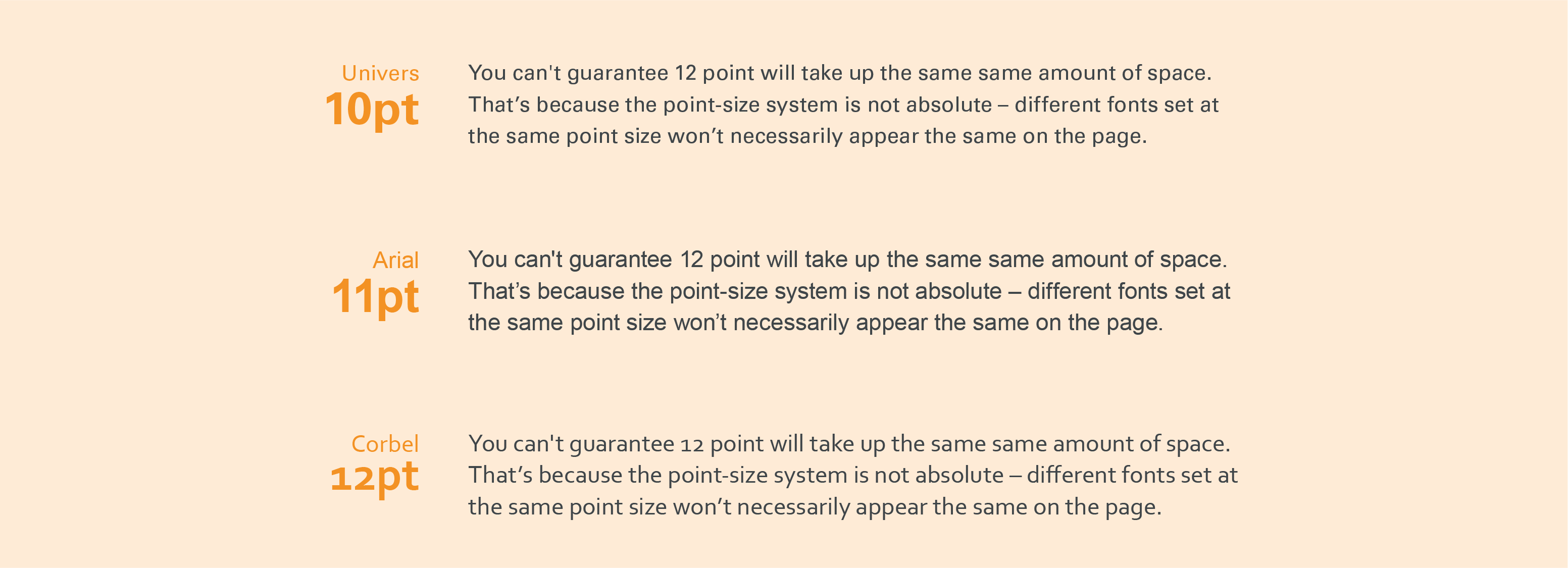
To further demonstrate the size differences, below are the same three typefaces, but now with the largest appearance, Univers, in 10pt, Arial in 11pt and Corbel, the smallest, remaining in 12pt.
They now take up exactly 3 lines in the same amount of space, with a difference of 2pt.
With this is mind, it is key when designing for print, or instructing for design, that just referring to a point size really needs more thought going into it. We must consider what typeface we use, what colour it is in, where the artwork is positioned and used. Sometimes, bringing the type size down, scary as it may seem, won’t actually hinder the accessibility or readability of the design, and will probably benefit from it.