At TDL we strive to continually improve our bid graphics processes in order to provide the best service we can, making life easier for our clients and ourselves.
We recently completed a large-scale project, spread over several months. Using this tender as a case study we decided to examine all of the work completed, drilling down into the fluctuating levels of graphics resource that the client required. The aim of this exercise was to collate data and see what we could learn internally, identifying key trends and challenges that we could feedback to our clients for future projects.
After reviewing all of the bid diagrams, we decided to narrow our focus into three sections:
- The design hours spent by the team, both as a whole and individually
- Our assessment of the diagrams completed over the length of the project, in particular the categorisation of their complexity
- An evaluation of a particular section of the tender and where efficiencies could be gained.
Design hours
The project consisted of two submissions. Submission 1 took place over 31 working days, whereas submission 2 was completed in the shorter time period of just 21 days, despite a greater workload.
We had a total of four designers working on the tender, over different time periods and stages. Throughout the project we had a core team of two designers that were there from the outset, right to the submission of the bid. The additional two designers were brought in to accommodate the varying and increasing workload as the project came to a conclusion. Through analysis of the working hours we could identify the trends and visually portray the build of work.
By breaking down more complex projects to this detail and continuing to collect data, we can work at consistent working days based on the size of the project. Even though the world of bidding can be unpredictable, having a baseline to work from is useful for both our internal and client’s project and financial management.
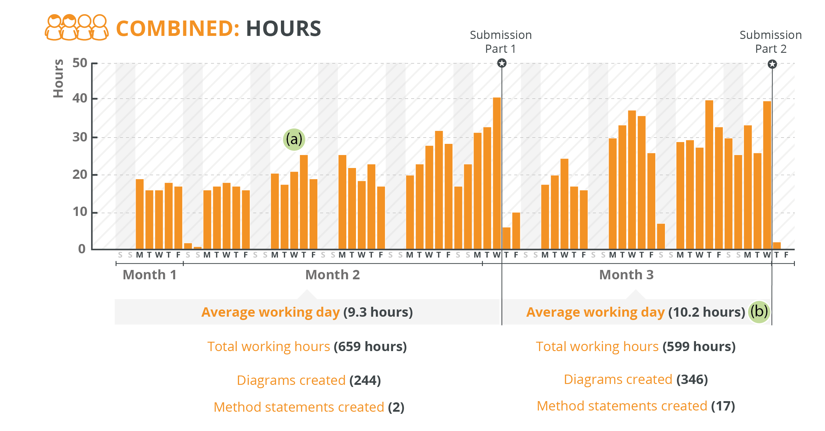
As seen in the chart above, there was an expected climb of graphics workload towards the last two weeks of the Part 1 submission date. This contrasts slightly with the trend in Submission 2, which seems to be spread across the last three weeks due to the condensed time period. We can see this is where the supporting resource of the extra designers came into effect.
The review process during the bid can be seen in the peaks of work each week (a). With reviews on Wednesday and the subsequent work on a Thursday, these days are generally the peak of each week. Recognising these trends helps us to understand project pinch points and prepare accordingly.
The accelerated delivery of submission 2 resulted in an average increase of an extra hour per day (b). This in turn saw the creation of an additional 100 diagrams and 15 method statements despite the short timeframe. Through the analysis of this data we can improve our estimation process and help our clients to better forecast resources on a project of a similar size.
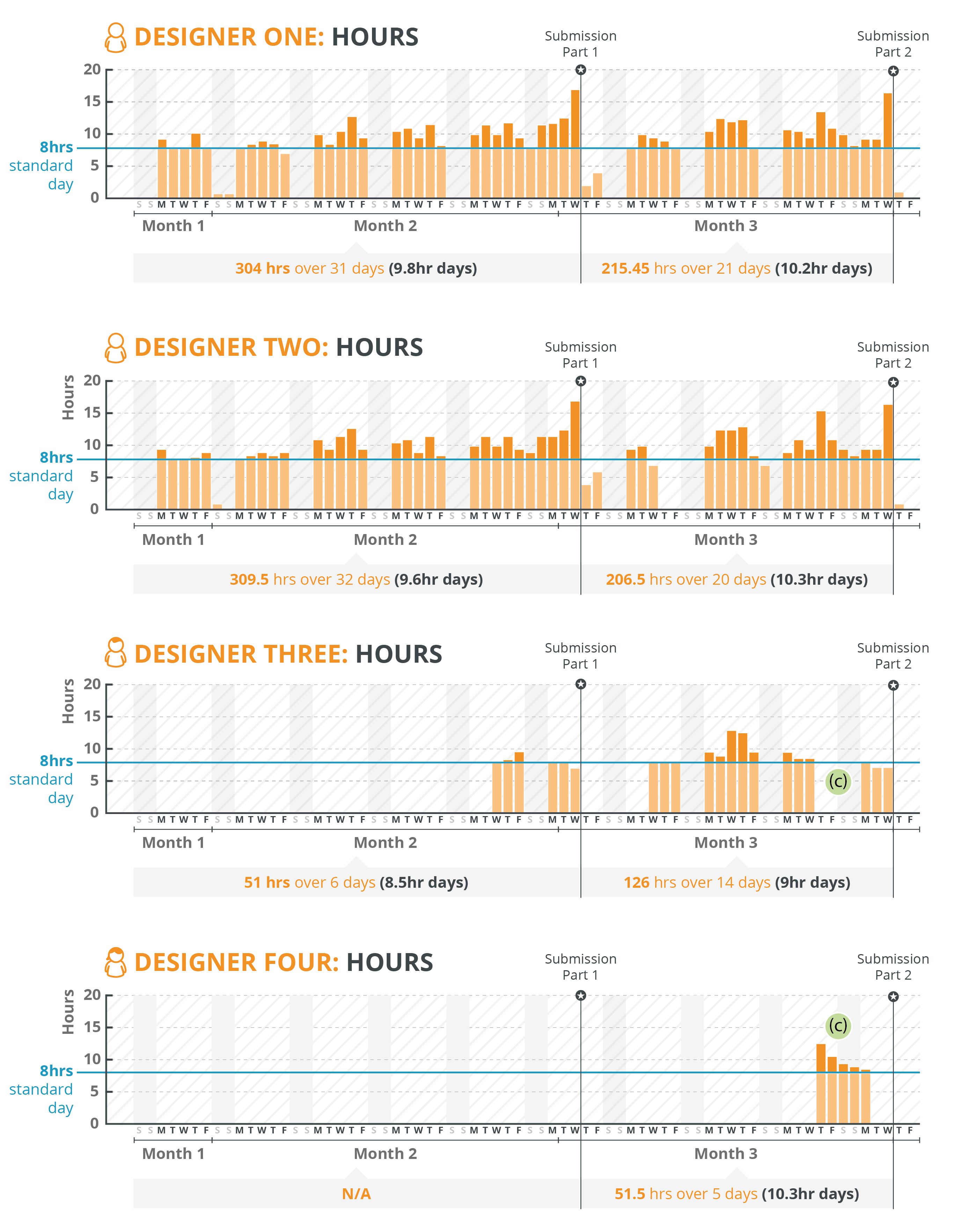
The figures above break down the working hours of each individual designer, illustrating that designers one and two were the core design team. With the core team managing the project they knew the best time to bring in additional designers. It’s worth noting that designer four was brought in for a short time right at the end of submission part 2 in order to cover a time when designer three was unavailable (c). The number of in-house designers that we have at TDL means that we can accommodate unplanned events and provide that reassurance to our clients.
Complexity
TDL Creative has been working on bids and tenders since we started in 2011. Over that that time we have completed thousands of diagrams. It can be difficult to predict how long a diagram may take purely due to the amount of variables involved and how significantly a project can change. However, as our experience has grown, we have started to implement a system to capture a time-based guide.
Over the past year and a half we have analysed a number of tenders and hundreds of diagrams to create a categorisation system. We decided on a three tier structure based on the amount of data, the level of problem solving required and the intricacies of the design.
Tier 1 – Simple
Characteristics: Self contained, limited information, restricted colour palette, pre-constructed iconography, familiar type
Examples: basic graph, short management process
Tier 2 – Medium
Characteristics: small data set, hierarchical colour palette, explanatory content, some creation of bespoke elements
Examples: simplified maps, basic illustration, more complex graphs
Tier 3 – Complex
Characteristics: large data set, hierarchical colour palette, very detailed content, increased creation of bespoke elements, animated or interactive content, multi-layered design, greater designer understanding required
Examples: complex maps (with precise location markers), large organisational charts, Isometric plans, method statements
By categorising diagrams into the above tiers, and then recording the time spent on a them, we have been able to establish a “time range” for each of the three tiers.
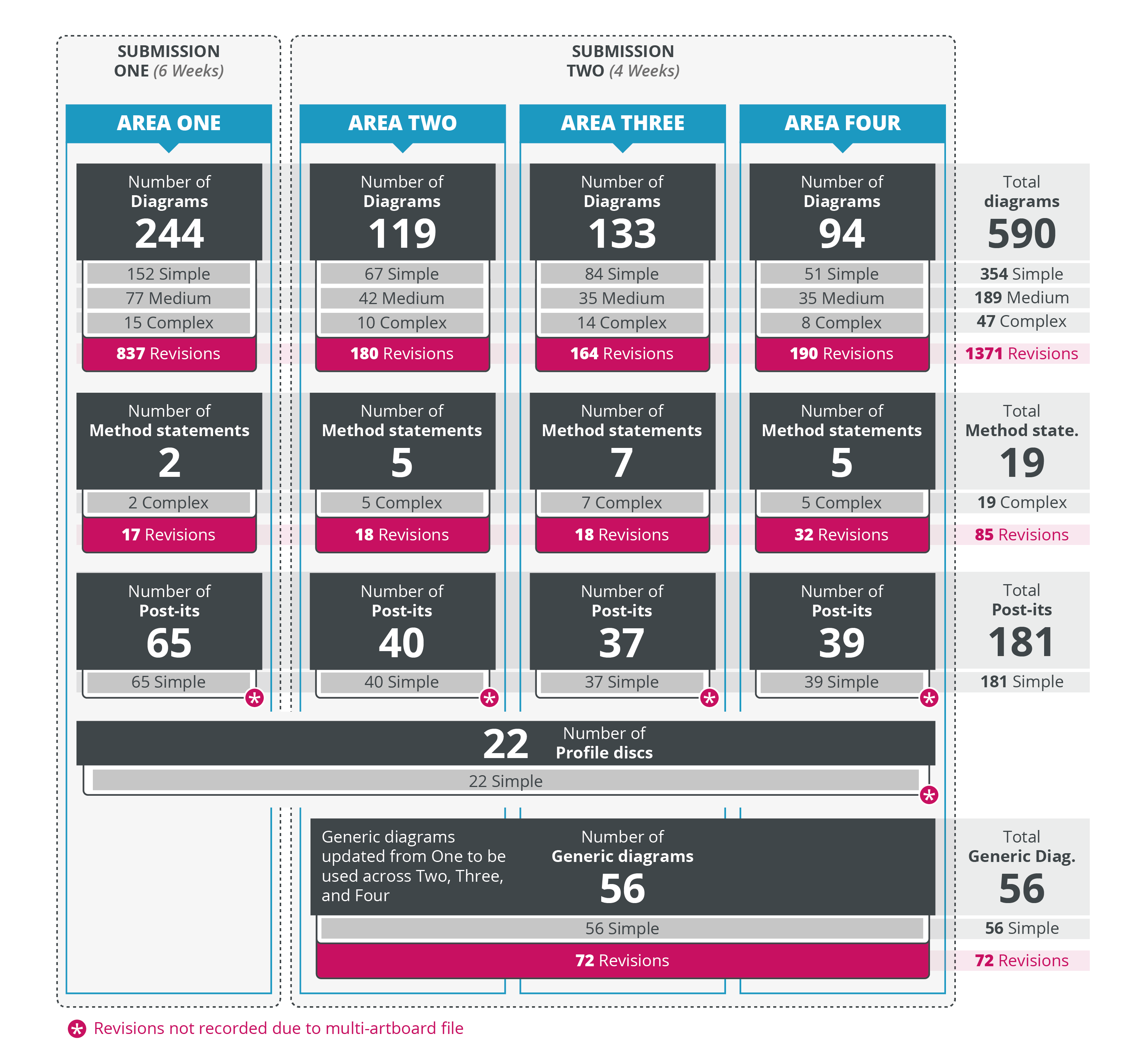
The diagram above shows the number of each type of graphic created during both submissions, as well as other design elements (e.g. ‘Post-it note’ pullouts for key information). In addition we added the number of revisions, which substantially influences the amount of time spent when developing a graphic.
By recording the total number of diagrams across the bid we can understand the types of diagrams that were most common; those that required the most revisions and how long the diagrams took to complete. In this large tender there was a ratio of 10:3:1 to the various tiers of diagram from simple to medium to complex respectively. As seen above, there were significantly more simple diagrams. This type of diagram is often used to support text passages and weaved into the responses. The more complex diagrams, such as the method statements, are much more limited. This is due in part to the length of time they take to create and amend, but also the investment of time from the subject experts that they require. As they need to be explained thoroughly, devoting time to them during the bidding process should be reserved for only particularly important concepts.
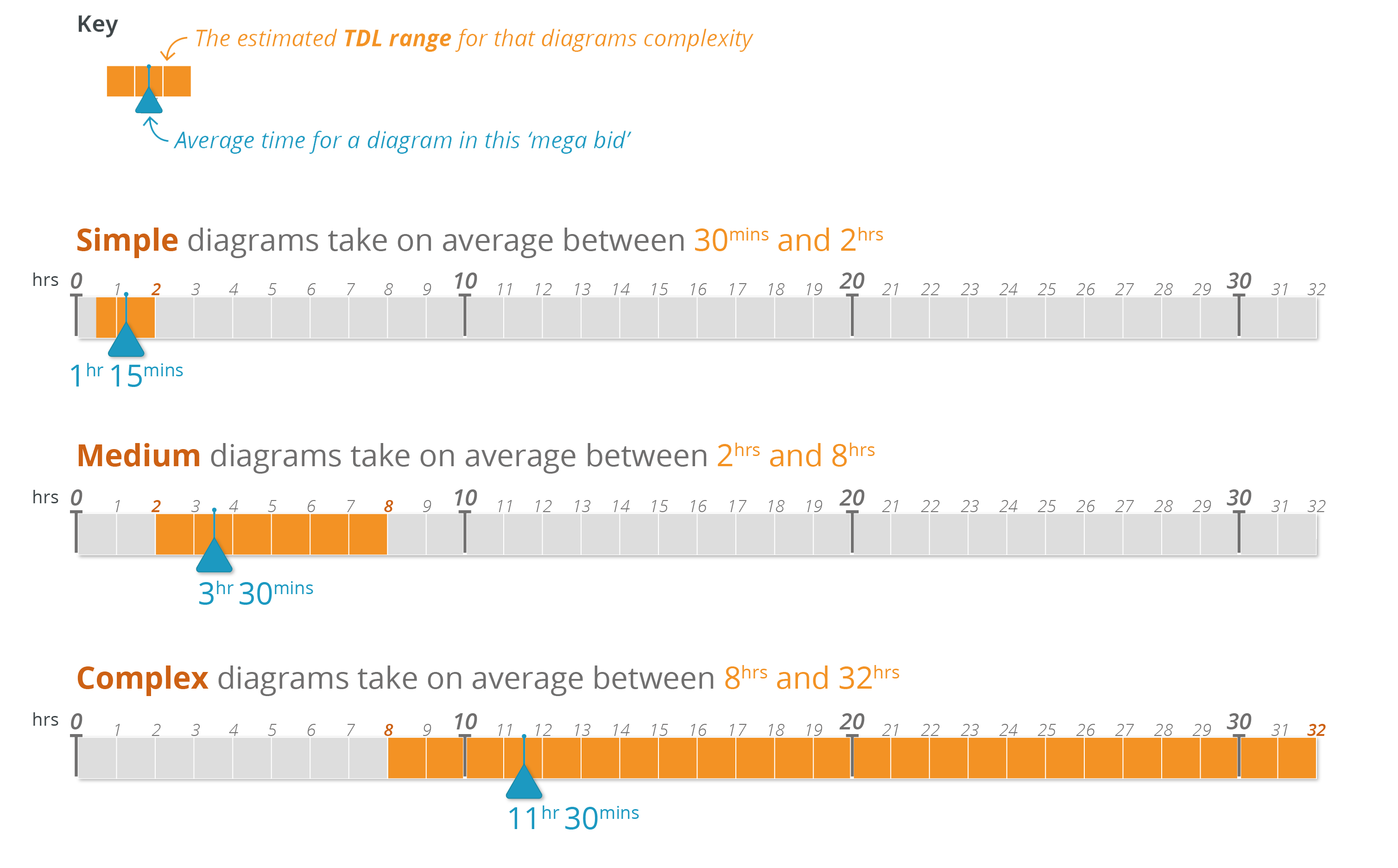
As mentioned previously, we have attributed time frames to the three tiers of complexity, in order to understand the average length of time it took to complete the diagrams on this bid against our generalised scale. Aside from the simple tier, the time taken to complete the diagrams is at the lower end of our TDL expected scale. This is due to three main reasons:
- Limited Time: The fast pace of the submission and number of diagrams led to an increased working pace to complete everything on time.
- Experience: The core team, who completed the majority of the diagrams, are senior designers. Their experience of working in that environment, skill level and fast working pace all lead to a quicker turnaround.
- Subject matter understanding: As well as their design experience, both of our core team had worked on projects of the same subject matter. This prior understanding of processes, terminology and key information points led to a faster and more efficient design system.
The scale allows for the different levels of designer we have within TDL, as well as in some cases accommodating the individual expert skills that the team has.
The complexity scale will continue to improve and become more exact with the increasing amount of data that we use to develop it. The better the scale gets, the more accurately we can estimate both time and cost the design work when supporting our clients.
Efficiencies
When creating diagrams for a tender of this size, there can be certain amounts of graphics that don’t get used. This is an area we wanted to investigate to identify where efficiencies could be made. The aim was to find out if we could save time and potentially save the client money.
We decided to take a closer look at all the diagrams created in submission one and split them out into the different tiers of complexity. We then identified which diagrams were used and which ones didn’t make it into the first submission for Area One.
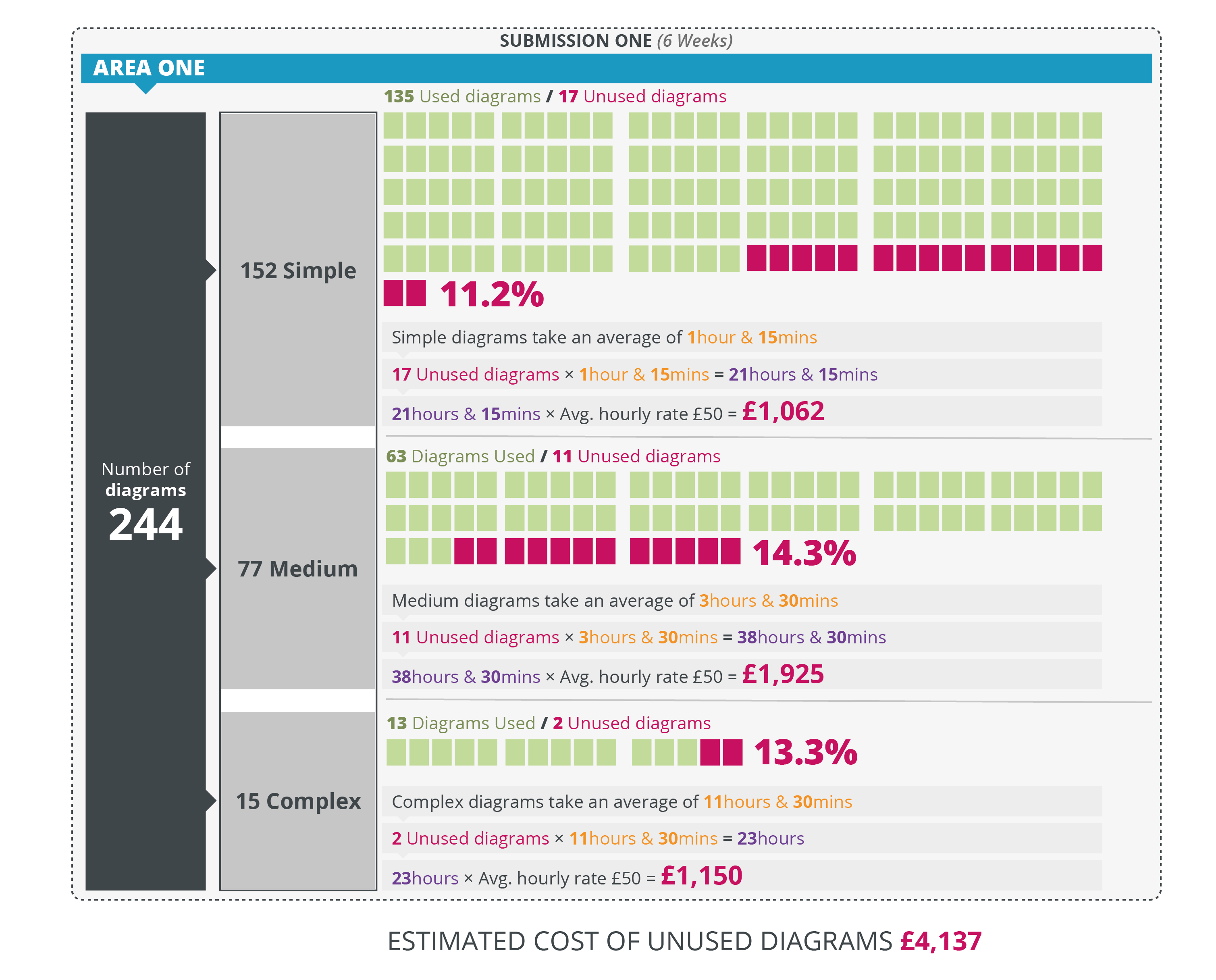
The graphic above shows the number of diagrams used in this section, compared to the percentage of unused diagrams. You can see that it’s fairly consistent across each tier, with the greatest loss in the medium category. When you scale these numbers across the whole tender, it’s clear that there is a significant amount of both time and money that could have been saved.
In order to devise ways in which to be more efficient, it’s important to realise the reasons why some of the diagrams were not used. We’ve outlined 5 key reasons that certain diagrams were not used during this tender:
1) Change of direction or solution
Tender solutions are subject to change as the submission is written and we often see diagrams produced in the early stages changed or adapted. There is little we can do to combat this as it’s entirely dependent on the tender and we would still recommend that design support is available from the outset to aid the development process.
2) Diagram was amalgamated into another graphic
In this mega bid in particular there were a number of smaller graphics combined to make more creative, and space saving visualisations of data and concepts. Whilst aspects of the originals may still be used, they often have to be redrawn or amended to fit alongside the other information.
3) Redrawn from previous bid graphics but no longer relevant
Again this is usually down to earlier solutions being drawn from past experiences or submissions. We often get a number of graphics that are quite general and dropped into supporting an answer. We redraw and change these to better fit the look and feel of the individual tender, but as the process continues they are swapped out for a more specific and bespoke diagram with revised content. In this case it might be better to wait until the answer is in a later draft before revitalising a recycled diagram.
4) Created as a concept / sound-boarding exercise to lead to other diagrams.
This is a particular area in which inefficiency can be avoided. During some tenders a number of graphics may be created to a high level of detail purely as part of an exercise to visualise an idea. It’s often best in a situation like this to have hand drawn sketches or at most basic wireframes drawn up, leading to a more finalised version when the idea is approved by the bid team.
5) To save space in a document
As the submission date approaches, some of the simpler diagrams are removed from the document to make way for more text. Whilst we can work to make the diagrams as small as possible without compromising their quality, it’s understandable that sometimes they have to give way to the document’s body text.
As mentioned previously it is expected that some diagrams will be removed or remain unused in the process. We will in future analyse other projects to see if the percentage of unused diagrams is similar and whether this is a trend once a project hits a certain size. We will also continue to note the reasons why this might occur to offer advice to our clients on where they may be able to make savings.
Conclusion
So what did we learn from our three areas of interest?
We saw the designer’s hours taper up through the bid and that even from the start the average day was never usually just eight hours. We got a better insight into the workload by splitting the graphics into complexity levels. This information has fed into our ongoing aim of being able to assign more precise time ranges to diagram complexities. We looked deeper into why diagrams were not used and costs attributed to them. We appreciate that even though some graphics were not used in the final submission, they aided the progression of the project and are a vital part of the bidding process.
“Great design is not always about what it looks like but sometimes about how you have analysed and solved a problem to help others”
Dave Stroud
Senior Designer at TDL Creative
This exercise of analysing just one bid has highlighted trends and identified key patterns in the way we work. This in-turn will enable TDL to further develop our own working practices and improve the way we support our clients; helping them to forecast graphics resource and plan more efficiently for future projects.
TDL will continue to evaluate more of our projects, and interpret the data. This will lead to more precise capacity projections, better understanding of the clients diagrammatic needs and even more efficient collaborative working in the future.
We hope this blog has been of interest, and if you’d like us to chat to you about your bid graphic requirements then please get in touch.