TDL doesn’t just do bid graphics….
Back in 2013, we were approached to design the layout and style for the informative side (where the food is!) of a new American-style bar in London. Take a look at the Jackson + Rye website.
Our brief:
“Cool bar, not diner”
“Evocative 1940’s, not shouty 1960’s”
“Classy, not dull”
“Oh, and more content than space!”
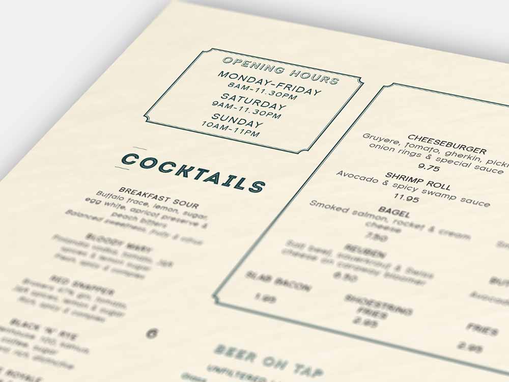
The Jackson + Rye menu typefaces went through several stages of trial and error in order to get the best look for the wording. Whilst constantly keeping the illustration style in mind, we worked with a series of display typefaces and body type to find harmony on the page.
Florence Sans was the final choice for the body text, a clear and readable type, with a few quirky extensions to the ascenders and decenders on the more elongated letterforms. Something a bit different for an individual restaurant.
Volume of content was a lot greater than the space we had (a familiar story!), so there were many variations and styles created, placing the food in different areas of the menu to find the perfect balance of space-saving layout and intuitive readability. It was very important to maintain sufficient legibility in this dimly lit dining situation, and still make it look aesthetically pleasing.
The illustrations have featured on ‘It’s nice that’ and are by an illustrator called Bjorn Rune Lie. He was sourced by the client and his work provides a brilliant wrap to the menu cover, and throughout the restaurant.
What a thoroughly enjoyable project, giving the TDL design team a chance to show-off their creative capabilities.