When an international development organisation approached us to bring their strategy to life, we were excited to flex our information design skills. Read on to discover more about our collaborative journey to creating a set of engaging and accessible illustrations.
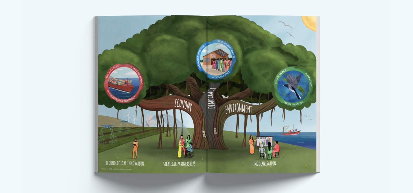
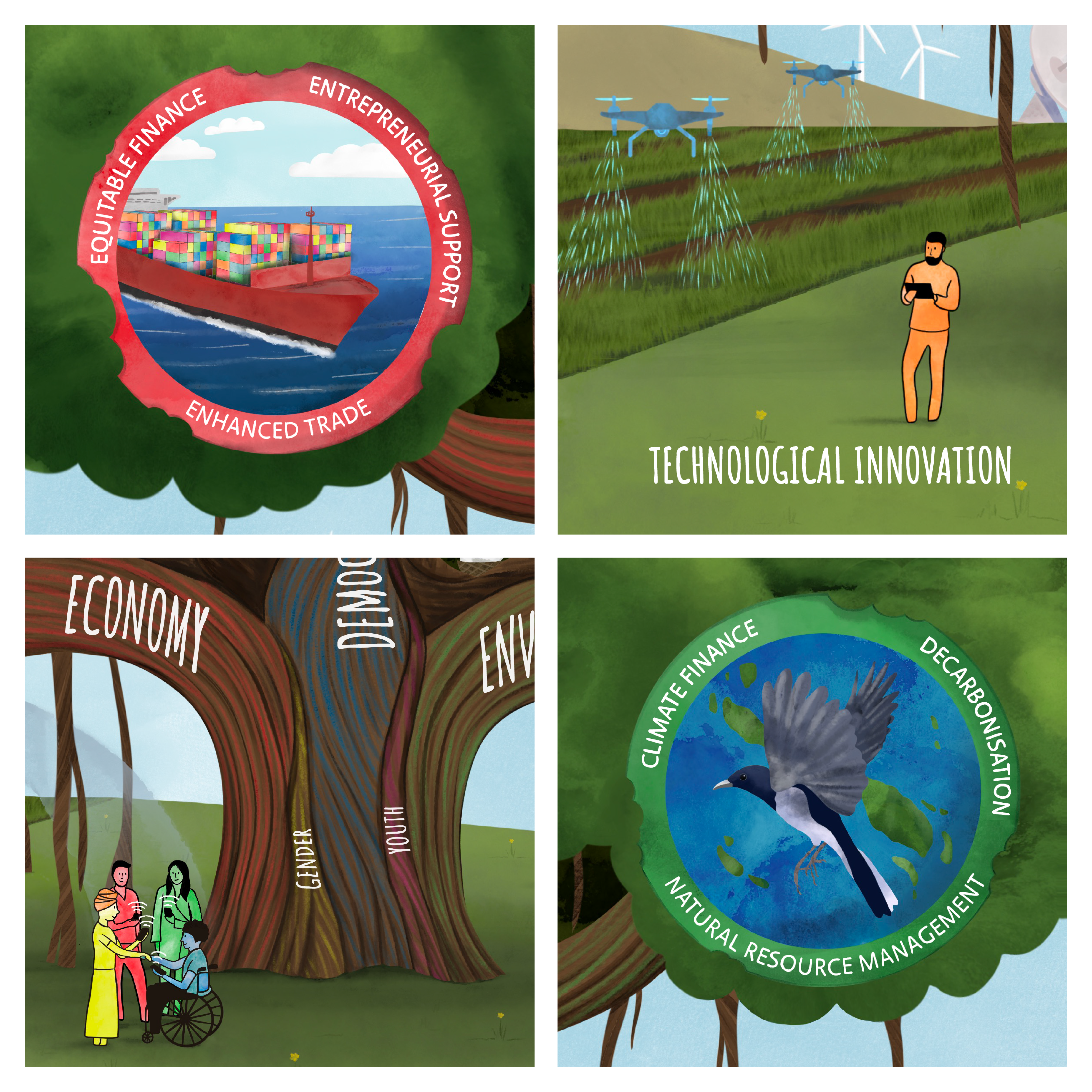
We’re always up for a new challenge and knew this project was an opportunity to apply cultural sensitivity, strategic thinking, and inclusive design principles, beyond our core bid design service. The client came to us with an initial sketch capturing a single, powerful idea: using a tree as a visual metaphor for their international development strategy. They sent us a hand-drawn concept of a tree connecting three central themes – economy, democracy, and environment – with gender and youth connecting them all. Surrounding the tree, they wanted to capture active and connected communities, and potentially include a nod to the various nations they operate in.
Recognising the complexity of the task, Kristina Vang (TDL Designer) and Craig Melvin (TDL Creative Director) visited the client’s UK-based office to explore this concept together, discussing possible directions and sketching out ideas to bring the concept together. Our task was to translate their concept into a polished and versatile digital illustration, one that could hold a complex story without overwhelming the viewer.
We soon discovered that the initial idea was ambitious and needed to be distilled to communicate their strategy clearly. As part of the process, we presented the client with a series of mood boards, featuring illustrations of trees, abstract characters, and three illustration styles: textured digital, hand drawn, and digital watercolour.
“This project might not look like our usual TDL outputs, but it’s built on the same foundations – listening, understanding, and collaborating. By exploring the client’s goals and challenges together, we shaped a solution through sketches, conversations and experiments. It’s the kind of project we love!”
– Craig Melvin, Creative Director at TDL-Creative
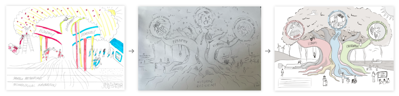

From the earliest sketches through to final approvals, we maintained an open dialogue with the client. This ensured that every revision moved the project closer to something both creative and strategic. Because this was the first time the client had commissioned this type of illustration work, we placed particular emphasis on co-creation. To do this, we provided visual examples, discussed options, and tested ideas together.
After reviewing our illustration concepts with the client, we landed on a hybrid style combining hand-drawn illustrations with digital watercolour. This approach offered the flexibility to adapt individual illustrations while maintaining consistency across the full suite of visuals. The secondary colour palette from the client’s brand inspired our illustration tones, helping us stay connected to their core identity while introducing a fresh and contemporary feel.

As the project evolved, the client also realised it was equally important for them to find the right balance between the natural environment and technological progress. The client wanted to highlight innovation, from digital tools to robotics, without losing sight of the human connections at the heart of their work. This balance guided us towards visuals that felt optimistic and forward-thinking.
All illustrations were created digitally using Procreate on iPad and developed in Adobe Illustrator and InDesign, which allowed us to create flexible visuals that can be applied in different contexts and formats.
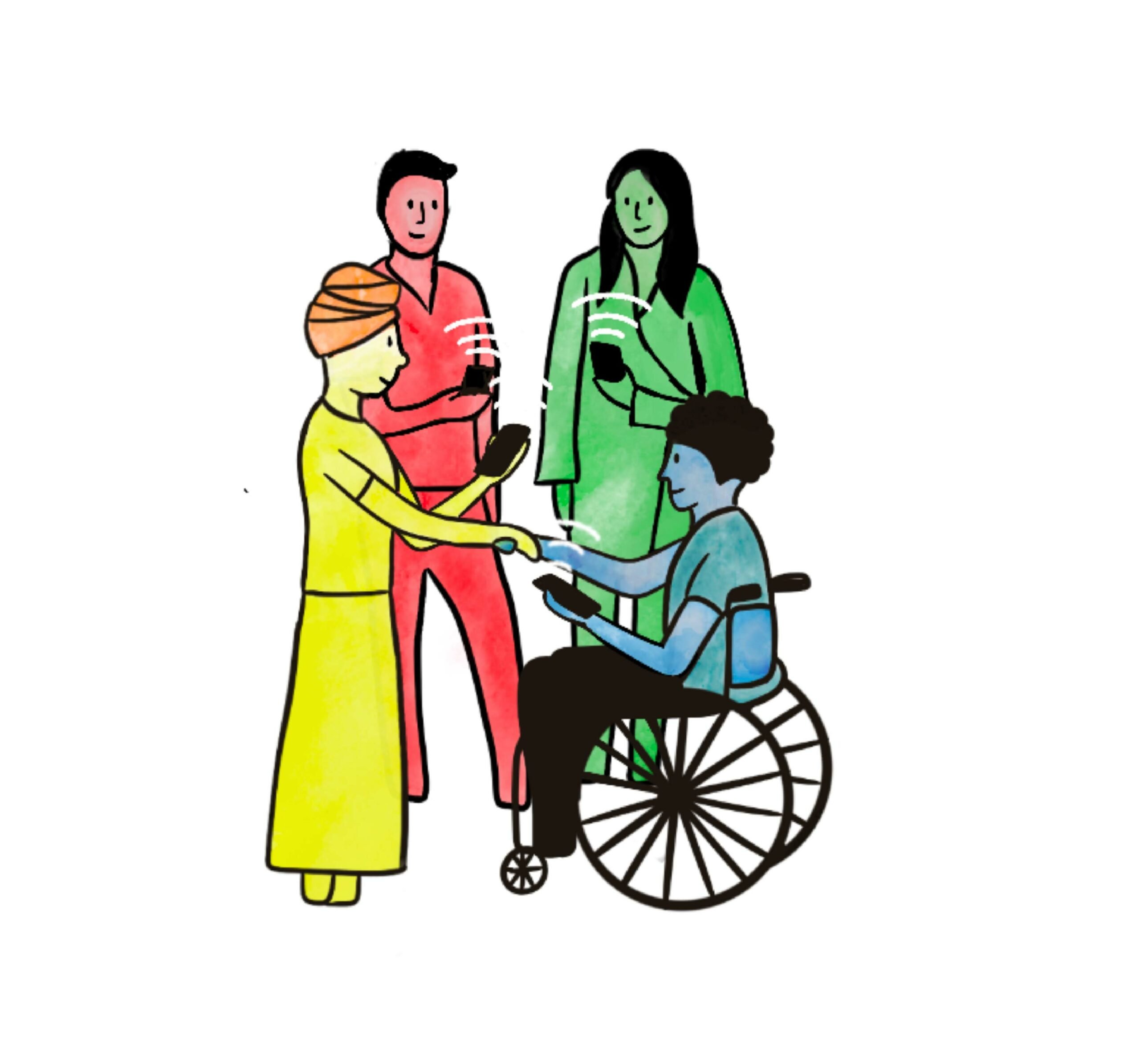
Creating illustrations for an international development organisation involves more than aesthetic skill; it requires an inclusive approach that resonates across a diverse, global audience. That meant careful attention to details like clothing styles, skin tones, and symbols – ensuring the illustrations of people reflected a range of cultural contexts while remaining cohesive within the client’s wider visual system.
Accessibility was also a key factor. Maintaining a balance of colour, space, and readability ensured that the visuals effectively captured the core strategic messages, without diluting them. For example, rather than overcrowding the main tree with references to different countries, we suggested developing a separate illustrative diagram – adapted from the client’s logo – to acknowledge the organisation’s global reach. This process of simplifying complexity, while maintaining key messages, became the core of our creative challenge.
“Inclusivity within the global community was a crucial factor in the design, both in ensuring diverse representation and in making the illustrations accessible and understandable to a broad audience.”
– Kristina Vang, Designer at TDL-Creative
This project offered valuable insights – both creatively and strategically. For us, it was an opportunity to continue expanding our work in the international development sector, learning how to visualise abstract themes like democracy and sustainability in a way that felt both respectful and engaging.
We also learned the importance of designing for flexibility. With multiple approval stages and evolving priorities, our hand-drawn digital approach allowed for quick adaptations without losing meaning or visual consistency. And, perhaps most importantly, we saw how illustration can play a powerful role in bridging complexity – helping organisations articulate nuanced strategies in a way that feels accessible, human, and hopeful.
This collaboration reminded us of why we love what we do at TDL-Creative. The project demonstrates how information design, whether for bid and tender projects or international development, can bring clarity across global audiences.
“Collaborating with an organisation that shares my values of supporting an international community, peace, and democracy was not just creatively fulfilling; it was personally meaningful.”
– Kristina Vang, Designer at TDL-Creative