
THE CHALLENGE
World Bank approached TDL to visualise a long and information-dense report. It needed to be easy to read, with clear user navigation and interactivity. We also wanted to bring a look and feel that would help to make the content engaging and memorable.
SOLUTION 1
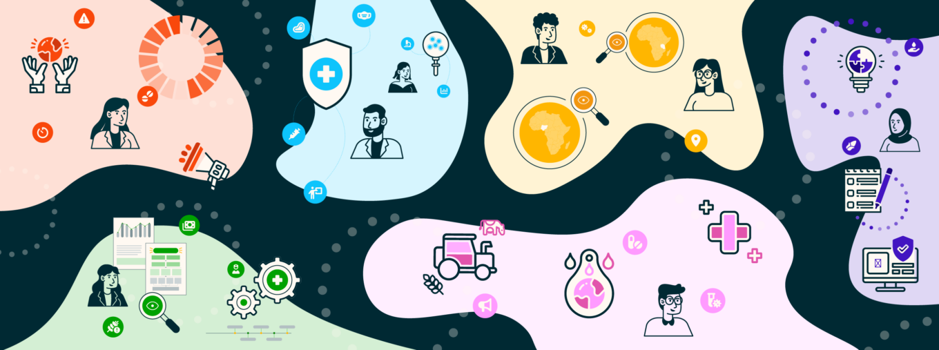
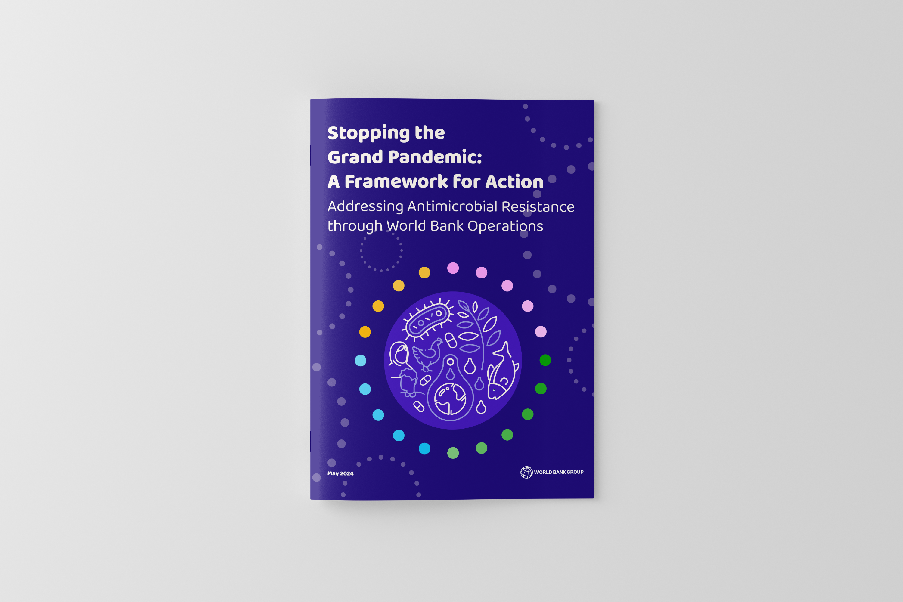
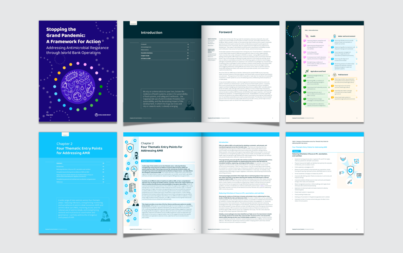
The final report was broken down into different colour-coded chapters to make it easier for users to navigate through the document and skip to desired sections if short on time. Iconography was used to supplement the supplied copy, and minimalistic illustrations demonstrated the human, animal, and environmental health systems discussed in the report.
In addition to the full document (244 pages excluding appendices), a summary report was created, highlighting the key takeaways and summarising the framework for action.
SOLUTION 2
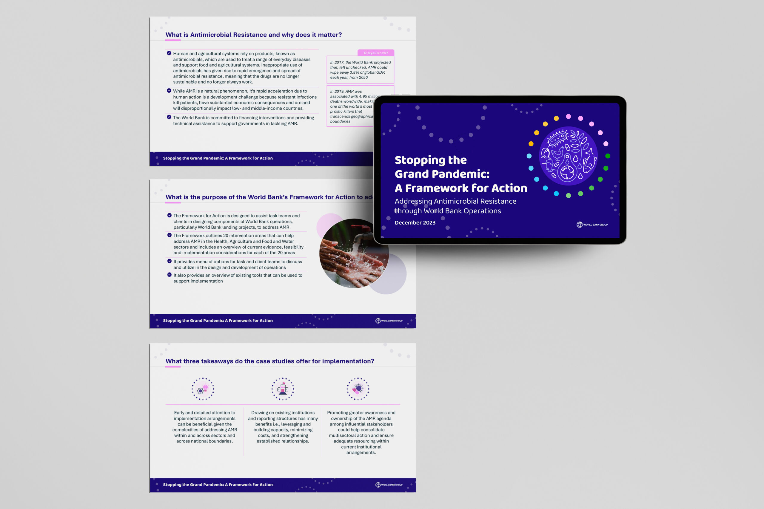
Following completion of the report, the client requested a PowerPoint version with the same look and feel. The challenge here was translating the information from portrait to landscape orientation and integrating photography. Each slide had to be well balanced with less text, because the user would have much less time to absorb the information.
“It was fantastic working with World Bank on this report and I enjoyed the challenge of creating a flexible and clear design system to display the complex information. Interactivity and user navigation were a core focus for this project, which was a real bonus for me as an advocate for user-centric design!”
Sammi Loerns, Head of Editorial Design at TDL-Creative and Lead Designer for this project