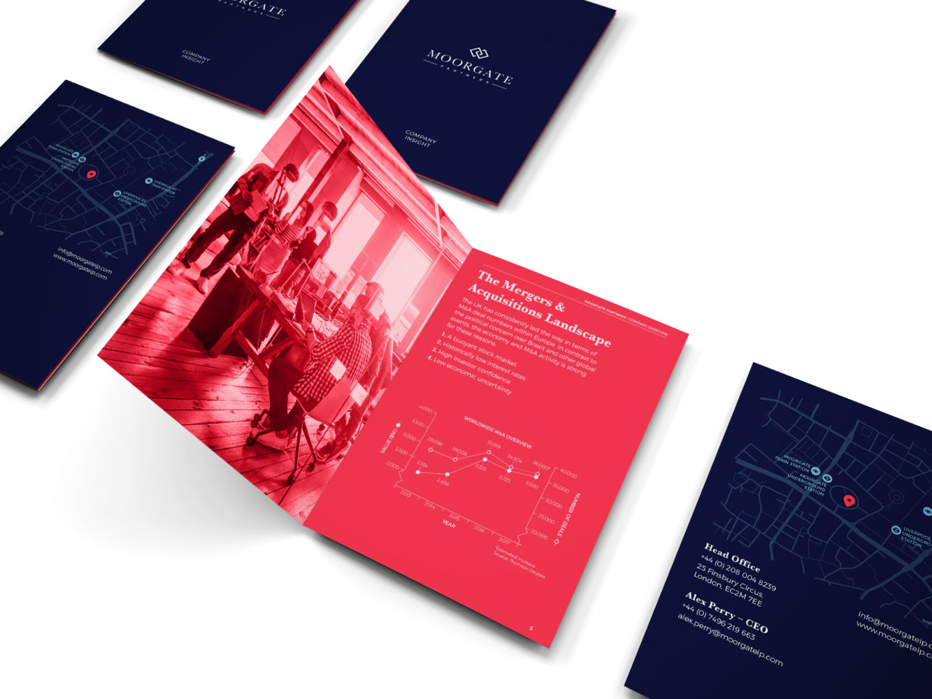
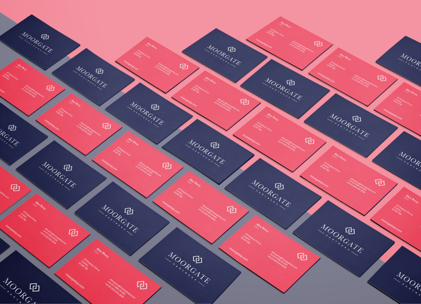
Moorgate Partners specialise in merger and acquisition deal generation. They asked us to translate their corporate brand into a visual identity that would enable them to successfully promote their business.

They set us the challenge of creating an identity that was contemporary but had an established look and feel. The visual identity was built upon Moorgate Partner’s values: approachable, trustworthy and confident.

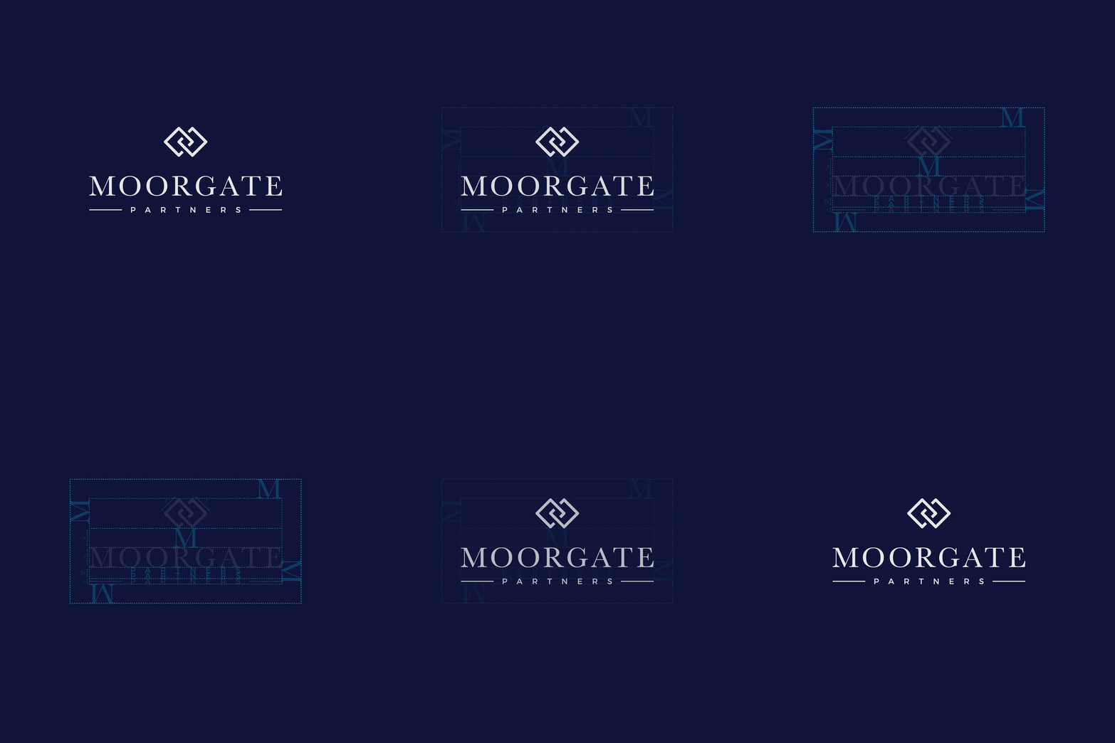
A combination of serif and sans-serif typefaces helped to promote the idea of a new, but established brand, which was adopted not only for the main logomark but across all supporting collateral.


The brand’s monogram symbolises partnership, this is representative of Moorgate Partners’ approach when working with their clients. As a diverse asset it acts as a supportive feature to the main logotype but also as a lone visual in a number of different contexts.
