Collaborating with Harmonic Ltd to create a new website which engages with all of their stakeholder groups.
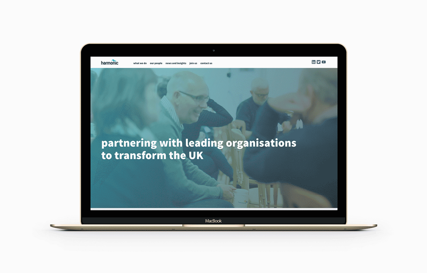
Harmonic came to us for a completely re-designed website. With a current site that was difficult to use, dated and didn’t reflect them as a company they needed to make a big change. They had a clear vision for what they wanted their future digital presence to be, so we set out a plan of how to get there.
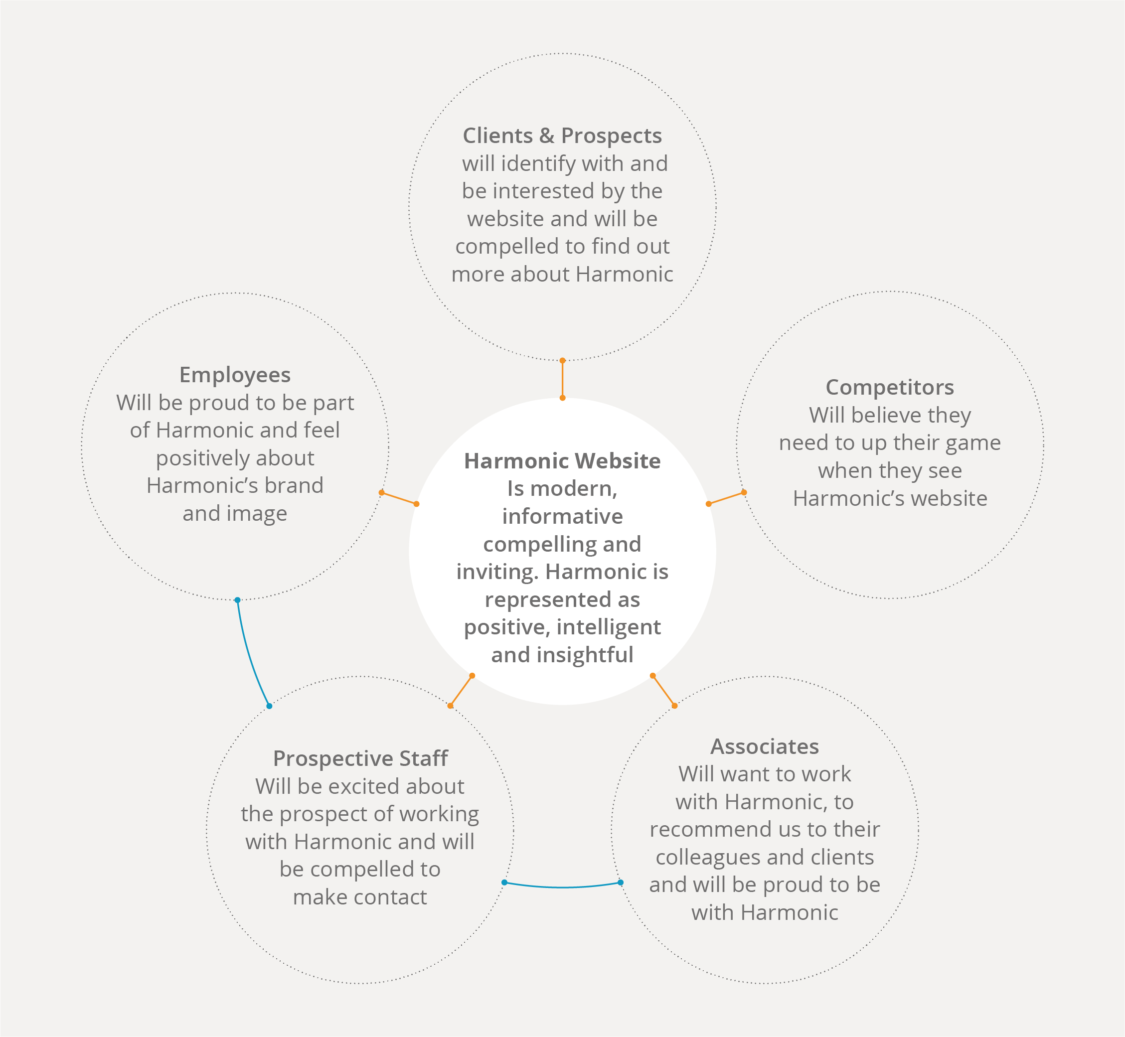
As an extension of their overall vision, each stakeholder group had their own vision of the future harmonic site from their perspective. Throughout the process these visions served as a baseline for what the site needed to achieve.
Research and analysis allowed us to start turning these visions into actionable insights. Our research began with two areas – competitors and users. Investigating competitor sites with Harmonic gave us and understanding if where they wanted to be visually, the features they liked and what the target areas should be. Key points were strong brand implementation, responsive design, conversational copy and a site that’s easy to use. Analysis of the current Harmonic site showed us that these areas were where the site was failing. Looking at the pain points of the site revealed a complicated structure hidden behind a homepage that made it appear like a one page site. This coupled with confusing content made the site difficult to engage with.
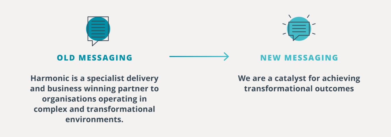
In order to help address these issues in the right way we created personas and used them to construct user journeys. The personas represented the visions of each stakeholder group but contextualised them into real life scenarios. Working through the process with Harmonic helped us to use their client knowledge and accurately layout the journeys. As well as providing a better understanding of the user aims, it helped to start mapping out the content they would engage with. Content mapping led us to a clear site structure and direction on messaging – alleviating two of the identified pain points. In both cases we were moving from something complex, confusing and hard to understand to a straightforward, compelling and clear approach.
Laying out the current site architecture was invaluable – it was easy to see an over saturation of similar content, and a lack of navigation points to draw the user through the site. The revised structure is easier to follow, sorts the content logically and provides content in much more digestible chunks.
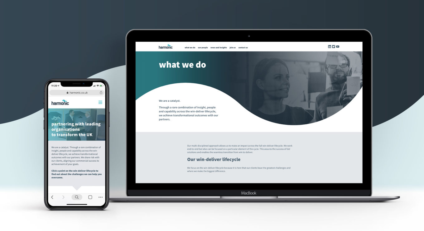
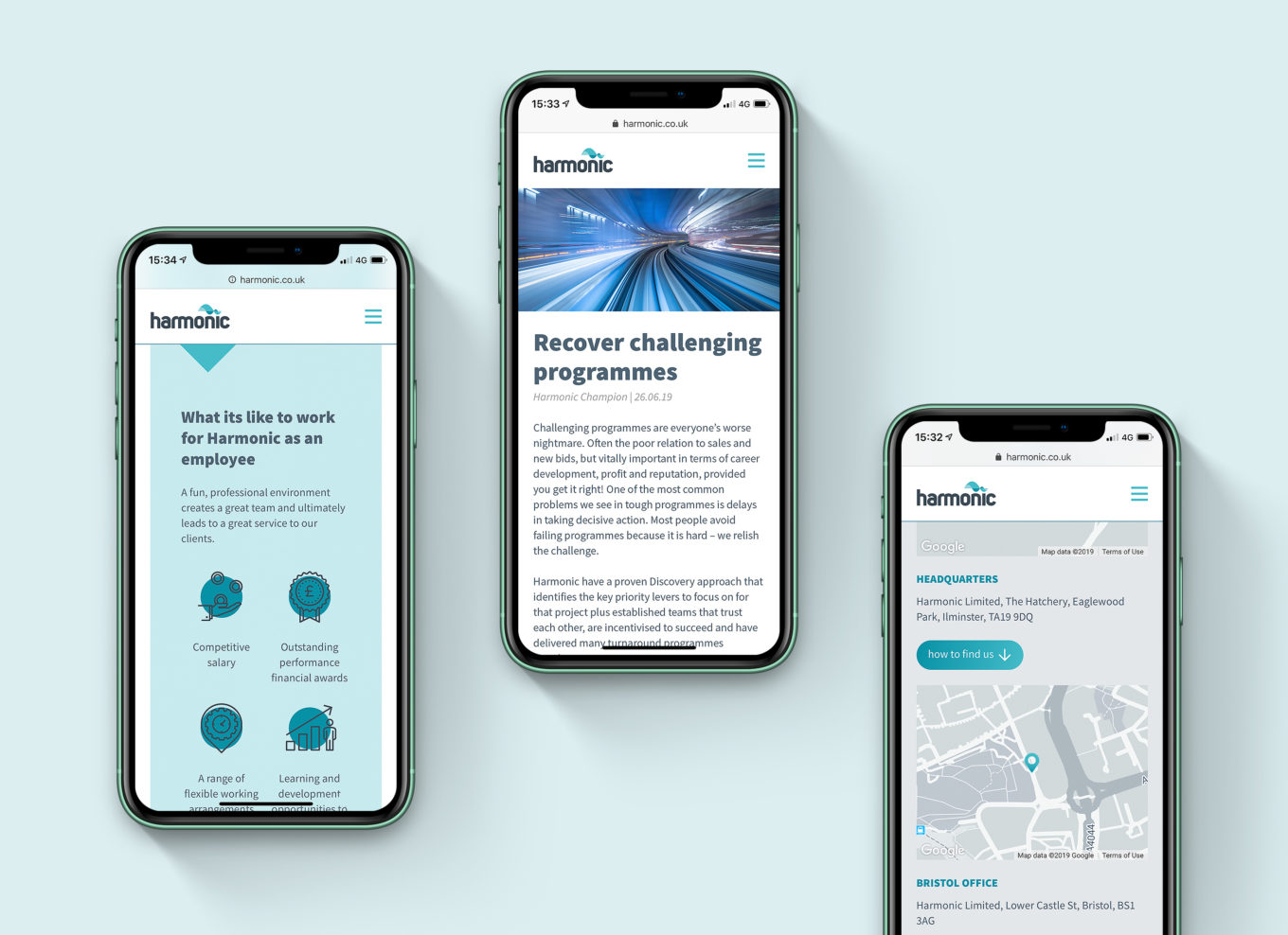
Using the agreed new site architecture as a base, we started developing sketched wireframes., before moving onto Adobe XD Low fidelity screens. Working on mobile and desktop designs helped us to consider the functionally, layout and stacking of elements at different breakpoints. Working without development partners, Orphans, during this stage ensured they had visibility of progress and could provide input on feature development.
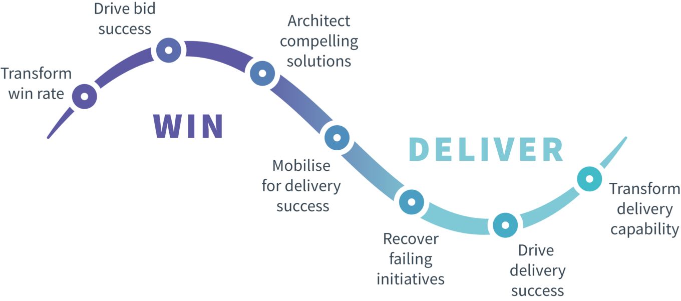
As we started to get a picture of what the future site was going to look like, content hierarchy became more important. Harmonic made it clear that the most significant aspect of their site would be the Win Deliver Cycle. The cycle was the visual summary of their service offering. We needed to turn this into something engaging and conversational. After some discussion we turned each aspect of the cycle into a question, opening that dialogue directly with the user – clicking on the question would bring you to the relevant service provided by Harmonic. As such an integral part of the design, we used aspects of the diagram to form visual accents through the rest of the site.
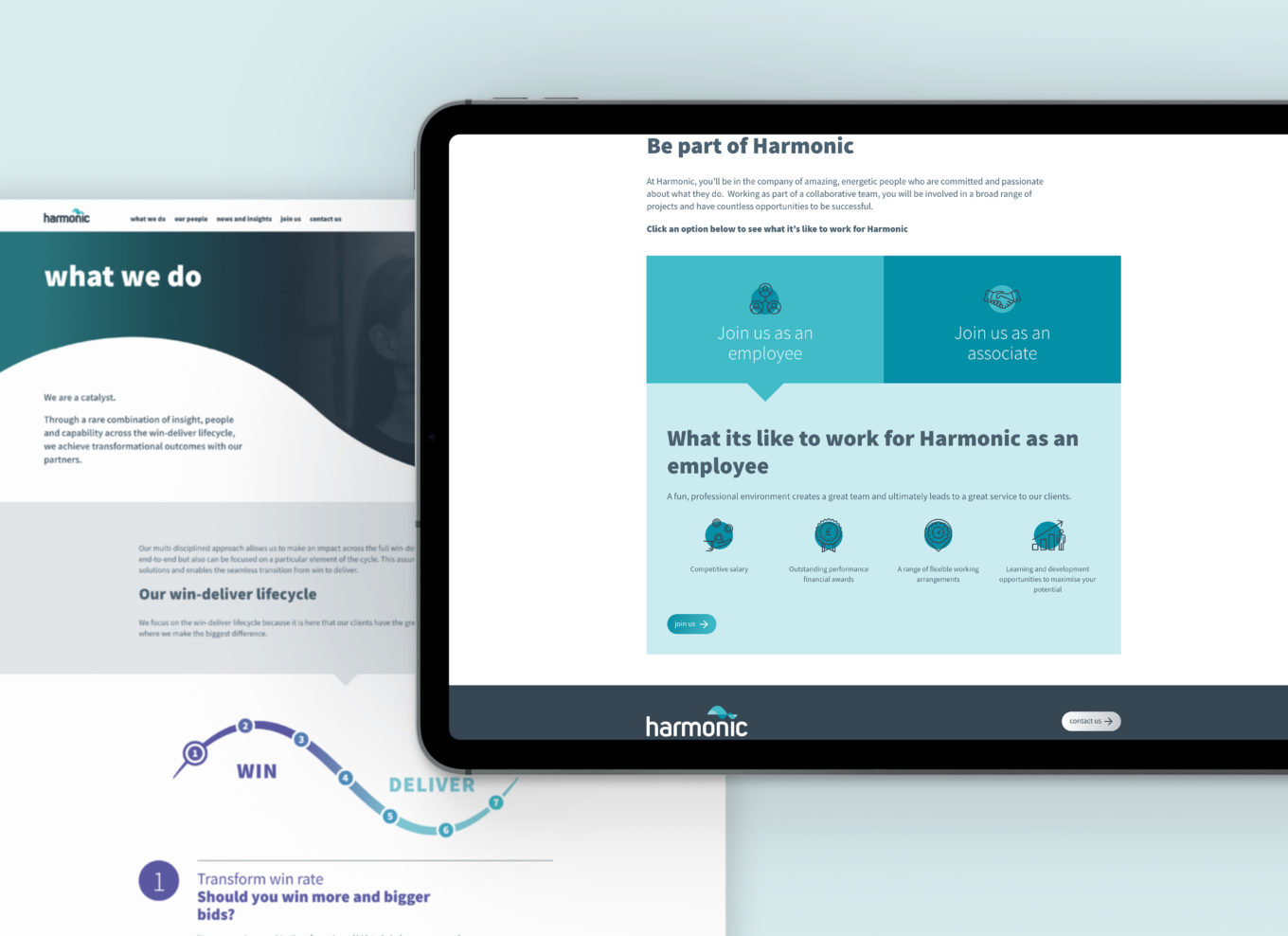
We efficiently moved through design stages implementing feedback as the designs were refined. Prototyping the high fidelity concepts allowed Harmonic to share them with their internal team of content champions and let us test on various screen sizes. After handing over the designs for development, we continued to work on the beta site, which changed as more content was produced. As we tested the beta with members of the team, we re-organised some content to group it together and create more cohesion across the site. Orphans were responsive and dependable in implementing the changes, helping to create a great product.
The new Harmonic site delivered on all the fronts we identified at the start of the project. Harmonic now have a site with:
- A professional and modern appearance which will resonate with their client base and employees; focussing on the people and methods which make them stand out
- An interactive diagram which allows users to engage with the content they actually want
- An easy-to-use and update custom content management system all based on the WordPress platform.