We worked closely with NRS Healthcare to create a family of new websites using their refreshed brand.
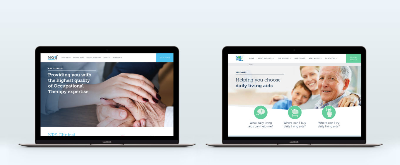
After working with NRS to develop a new, consistent and professional brand to be used across their bid and tender activities, they approached our TDL digital design team to create a new family of websites as part of the NRS Service provision.
Similarly to the work we completed on the tender brand, the sites needed to be engaging for the target audience and reflective of the NRS values. The first site we helped to design was to promote and describe NRS Healthcare’s clinical services.
There were three target outcomes for the site:
- Engage clinical professionals
- Translate the tender brand into a public facing identity
- Create a website that is easy to use and follow
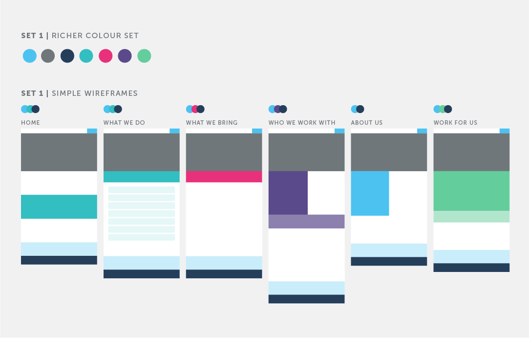
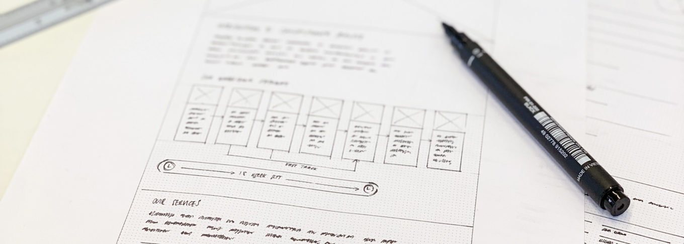
We worked with the client to plan the site architecture, using the customer journey as a foundation. The user could explore the site or understand a snapshot of the service offering from the homepage. Once the structure was approved, we worked iteratively through wireframes, colour palette testing and then visual application.
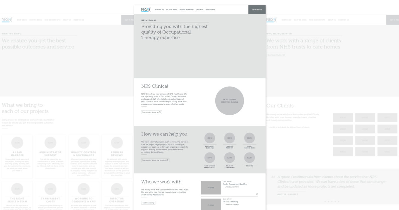
Collaborative design was key in ensuring a strong final design which hit all of the outcomes. At each stage we shared the concepts and collected feedback from the NRS team. Prototyping helped to understand the user interactions and journey through the site. The prototypes were also useful in sharing our designs with NRS’ development partners making the handover process smoother.
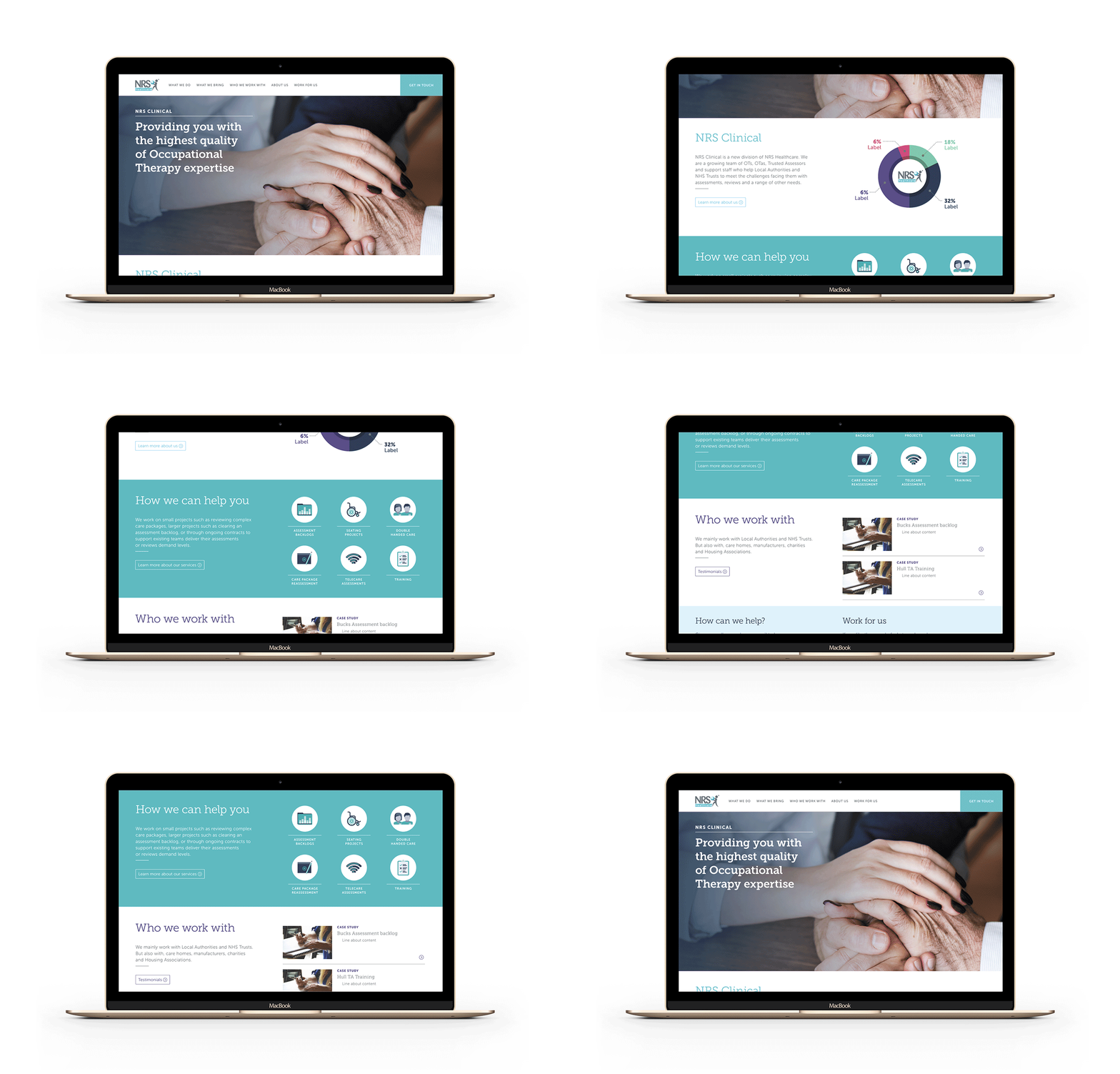
Delivery of the first site (NRS Clinical) was a great success! It featured;
- A considered design, reinforcing NRS’ professional and reliable image;
- Opportunities for engagement with calls-to-action throughout the website; and,
- A clearly defined information architecture helping to guide users.
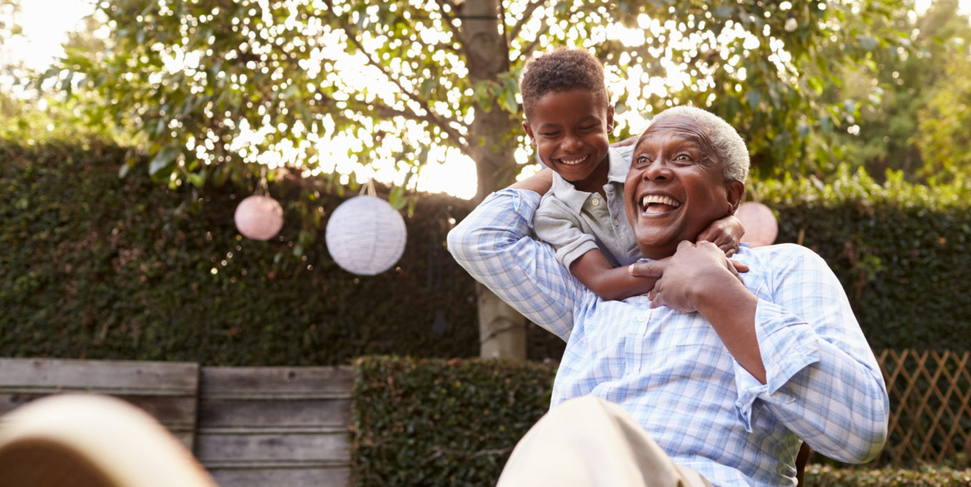
Following the successful delivery of the clinical site, NRS asked us to improve their ‘Safe+Well’ sites. Slightly different from the clinical site, the Safe+Well sites had localised information for contracts delivered by the client. They are all consumer-facing, providing advice on different living aids and services that NRS offer. Understanding the target audience was key in the design, ensuring it was user-centric, worked with the existing structure and was accessible to an older demographic.
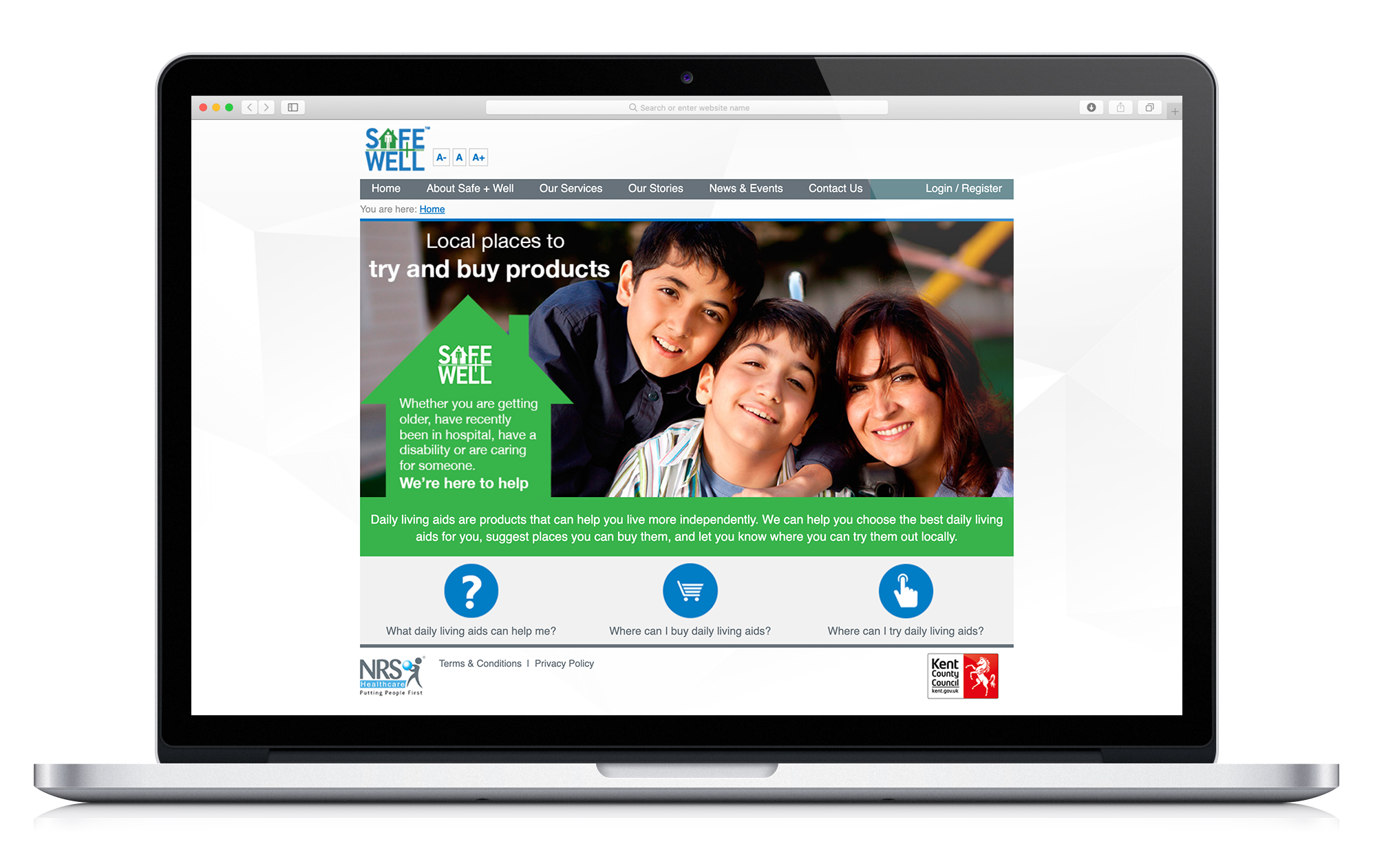
Target outcomes for the new Safe+Well sites were to:
- Build a site that was easy to navigate and understand for the target audience
- Continue the implementation of the evolved brand
- Create a new interactive tool to explain the range of products NRS offer
As this was a re-design of the existing site, we started by analysing the pain points and the aspects that were already working well. A large typesize, improved contrast, and clear navigation were all important features to implement. These improvements could be addressed site-wide, but we also needed to develop the new digital tool with those requirements in mind.
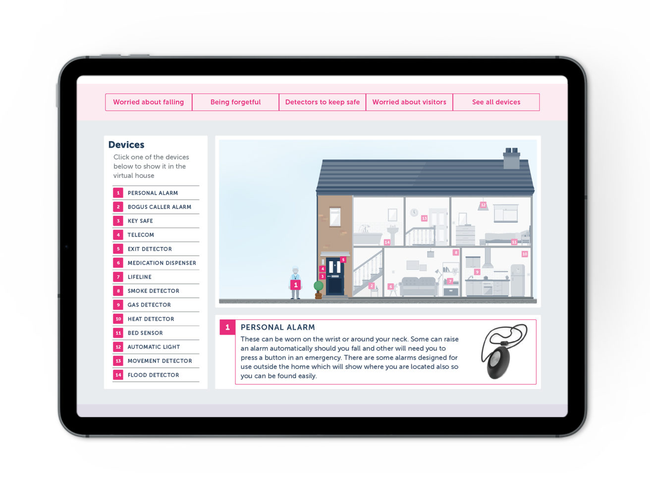
The new interactive tool was designed as a virtual house, placing products in situ, allowing the user to navigate through the content and understand how it will work in their own home. Working with a range of products from NRS and guidance on where they should be placed in the virtual environment, we began with the illustration and investigated how it would work with more detailed information. Testing and prototypes were key in understanding the usability, layout, hierarchy and filtering of content.
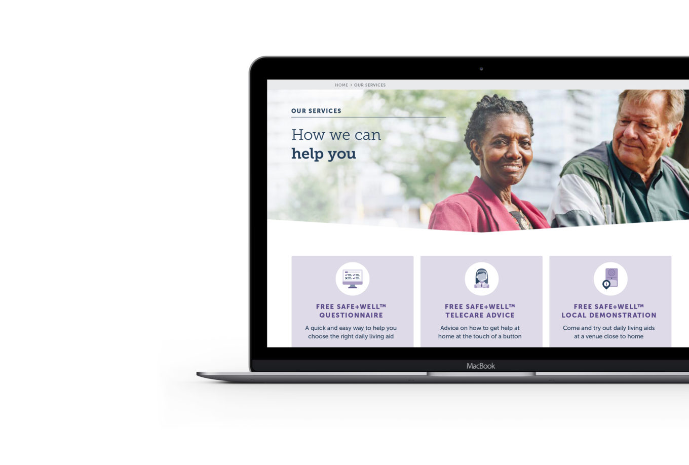
The new site design is more vibrant, open and bright. As well as improving current features, we added some engaging new ones, working again with NRS’ development partners. Three key improvements were:
- Navigational ‘breadcrumbs’ so the user could understand where they were on the site
- A more accessible range of forms
- The introduction of the virtual house, helping customers understand how NRS could help them continue to live independently; adding scenarios to filter products help to make the products relevant to real life situations.
