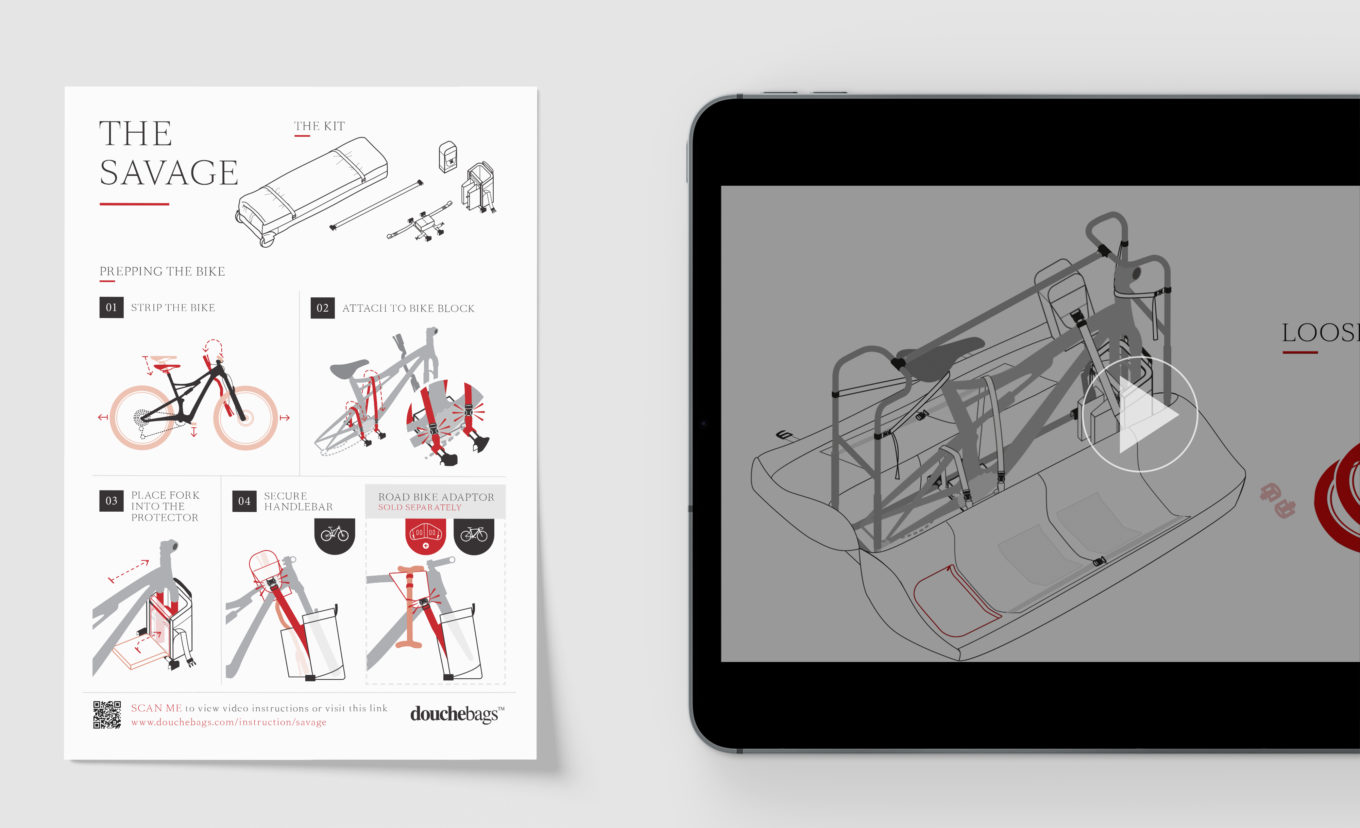
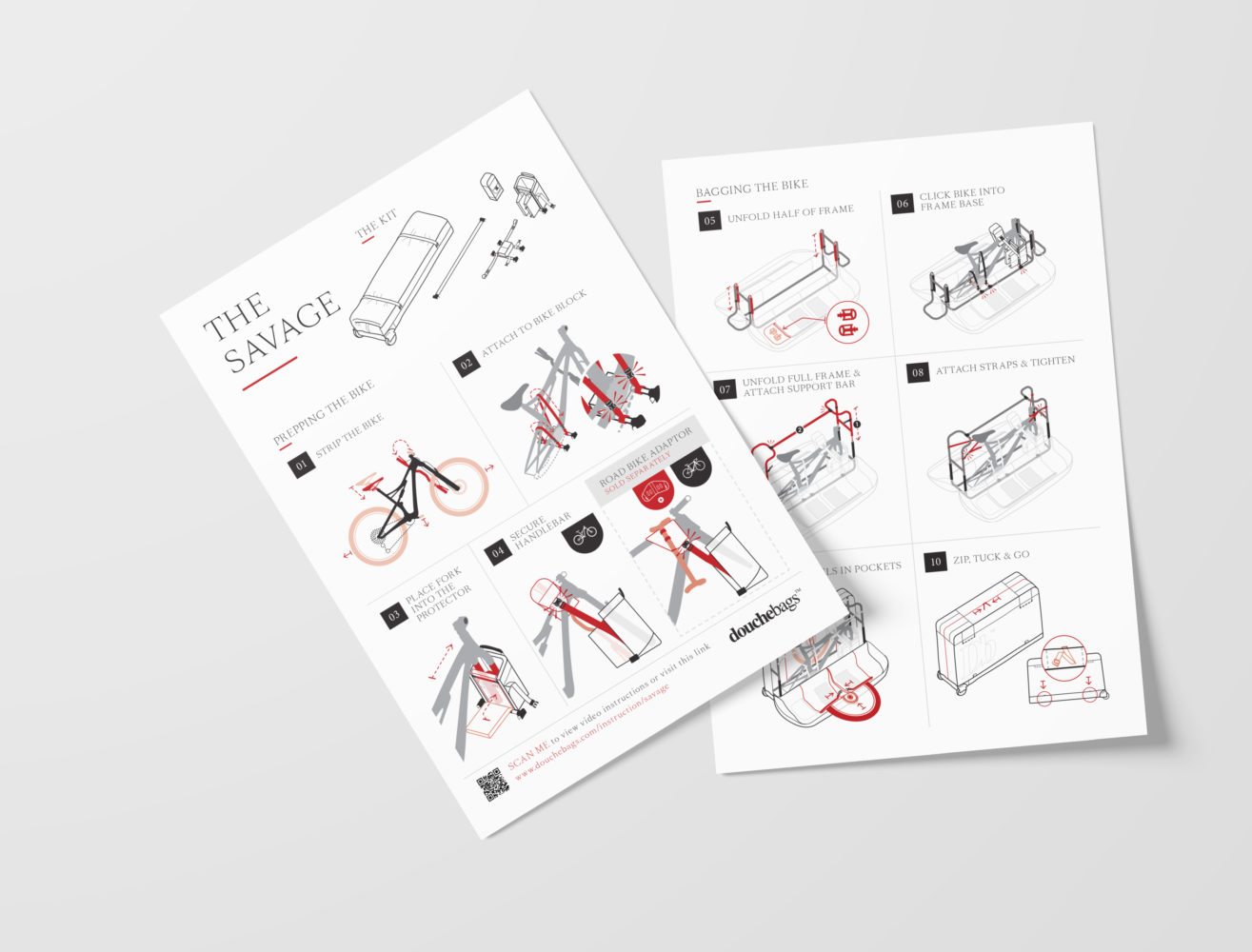
Douchebags (yes we love their name too!) asked us to create user instructions for their 'Savage' Bike Bag. The instructions needed to enable the customer to quickly and easily assemble their bag.

Douchebags (now rebranded as Db) is a company that strives to “make better journeys through smarter travel gear”. With its latest product, a flat packed bike bag integrated with roll cages, we helped their team with the instruction design so that their customer can worry less about packing and focus more on the biking!

Working closely with the team and their specialist manufacturing partners, we developed user scenarios to pinpoint the critical steps on the product assembly, plus the environment and the state of mind of the user when they interact with the product. We kept initial drafts as simple as possible (basic sketches, a collection of photos of simple written steps) to ensure we had full understanding of the process, the product and the users before refining the design detail.

For the instructions we developed a system of colours and illustration style (block and line styles) to highlight action areas. This allows the user to quickly identify where their focus needs to be. True to Douchebag’s established brand, we worked towards minimal worded instruction and created a snappy ten-step instruction guide.
After completing the project, we decided to produce an animated version of the instructions. Moving imagery helps to sympathise with the users, keep them engaged and immersed with the product.
