Continuing the TDL tradition, last month I attended both the Information Design Summer School and IIID VisionPlus Conference in Vienna, Austria! This amazing opportunity granted me the chance to learn from expert information designers, see historic collections at the MuseumsQuartier and connect with a wide range of researchers.
This blog will cover the activities of the summer school. It will focus in on what I learned, how I will implement it back at TDL and what I got up to during my spare time in Vienna!
Day 1 – Information design for text
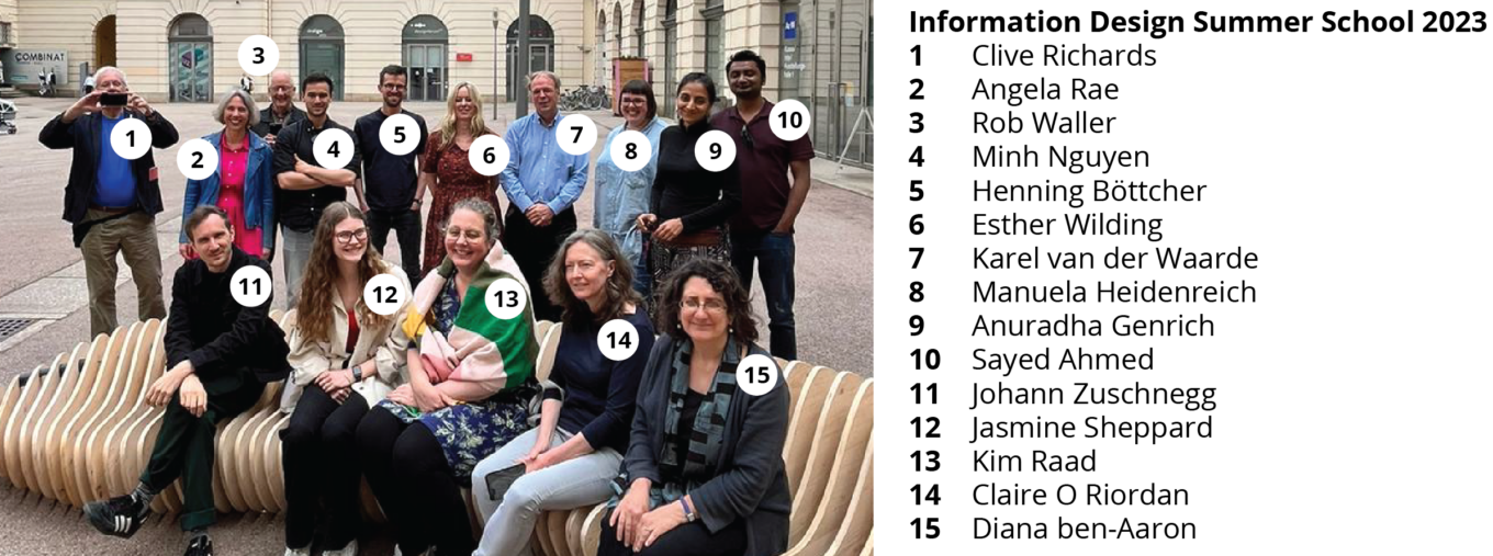
We started off the Summer School by introducing ourselves and showcasing examples of information design we had found prior. By critiquing these pieces of design right at the start, we got to meet each other while sharing a snapshot of our lives through the item we brought, as it tended to be related to that person’s career or hobbies.
Interestingly, there were a number of lawyers attending the Summer School to utilise information design within their law papers back home. Working alongside professionalsfrom a wide variety of disciplines was a major highlight of the school as they brought completely new concepts to the table and (the lawyers in particular) helped clarify the legal jargon in the MCC.
One of the biggest challenges of the brief was the translation of ‘legalese’ into ‘plain English’. Legalese is a more formalised sub-language used to achieve a consistent and complete meaning. This long form of text technically leaves nothing to chance as it explains every single relevant piece of text. But as we tried to understand it ourselves, we learned how overcomplicated it is for the general public. Some of the lawyers I met help to translate documents for clients in their day-to-day roles.
Below is an example from Rob Waller, the host of the Summer School, about a bus lane penalty charge where he made the information much more easy to understand simply by shortening the ‘complex text’ provided, and altering the layout.
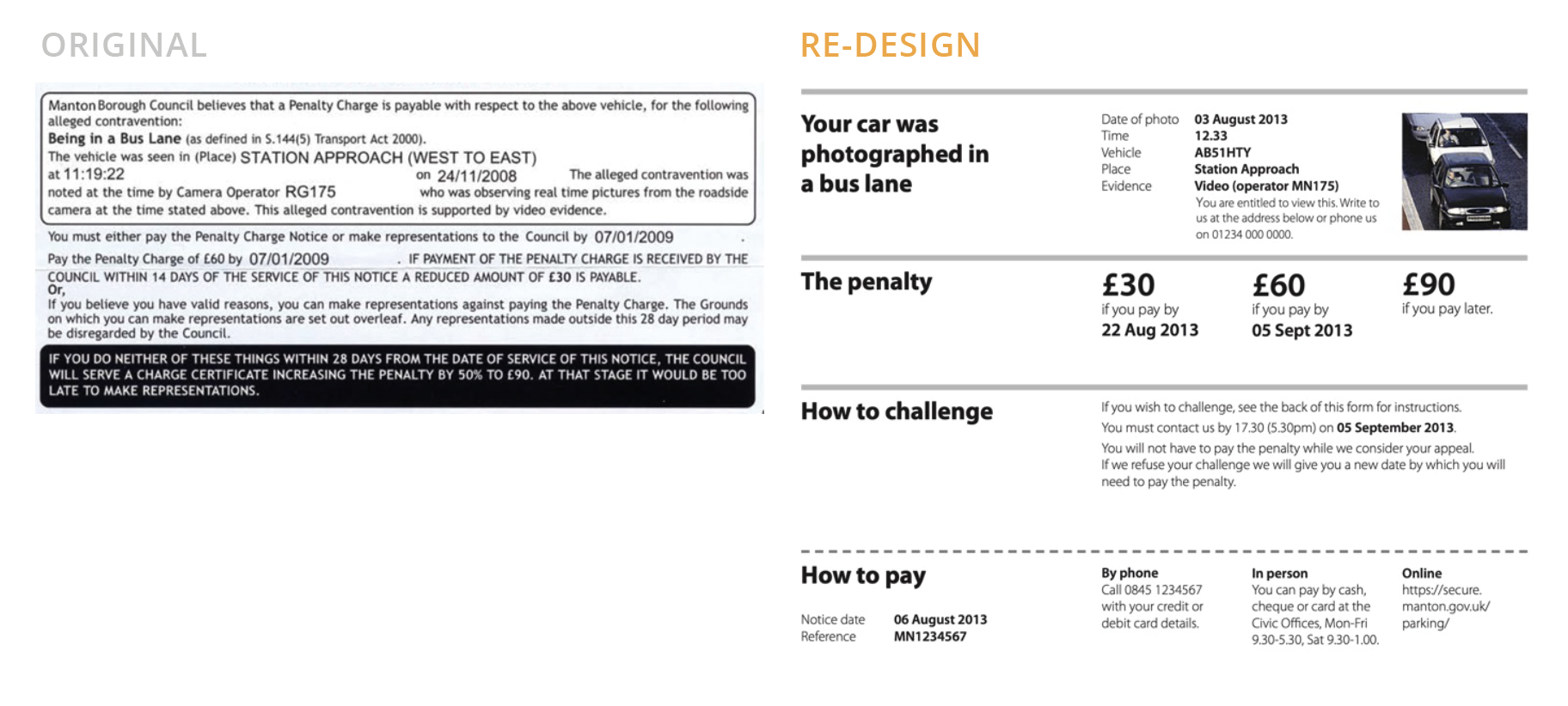
The original document expects the user to have the skills necessary to decipher what actions are needed. Whereas the re-design treats it more like a user guide that states why this happened and how to amend it. The key thing I learned from this example was how language should be simplified to reflect what it means to people using it, not all the terms and conditions of how the regulations work.
We attended two lectures from Rob Waller that discussed how he had made legal documents more usable for communities. A key lesson that stuck with me was the importance of creating a narrative through ‘sequences’. Narratives can be the overall story told through the design that users can follow. I can apply this to my work at TDL by utilising numbered guides and adding in keys that users can identify as sequences.
After these lectures, we were given the official Summer School design brief and separated into our groups. The brief was focused on relationships in the fashion world between large retail chains and the underpaid garment workers. We were given the Model Contract Clauses (MCC) from the American Bar Association that define the rules of cooperation between the buyer and supplier to maintain fair practice. Our task was to create visual communications that better translated the MCC to customers and the public.
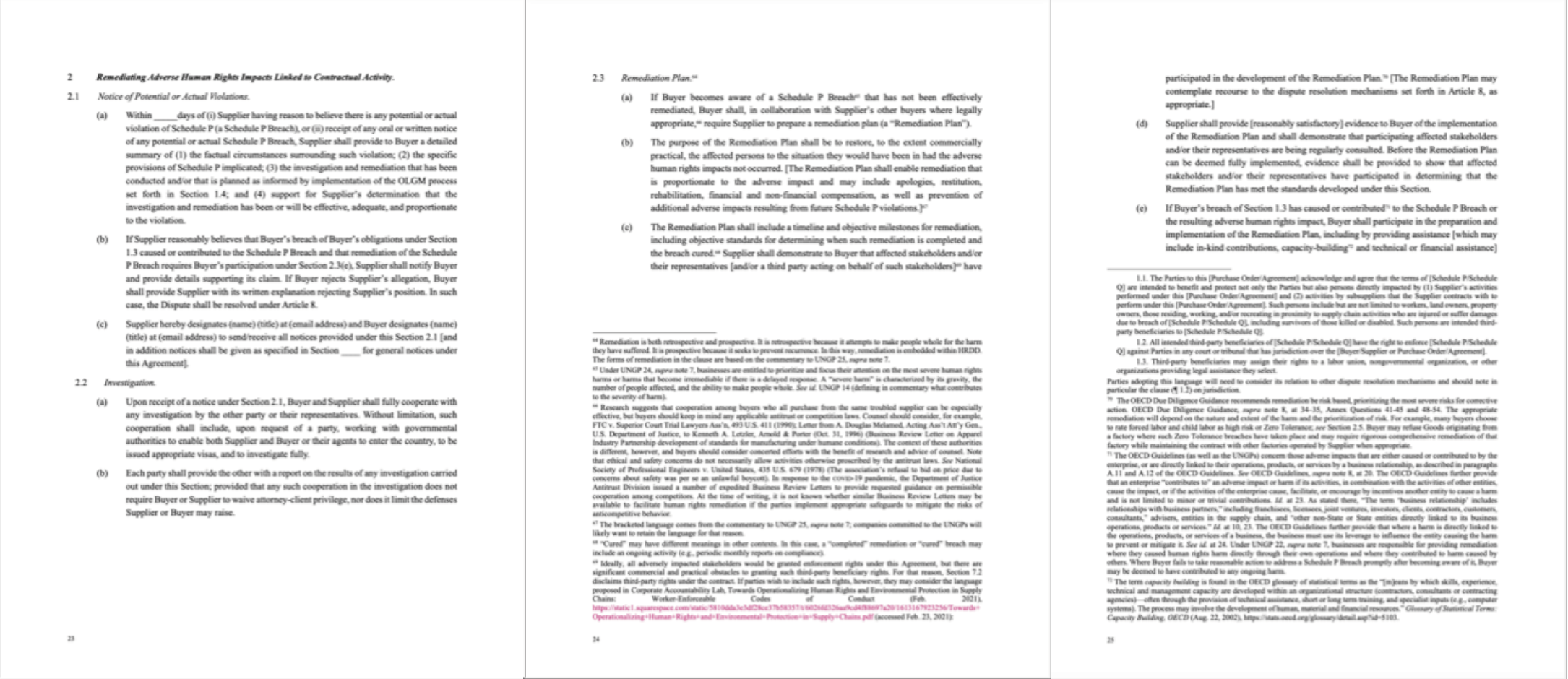
To kick-off the group project we ran a discovery phase where we discussed the implications of this MCC in real-world situations, what the clauses were asking of the clients and how we could help clarify the information. We used the first project meeting to identify group roles for each of us based upon our skillsets and interests. Then we started researching the topic of human rights violations in the fast fashion industry, and decided to redesign section 2 of the MCC titled ‘Remediating Adverse Human Rights Impacts Linked to Contractual Activity’. This section (pictured below) refers to an action plan that the buyers and sellers work through upon the notice of any potential human rights violations. We decided on this section because we wanted to help design an application that people in need could use instead of trying to decipher the 37-page document.
The most interesting conversations took place at the end of each day over dinner – this downtime helped to break the ice, and we chatted about the places people had come from (the furthest was Australia!) and how everyone had arrived at this stage in their career. Of course, as information designers, we couldn’t help but critique the stylish menus and sketch up complex letterforms on napkins.
Day 2 – Visual design
The second day focused on the visual aspects of information design, and started with an insightful lecture about the elements of diagramming. This outlined a technique for selecting what diagram to use based upon the type of information provided. Using this technique at the start of a project is good for building a database of how certain information types are best visualised – which can then be made consistent throughout. Much like the systems here at TDL. For example;

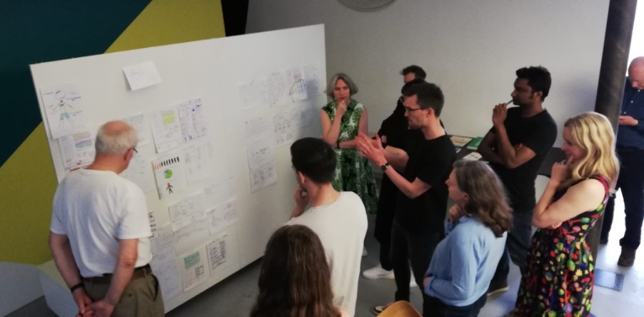
After the lecture, we completed an exercise drafting up medical statistics into clearer diagrams that could be displayed in a waiting room. This was useful as it encouraged us to use what we had just learned in order to highlight the types of information in the text, and then how best each category could be presented. The group crit (pictured below) was an excellent way to see everyone’s work and have any problems solved as a group. Thanks to the suggestions from the group I thought of a better way to present my poster!
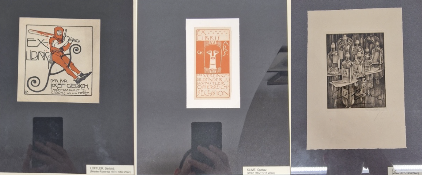
That evening we went to check out a local design historian’s collection of ‘Ex Libris’ – also known as a bookplate. These are decorative prints that would be pasted at the start of a book to indicate ownership. Traditionally, burin engravings were inked up and pressed onto paper which could then be pasted into the owner’s books. To this day there is still a thriving bookplate society who print and trade ‘Ex Libris’ in Vienna!
What impressed me most about the collection was the huge range of styles and how they had developed over the years – from emblems to highly detailed illustrations. It was interesting to hear discussions about what does and doesn’t count as a bookplate based on factors like printing material, size of the print and where it was pasted.
Day 3 – User Testing
We started the final day of the summer school with a guided tour of the Otto Neurath collection. Otto designed the first commercially successful infographics in the 1920s, enabling members of the public to interpret statistics that were usually written in complex pieces of text. This museum housed ISOTYPE projects he designed throughout his life – which was his attempt to create a universal picture language. He pioneered information design with his innovations, such as the use of hand pasted graphic symbols that he had printed with lino cut.
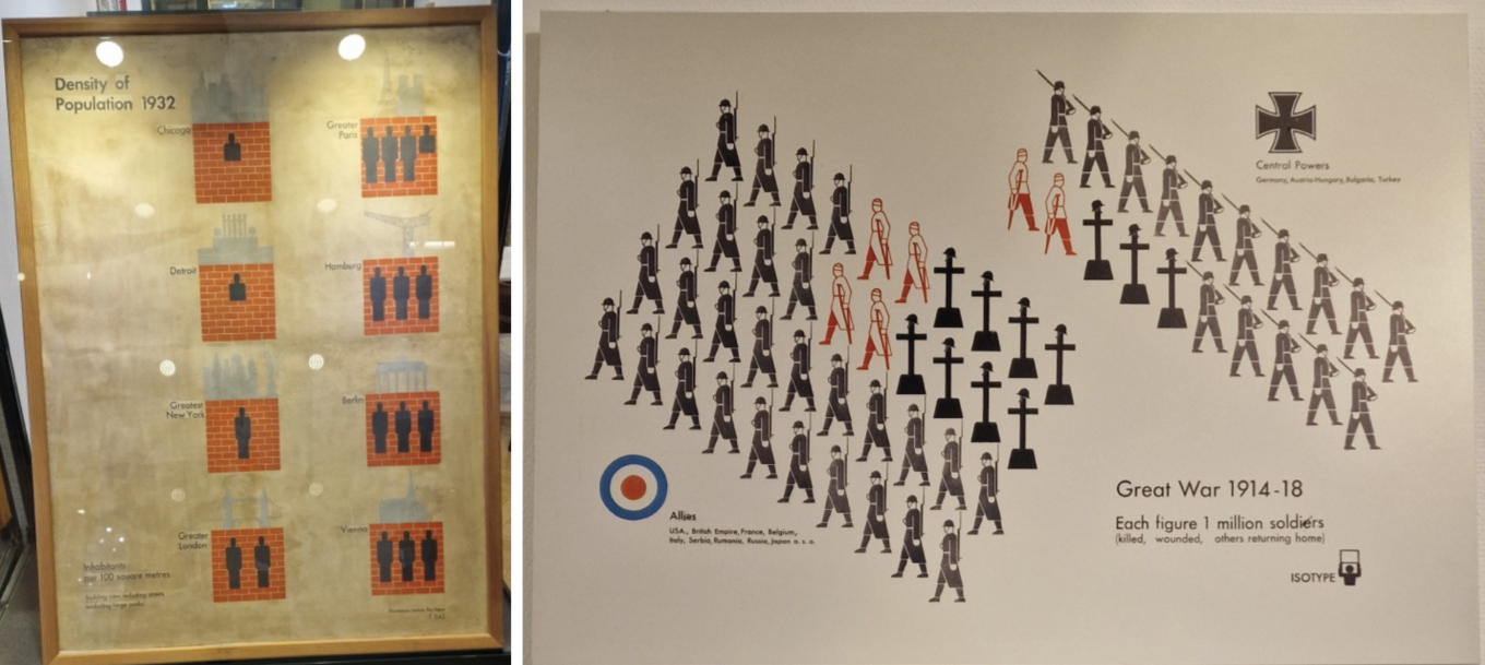
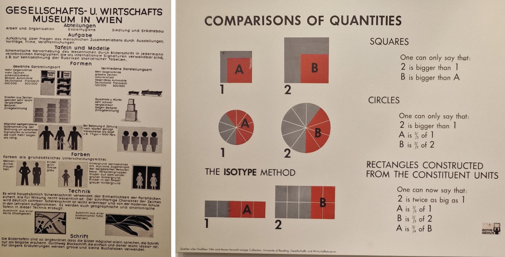
We also saw older examples of illustrated statistics dated from before Otto established ISOTYPE. It was interesting to see how much he minimalised the style and suggested rules that would define this pictorial language.
Our final workshop was all about utilising user testing on pieces of information design to highlight errors that real-life users of our designs would encounter. For the workshop, we were tasked with finding answers to questions about a medicine leaflet. Errors like not being able to easilyfind the maximum dosage amount showed the potential danger for users. I was asked to read out the medical testing consent form and then try to summarise what they had asked for; this was a struggle as it was written in legalese and used medical terms that the general public wouldn’t understand.
We had a group discussion to chat about how to improve the design with larger text, plain language, clear compositions and illustrations to depict how to take the medicine. Legally all this information must be presented but it does not account for the average reading age being that of a high school student. Many plain language groups are rallying to have medical text updated so users can better apply medicines – which benefits all parties! This workshop was exciting and reminded me of the importance of taking a step back to test the usability of designs.
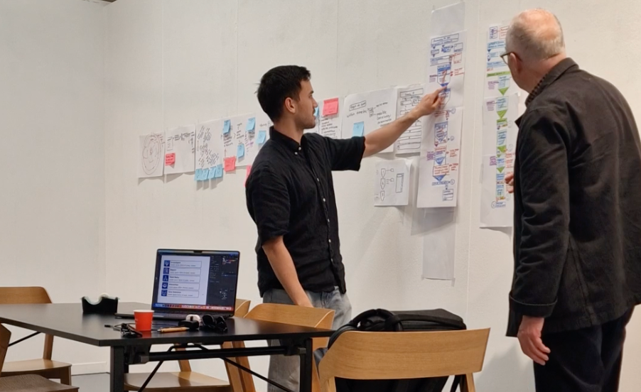
We then presented our finished group project, where we had transformed a long chapter of legal text into an easy-to-follow flow chart. Having three days of summer school rather than five meant that we were only able to get to the visual sketch iteration of the design process. If fully developed, we planned for it to be an interactive web application for business owners to click through. This flow chart would present how possible actions affect the maintenance of human rights for both workers and buyers involved in fast fashion.
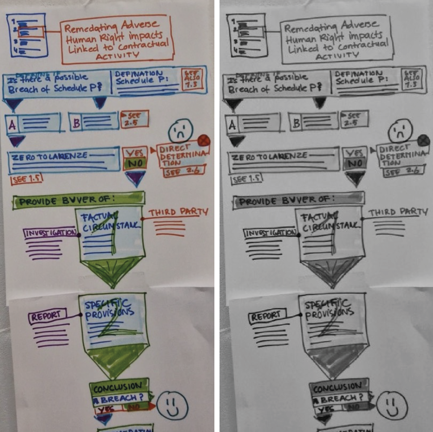
We made sure to include Call-To-Action (CTA) buttons that could help users navigate to the information they needed (like the ‘See 2.5’ button). Another consideration was accessibility – we considered how it would look for users with visual impairments who rely on different shades of colour to create contrast. Illustration also played an important part, as our group all wanted to create a narrative for users to experience as they clicked through. In this draft we included smiley faces as placeholders, but if had developed further we planned to use Johann’s illustrative skills to create visual representations of the key steps.
Reflections
Everybody at the Summer School was a pleasure to work with and brought their own unique flare to the projects. Students came from all over the world which gave the class a refreshingly diverse feel as we bonded over creating universally understood designs.
It was exciting to work as a team with so many different experiences and skillsets (yet none of us had experience with legal text!). The group dynamics helped me to develop leadership skills such as assigning tasks, keeping to the timeframe, prompting the best work out of my teammates and leading discussions. Being in-person highly benefited our ability to collaborate as we could gauge responses and be inspired by the other group members working hard. Thank you to my brilliant team members Kim, Sayed and Johann – it was a pleasure!
The Summer School project showed me that there’s so many different facets of information design, and highlighted the importance of pursuing projects that can help bring about real change. This has given me a new burst of inspiration and a host of information design teaching to bring back to what I do at TDL!