Even when we take time off for holidays we never stop looking out for interesting design that could inspire the team.
It can be anything from bus timetables to street art; we always have our cameras at the ready to capture what we see. When we are back from a trip we share what we have seen in one of our weekly hubbles. We thought it was about time we shared some of this with you!
Where the TDL team have seen and appreciated design
America
California
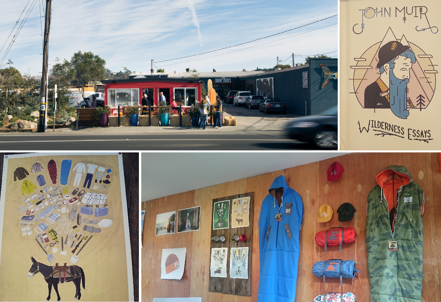
Whilst Sammi was in California she took a trip to the Muir Woods to see some giant trees, but she also stumbled across some lovely illustrations. When changing buses in Mill Valley she went into a little coffee shop (Equator at Prooflab) that had a cool display of products from the surf shop it was partnered with. The exploded illustrations of what is packed into a campers bag could be adapted and used in all kinds of contexts from waste management to construction. Sammi also saw a nice book cover in the gift shop, which she thought could make an interesting icon style.
New York
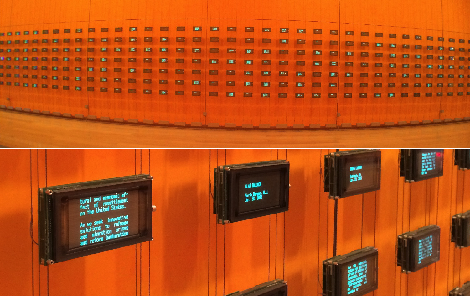
Only last month Ryan was enjoying a break in the Big Apple when he popped into The New York Times foyer. What he saw was a great installation covering the walls. Moveable Type (2007) by Mark Hansen and Ben Rubin is an active portrait of The New York Times. The artists have programmed the work to extract real-time and archived news from a vast database.
Spain
Andalucía
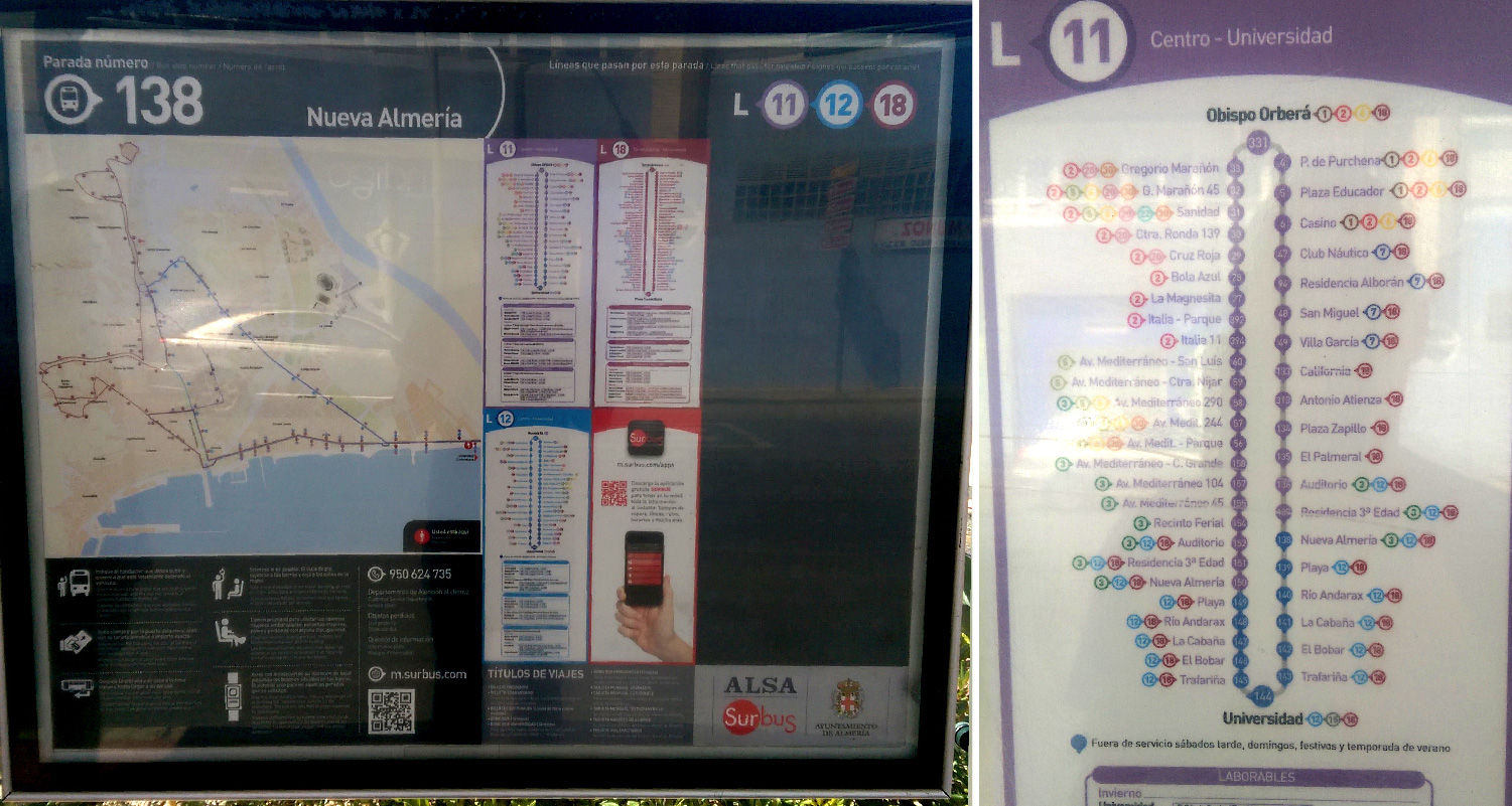
When Dave was in Spain he photographed these bus routes. He thought having a simple diagram showing the route and its connections, alongside a traditional map view, made it easy to work out where you were going and when.
Barcelona
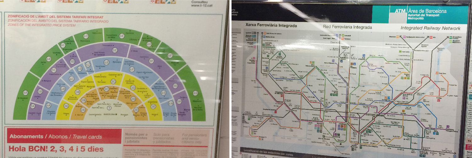
On a recent holiday to Barcelona, Craig took some snaps of maps he found interesting. The photo below on the right is of the Metro map; they have adopted a similar style to our London Tube map but the routes seem to be more organic as they grow inland from the seafront.
Craig also liked this graphic showing where places lie in the different travel zones and how this relates to pricing.
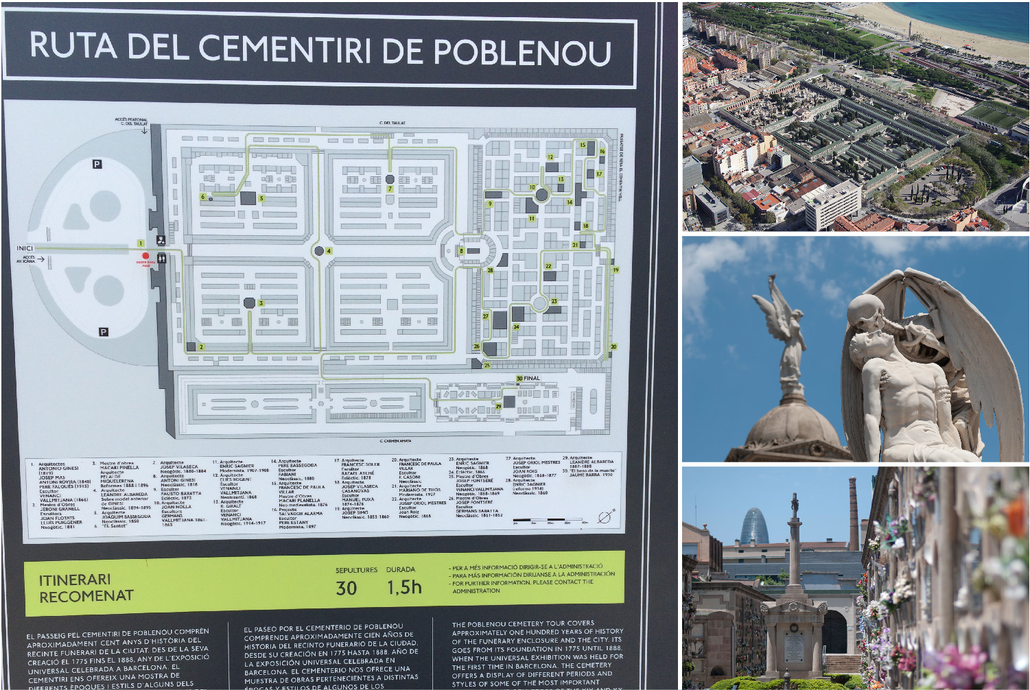
Craig’s final highlight from Barcelona – A Map of the Poblenou cemetery. He liked the use of muted colours, which matched the tranquility and peacefulness of the place. The use of capital letters throughout, perhaps a nod to the engravings in the cemetery, were also very clear. The green route on the map also highlights a notable graves walking route – weird!
Japan
Tokyo
Ryan was intrigued by these timetables he saw whilst getting around Tokyo. They use an interesting layout that we hadn’t seen before with the weekday and weekend times sharing the hours at centre with the minutes growing out on either side.
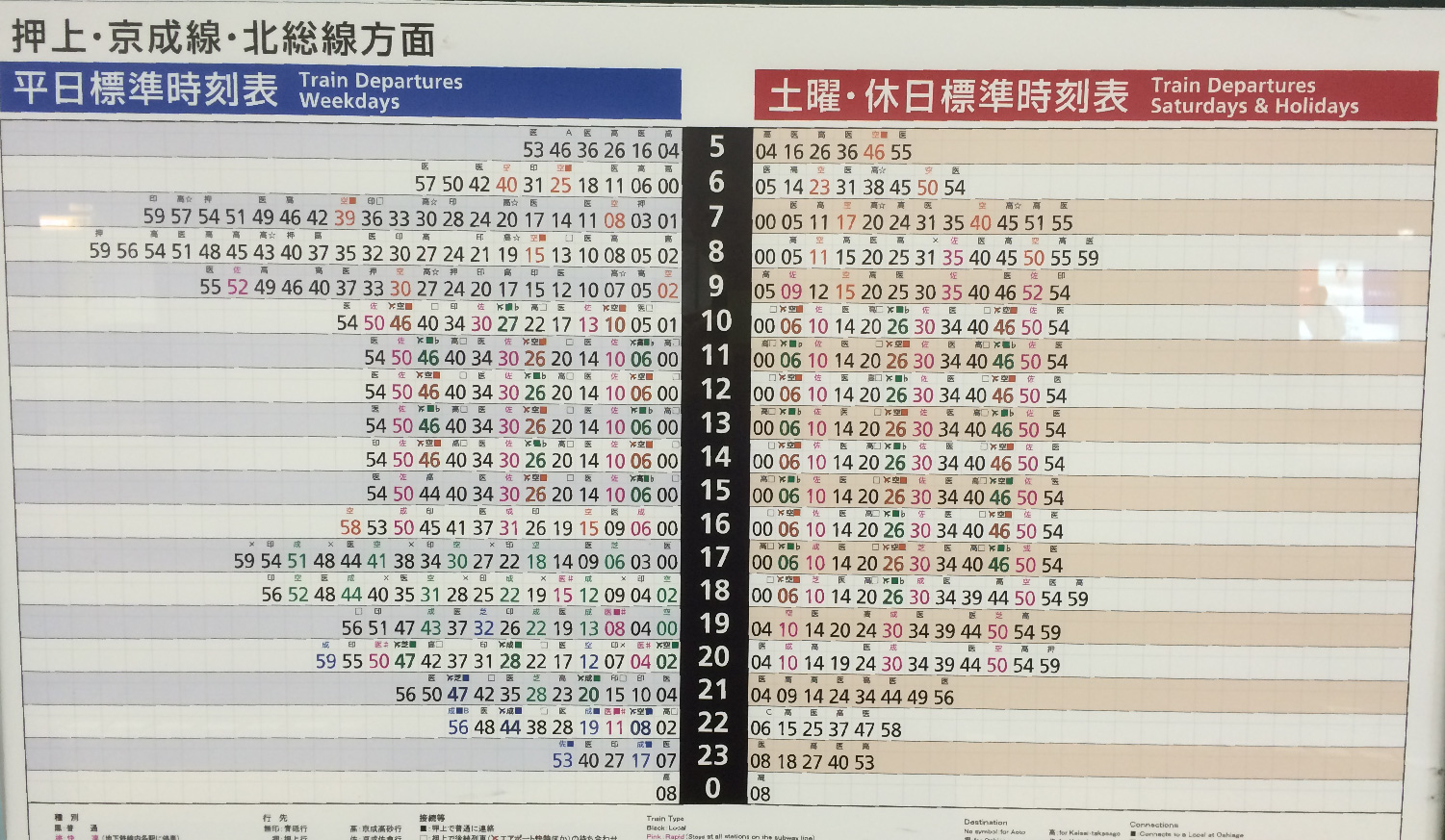
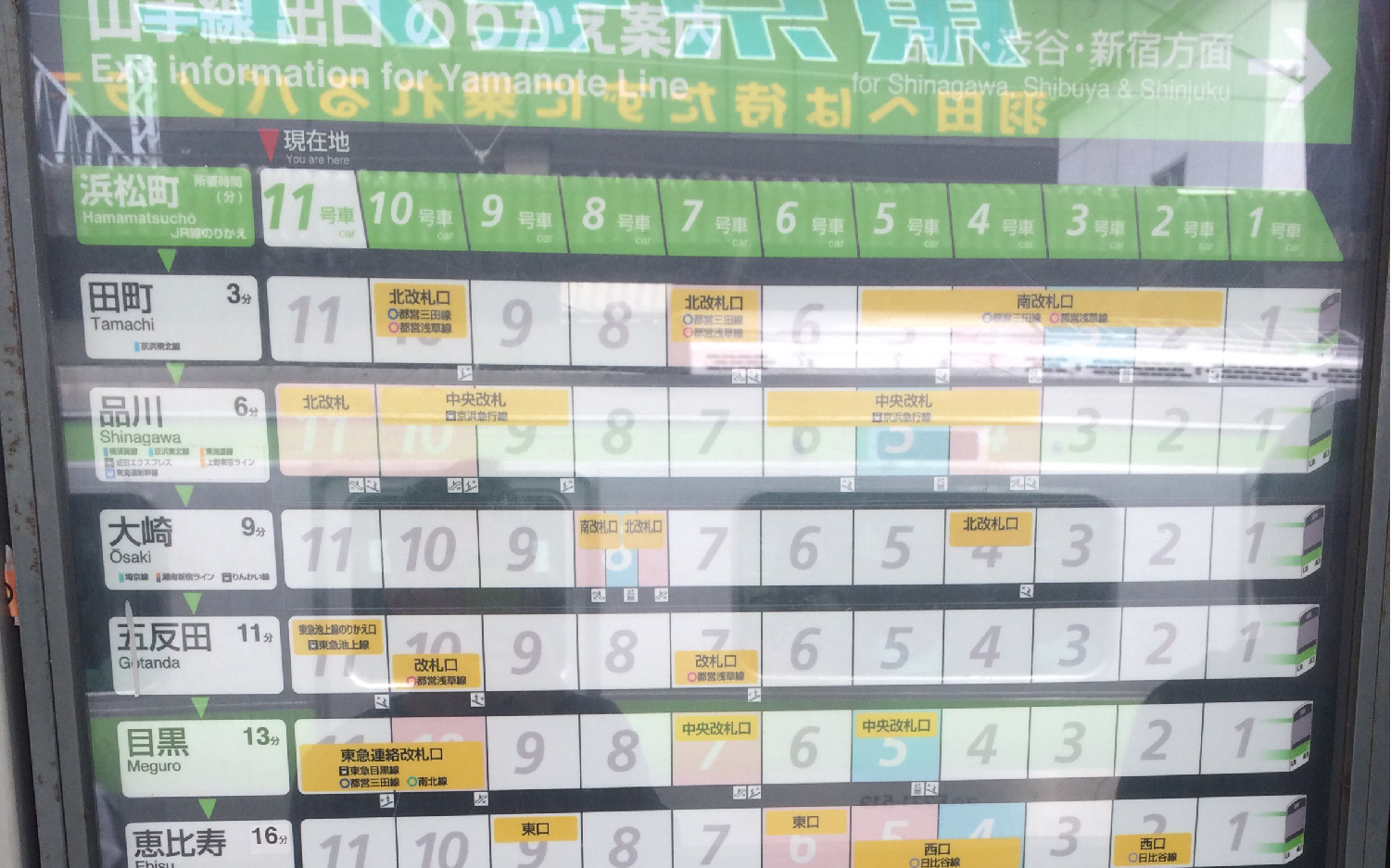
The photo below is a graphic that shows which carriages are best for connections and exits. Ryan also liked the illustrated train fronts that help give context to the graphic.