Eurovision has been a staple in television pop culture for seven decades now, and the time has finally come to tune in again with the competition final broadcasting this weekend. I, Robin Smith, a devoted Eurovision enthusiast since childhood, sought to create an encompassing, all-you-need-to-know guide on its winning performances (and those that were not quite so successful…) for fellow die-hard fans.
Click on the image to open up a high-res PDF.
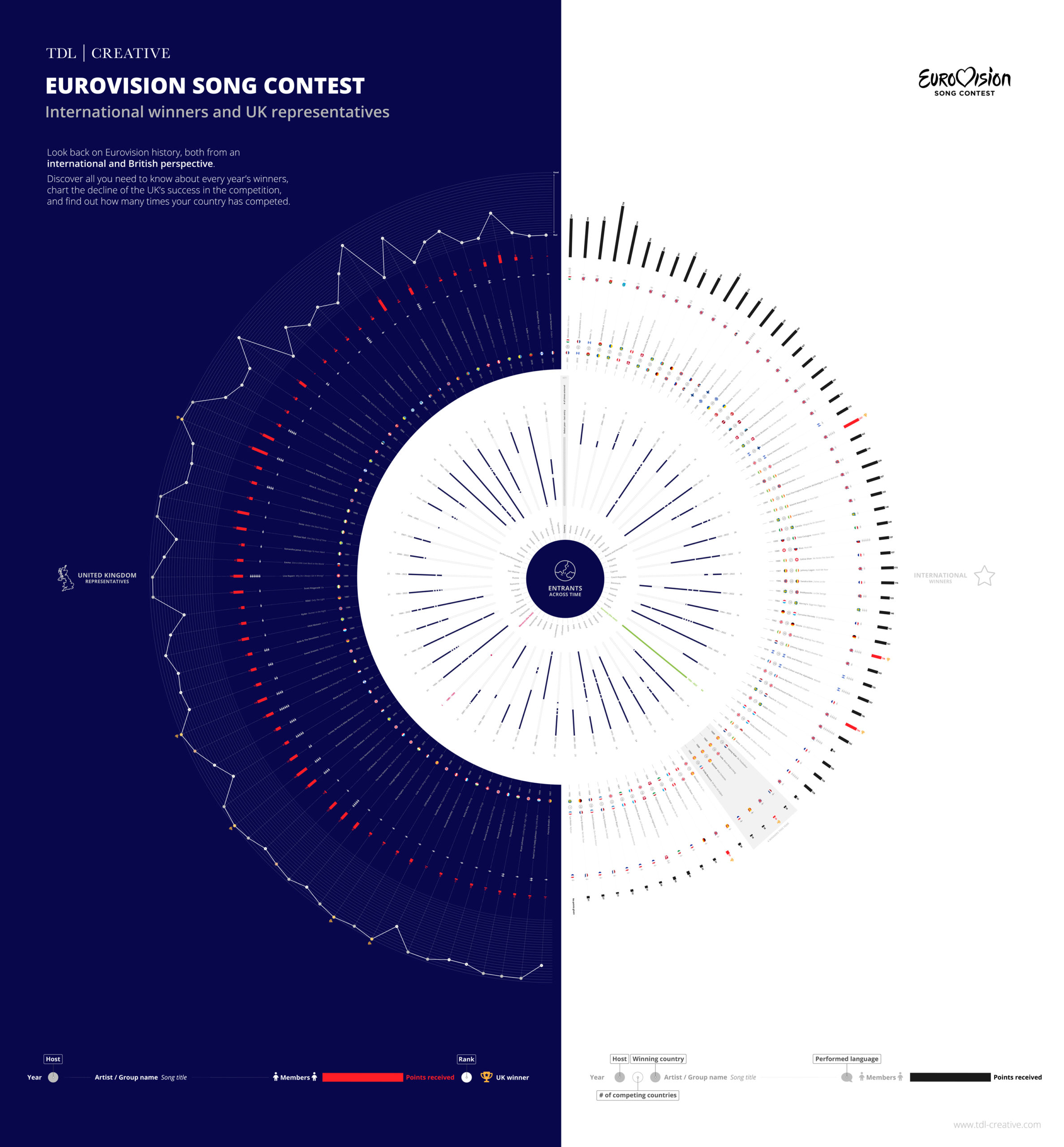
The diagram
In true Information Is Beautiful fashion, the aim was to portray as much information about the participants as possible in a digestible but visually enticing fashion, but also be accessible enough to seek specific answers depending on the goal of the user.
The right side encompasses everything to do with the winners since 1956 – Eurovision’s big debut. Find out everything you need to know about the winners such as; who they are, where they are from, what song they sang and in which language was it performed, how many points they achieved – and who hosted the competition. To bring further perspective as to which countries value this time of the year the most, you can also track how many times each has entered the competition since its conception in the centre.
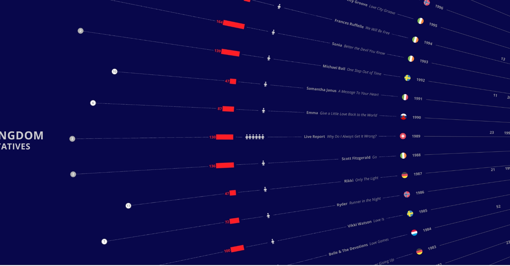
The project started by looking only from an international perspective, but later developed into also taking an in-depth look at, in recent years the most notorious losers – representatives of the United Kingdom. With the outer ring forming a timeline of our ranking, you can track our fall from grace and pinpoint exactly where it all went pear-shaped for us.
The concept
Visuals: Sticking within the musical theme, the circular arrangement not only visually represents a progression of time but also creates the overall illusion of a vinyl record. The navy colour separates the two narratives – that of international and United Kingdom-specific perspectives – but was chosen as a nod to the most common colour utilised heavily in Eurovision’s various branding schemes.
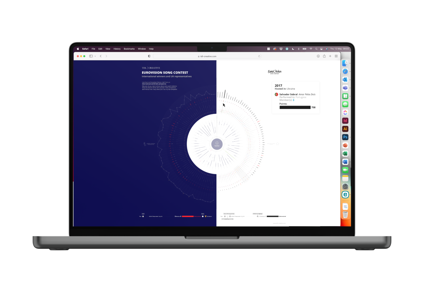
Filtering information: To develop this further and aid users, the diagram would be made interactive to isolate information. Users could rollover the specific performance they wish to find out more about, which would then highlight and reveal the information in a much larger pull out box – removing the need to zoom.
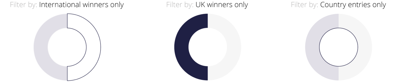
Taking this idea further, for those looking to seek specific information, filters would be introduced to highlight and group relevant sections – shuffling them to the top for easy comparison.
Filtered results shuffle to the top, and appear in a highlighted section. Unrelated sections grey into the background.
Similarly users would be able to view only one of the three narratives to focus on a single timeline, the hidden sections greying into the background as when rolling over a single performance.
Conclusion
Hopefully this has kickstarted a video binge of all your favourite performances to get you ready for tomorrow, but here are a few iconic songs that did not make it to the winning spot to get you started:
https://www.youtube.com/watch?v=1m0VEAfLV4E
If you enjoyed reading this blog post then you may enjoy our newsletter; TDL Quarterly! We will send you information on our team, latest projects and exciting initiatives every 3 months. You can sign up by clicking this link.