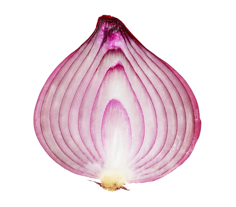
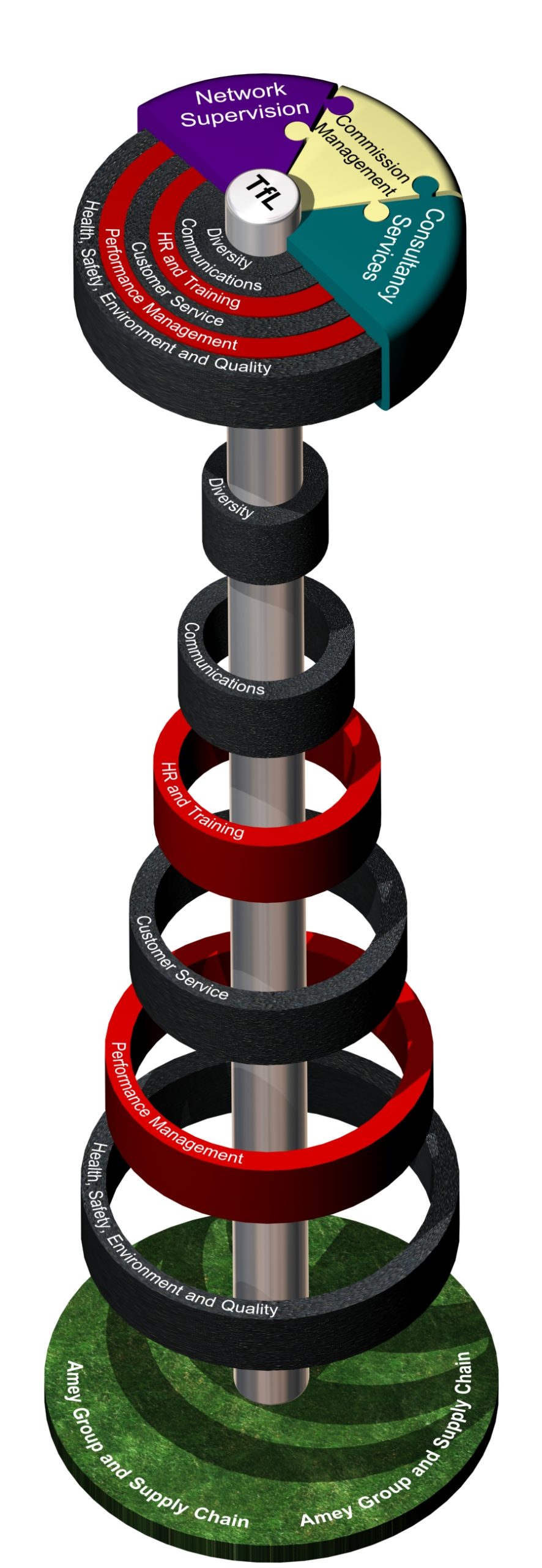
When Oliver Tomlinson (TDL CEO and Founder) worked as Senior Graphic Designer within Amey’s central bidding unit, he designed the ‘Onion’. He hadn't started off thinking he was going to design an onion, but that’s what it was called, and it’s something he and the rest of the TDL team often aim to recreate in bids years later.

What is a ‘Hero’ graphic?
We now call them ‘Hero Graphics’, but essentially it’s a graphic that explains a key element of a concept, service delivery, or target operating model; with the very best ones being christened with names according to their appearance or function. We believe the name is a key point in readers associating with the concept, and remembering the information it portrays. Along with the ‘onion’, Oliver has created Hero graphics such as the ‘kipper’, ‘dart board’, ‘jukebox’ and ‘revolver’, to name but a few!

The graphic you can see in this post was created in 2007 using a 3D tool called 3D Studio Max. Amey were bidding to run an area of red routes in London and this graphic was a key element within the bid, not only linking to the topic visually (see the red route and tarmac texture), but highlighting the most important themes and features to TfL who were placed at the diagram core. These diagram parts could almost be imagined moving and evolving, and were used as components in other sections of the bid to tie back to this hero.
Hero graphics sit in a diagram category to themselves, and can act as a navigation aid through a document, as well as multilevel explanatory tools, by drilling down into various parts of the diagram. Other diagram categories may include the following, and all of them could germinate into a Hero if designed in the right way:
- Data (evidence) e.g. Graphs & pie charts
- Flows, journeys or processes
- Physical explanations e.g. CAD drawings
- Tables
How to make one
- Think of it as a 3D product – an object – something a reader can imagine picking up or interacting with
- It could be a ‘machine’ with a clear in and out, providing a step-by-step flow for the reader to follow
- Break the concept down into its component parts
- Provide the reader with layers of information to drill down into
- It is a representation of a process or idea, demonstrating linkages and giving the intangible a tangible appearance
- Quite often it will be a collaboration of discrete elements e.g. people, place, process, ethos, communication
- It can be built from graphical lines and shapes that communicate; or promote an association by placement of the elements
- Hero graphics work best with words and graphic elements in harmony with each other
What they can do
- Intuitive navigation through a document or concept (by splitting into elements)
- Promote reader memory by theme, analogy and association
- Provide something to be built upon, built up and adapted
Where they can be used
- Bid stage – introduction
- Presentations – as an aid to explain
- Post bid – to adapt
In summary
By creating an overarching Hero graphic, you will have a visual that breaks down complex information into an understandable concept; and if readers start giving it a name, you’ll also have something that is remembered for a long time!
If you’re struggling to create your own Hero graphic, why not give the TDL Creative team a call – they love a challenge!