Property brochures are often composed from a variety of different design elements. For this blog we have gone through numerous property brochures designed by others, that we feel deliver on high quality design and use of information design thinking, and highlighted a few of the approaches we like in particular.
Branding
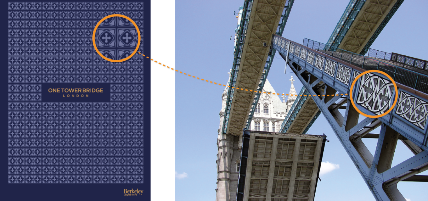
These documents are usually branded in a way that reflects either the construction or history of the property within, or the surrounding area of significance. A fantastic example is Berkeley’s One Tower Bridge development brochure, which uses details from Tower Bridge façade to create an elegant pattern and identity for the development brand.
Geography
Once the property is introduced, we usually see the document move into an area that discusses the geography surrounding the development. Such discussions often take place in 3 scales: the immediate surrounding streets, the neighbourhood and the connections to key destinations. There are various ways of showing this in the examples we looked at, from maps outlining the immediate proximity of the property and the local amenities, to schematic timelines to show travelling routes. To help visualise the neighbourhood, a combination of annotated aerial photographs and 3D elements are often used to put the property into perspective in relation to surrounding landmarks.
Of all of the maps we looked at, we find that the more successful ones show a right balance of information that the readers want to know. The filtration and de-cluttering help to avoid information-overloads – with maps it is often the case that less is more.
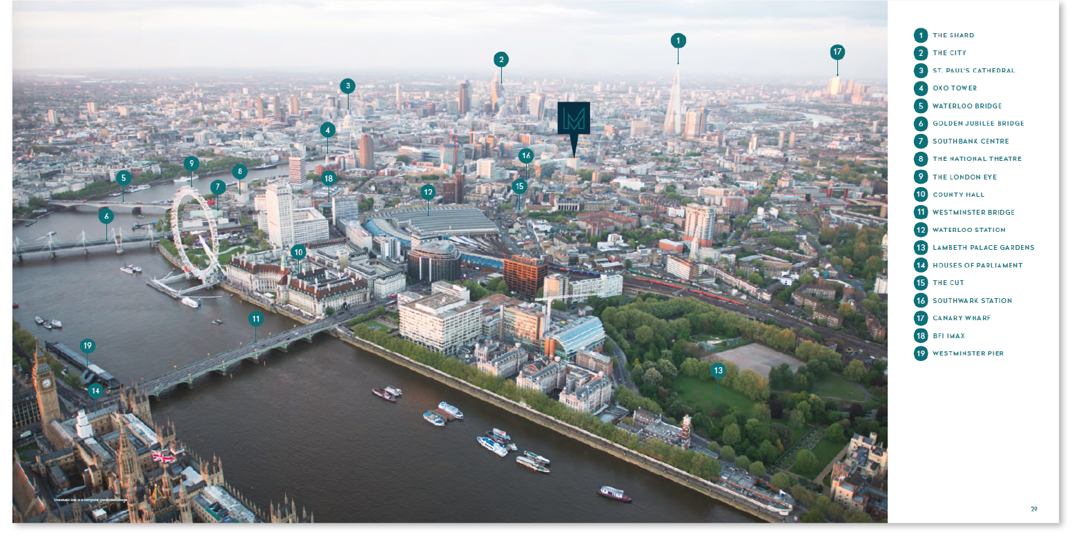
The Music Box brochure is a great example using an annotated aerial photograph accompanied with a key. A reader can easily visualise the neighbourhood and spot London landmarks in the same image as the property itself, thus getting a real sense of how it sits within the city. Aerial photos work best in cities and built up locations with recognisable skylines.
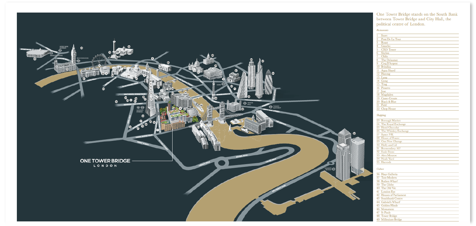
We also find the illustrated 3D representation of the surrounding area of One Tower Bridge effective and unique. Instead of showing every structure like a photograph, only key landmarks are illustrated and annotated to ensure an efficient understanding of the neighbourhood. By keeping the roads and river minimalistic, it allows the reader to remain focussed on the landmarks.
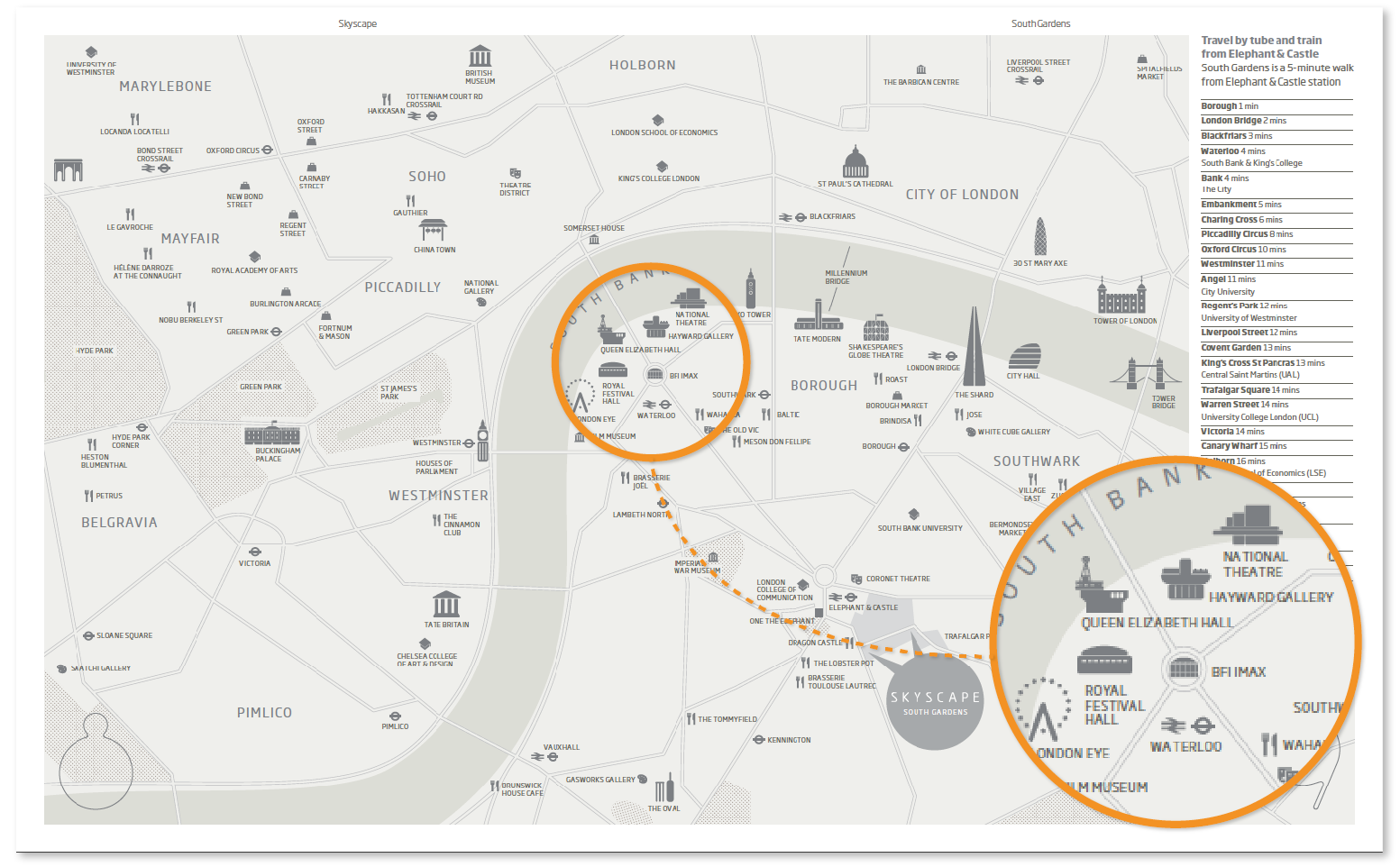
A more traditional 2D map can also show the same information and in some respects makes it even easier to understand and follow. The SkyScape (Elephant Park) brochure has a very elegant monochrome map, with similar features to that of the illustration above, this time using icons of landmarks to show the surroundings, and again, a basic road and river layout.
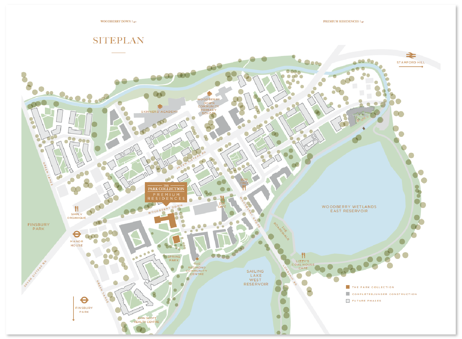
Maps are versatile in the sense they can inform at different levels of scale, such as the site plan of the Woodberry Down community. It is wonderfully illustrated in a very defined style, showing a balanced level of information in a well differentiated style. The use of colour, transparency and a clear label-key system makes this map easy to navigate through and comprehend.
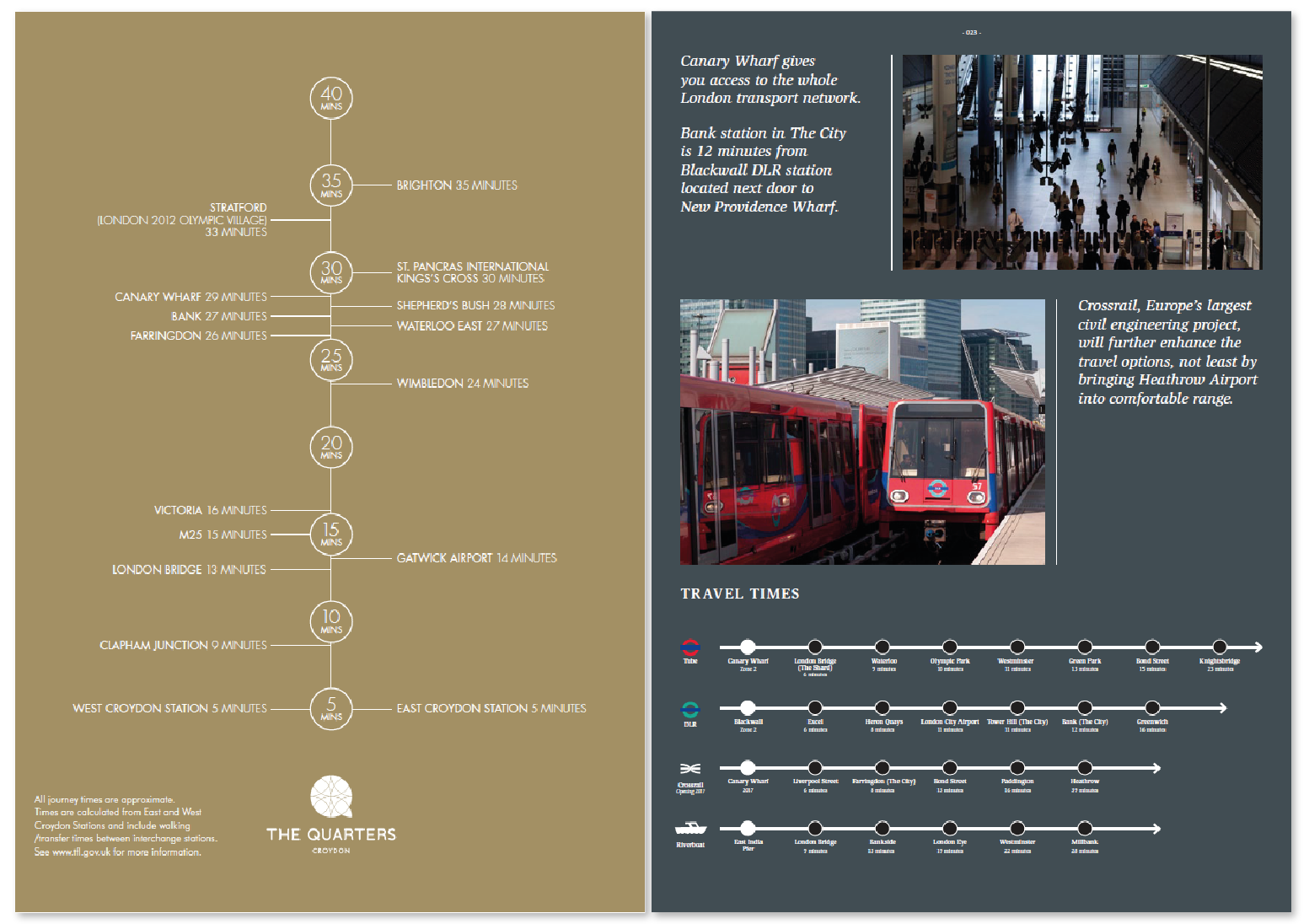
Where maps excel in showing surrounding areas and amenities, schematic representations tend to make travel times and distances easier to understand. Many property brochures use a ‘line with markers’ style approach to show travelling times to different areas. But what we like about the one used in The Quarters (above left) is its use of time as division rather than physical destinations. This takes the ambiguity away as a result – for example the ‘tube line’ shown in the Providence Tower (above right) may mislead the readers into believing that the locations shown are part of a running tube line (e.g. the Olympic Park stop is after Waterloo on a tube line). When dealing with information such as distance / travel time, the chosen style of presentation must be clear and unambiguous.
Imagery
Once the geographical specifications have been outlined in the brochures, these documents then tend to move into showcasing fantastic imagery of the properties, through photography or visualisations.
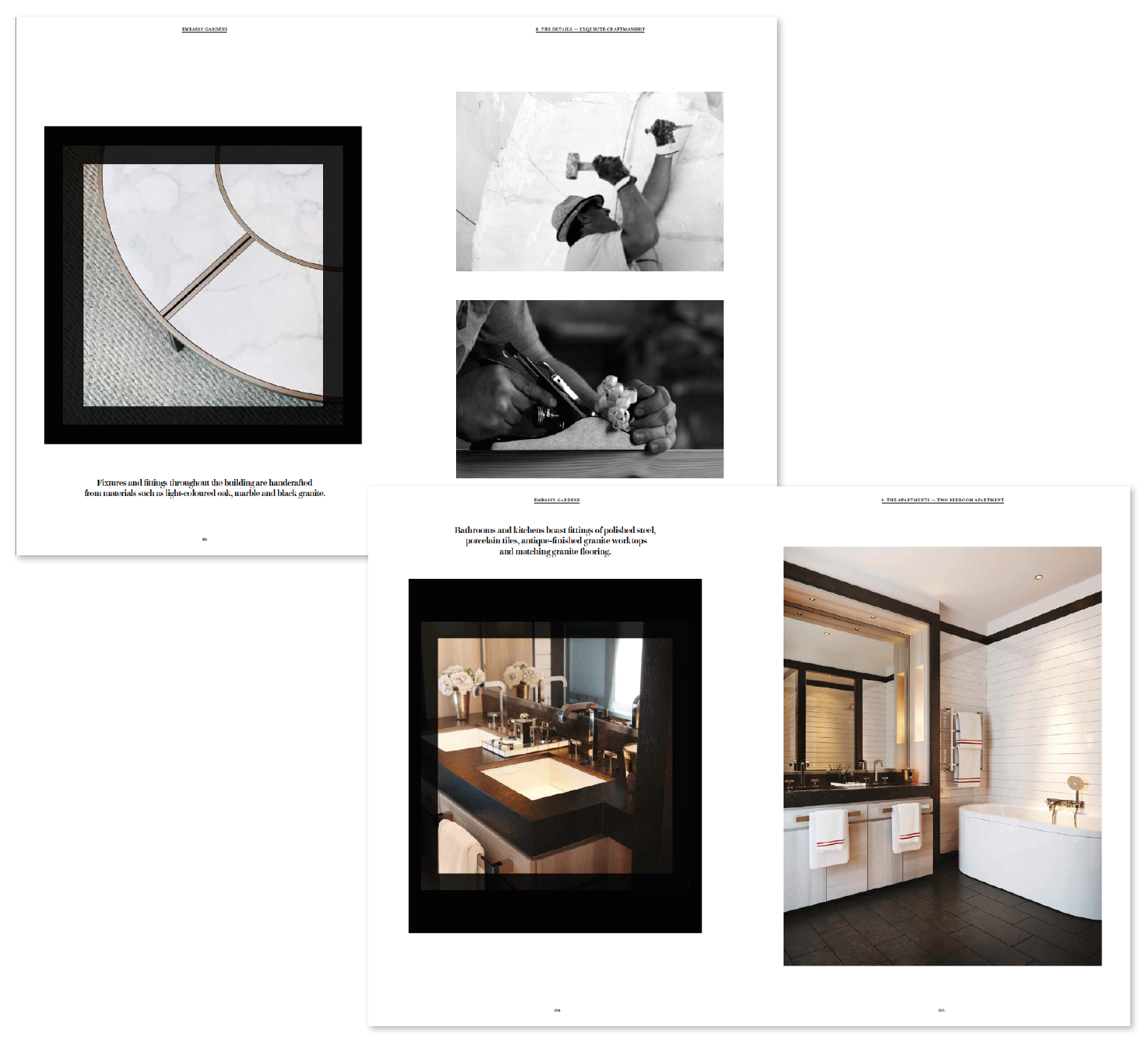
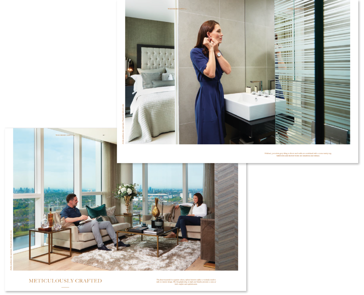
The luxurious Embassy Garden brochure uses stunning photography with great compositional shots, which works particularly well in setting a visual expectation of the rooms, fixtures and fittings – a picture is definitely worth a thousand word in situations like this. We also find that imagery with people interacting within the environment like the example below, gives a more realistic and homely feel that can help the readers to visualise living within these properties and the style of living – providing a visual story.
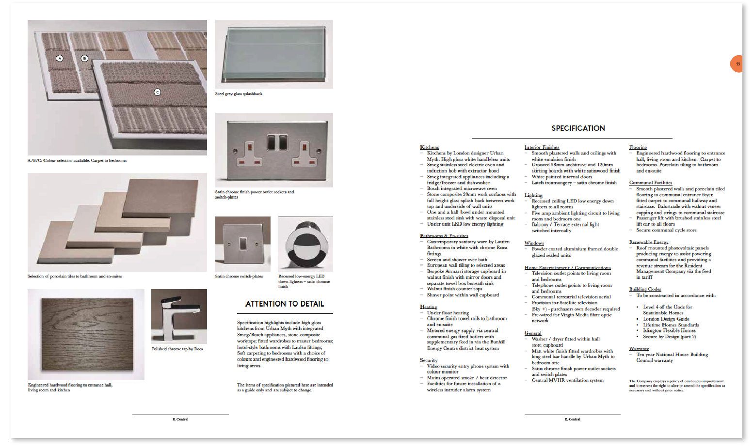
Of the brochures that summarise the finish specifications as an index, we find the ones that integrate images (almost like a gallery) work better from an information design point of view. This is because everything is together on one page, and thus allows for a more efficient navigation without flicking through pages back and forth. This brochure from East Central is an example of a listed index-style page, with the use of images to bring words to life and help to explain any specialised terms. However a table format may allow for an easy comparison.
Site layout and floor plans
Once the internal specifications are discussed, we come to the backend of the document that holds the more technical information like dimensions, site layouts and floor plans. Some of the finest documents we saw handled this large amount of information in a carefully considered manner, by connecting the information together to build a succinct and concise picture of the property at a glance.
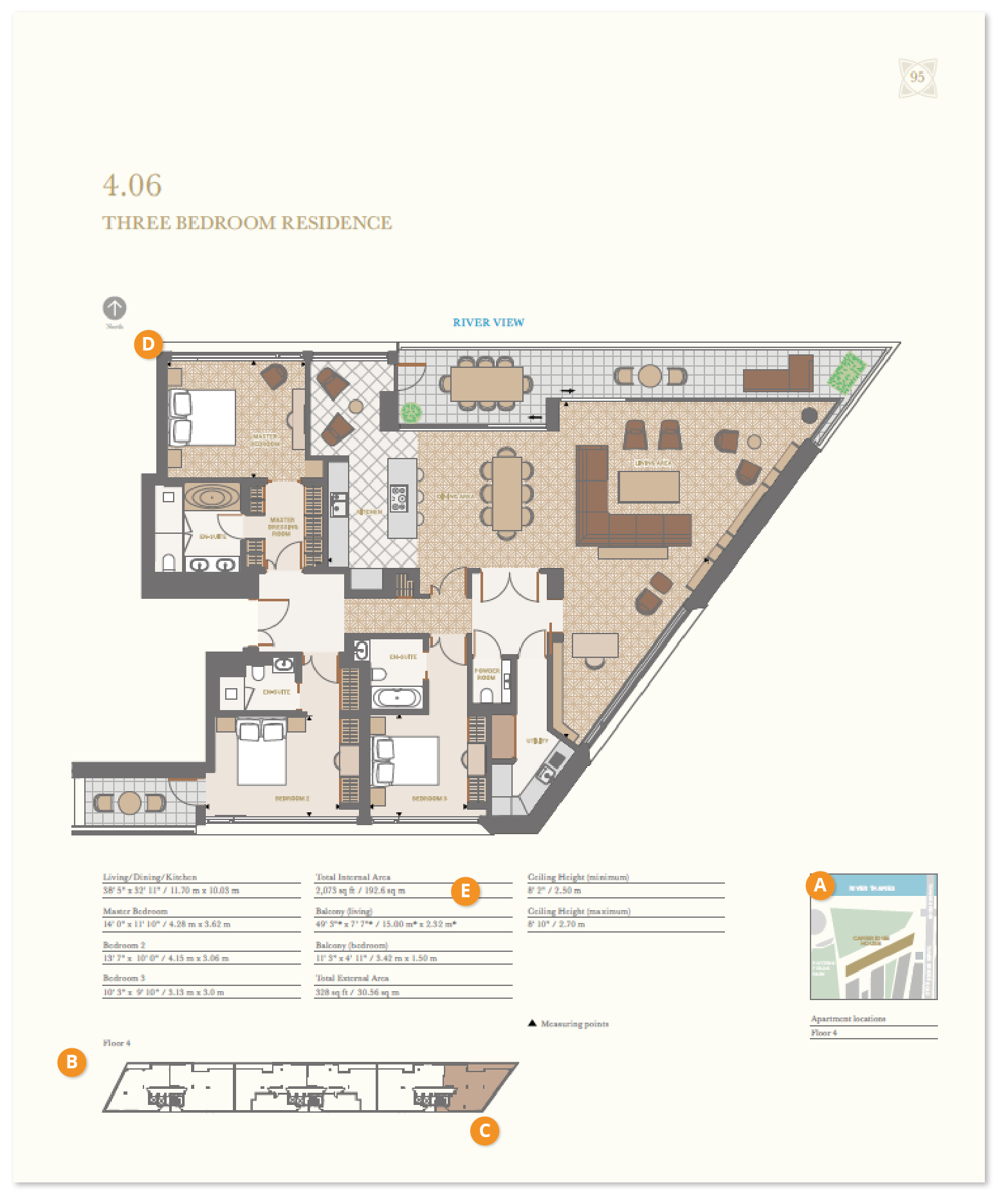
This fantastic example was found in the One Tower Bridge brochure. We have labelled a few areas (A–E) as to why everyone loved it in the TDL studio:
- A high-level site plan is used to show the location and orientation of the building as a whole in relation to its surroundings.
- We can then see the indication of what floor level we are on, giving us a sense of elevation. Some other documents give even further context by showing a cross-sectional view of the building and highlighting the relevant level.
- Here we are shown which apartment we are looking at on this floor, in relation to the others.
- The floor plan really showcases the apartment as a whole, breaking it down to the various rooms and areas. It even provides another level of information such as possible furniture and appliances locations (which also help to put the rooms into context), floor surface materials (although a key would help further), and the direction of the river view, which is a nice little reminder to the reader that it is a riverside property.
- Finally we come down to the technical details – a clear set of tables that shows the dimensions of each of the rooms within the property. We liked this format of presentation as it avoids any over-complications if layered over the floor plans.
Final thoughts
When you take time to break down a document and analyse its various design components, you can see the approaches used to ensure the information presented is clear and easy to understand by the reader. At the end of the day, these property brochures are the sales pitch of the developer, and the last thing a developer would want is a confused potential buyer!