Information designers love opportunities to tackle real-world issues and learn new things from practical projects. The Simple Action day on overdose emergency kits on 31 March 2017 gave me one such opportunity. The event was organised by the Simplification Centre in association with Stephanie VandenBerg, an emergency physician from Canada, who is currently studying epidemiology at the London School of Hygiene and Tropical Medicine (LSHTM).
9.30 am – Background
We learned during the introductory session that drug overdose has become a real epidemic in North America, UK, and Europe. The majority of drugs causing overdose emergencies are opiates/opioids – drugs derived from or related to opium. Not all opiates/opioids are illegal drugs as some regularly prescribed painkillers have similar physiological mechanisms and effects. Martin McCusker, who is involved in various harm reduction programmes, shared with us his valuable experience from working with the drug user community.
10.30 am – Challenge
An overdose affects the part of the brain that regulates breathing, so if the effects are not counteracted with naloxone, the common antidote, it results in death. Naloxone is so effective that it reverses all the life threatening effects of opioids, with the patients returning to consciousness in minutes. It makes you wonder why so many people are still dying from overdoses now naloxone is around!
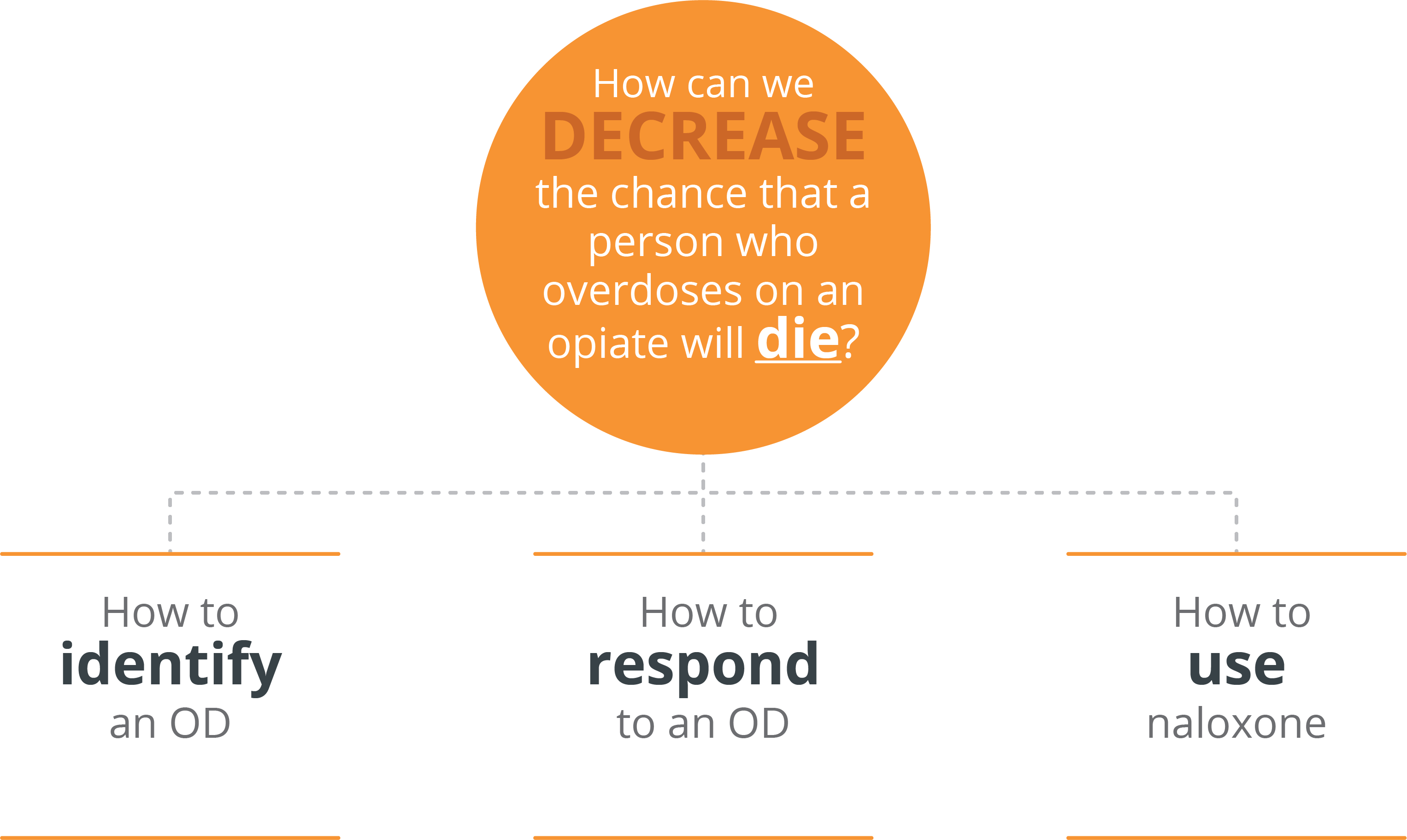
Our challenge for the day was to explore information design solutions for the current emergency kit in order to decrease overdose-related deaths.
We were divided into small groups. Apart from Stephanie, the rest of my teammates had no background in healthcare. Perhaps this helped us look at the overdose emergency kit from the user’s point of view while having professional input from Stephanie. I really enjoyed how our team discussion progressed throughout the day, starting with reviewing the current kit, followed by identifying the users and coming up with solutions. We thought the main users who would rely on the information contained in the package to be people like us who have hardly any prior knowledge on drug overdoses or emergency medical kits. For us the naloxone syringe looked too serious – something that non-users like us were not meant to handle while in reality precisely the opposite needs to happen.
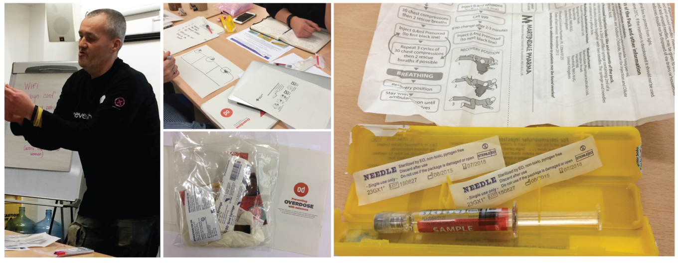
What we find difficult with the current overdose kit
- Too much information on the instruction sheet. Who can read and absorb all this during an emergency? Also, there were legibility issues in low light.
- The instruction sheet looks ‘too medical.‘ It fails to convey that in an emergency situation, the jab can and should be administered by a layperson without special training.
- Five doses in one syringe while naloxone needs to be administered one dose at a time. This may cause strong withdrawal symptoms once the patient awakens, and waste much needed antidote as the naloxone effects wear off after around 20 minutes.
- Exposed needles which may provoke fear and present other psychological barriers, as opposed to a design like the Epipen, which has no visible needles.
- The packaging does not convey a sense of emergency – it is not clear what the kit is for and does not encourage an action.
1. 30 pm – Transforming
After seeing the overdose kit close up, we realised that what we need from an emergency kit is for it to be informative and friendly. People like us who are not accustomed to emergencies or needles need to be reassured and encouraged.
There are two limitations to consider: capacity and time. Regarding the capacity, it is both how much information a sheet of paper can hold in a coherent manner and how much information our brain can process in emergencies. The time limit is an obvious one: there is not much time to ponder when there is someone lying unconscious on the ground.
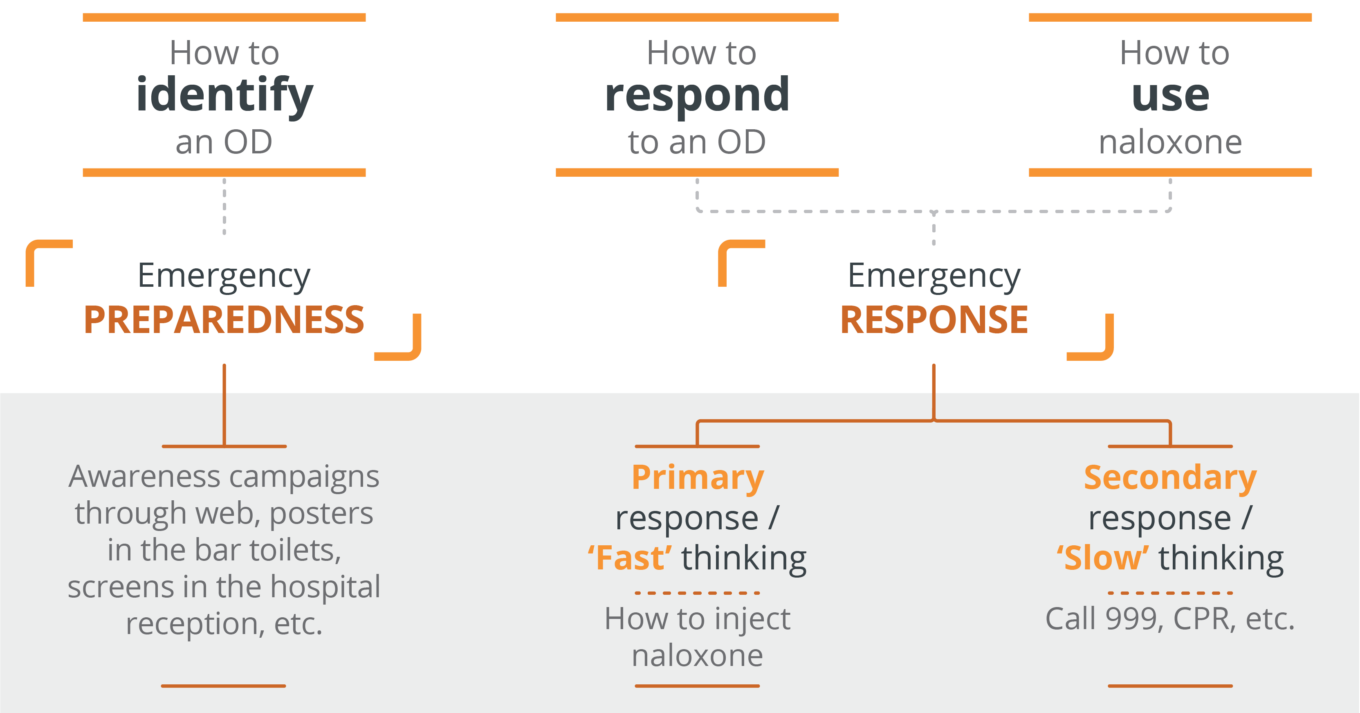
With this in mind, here is how we prioritised the information:
3.00 pm – Making
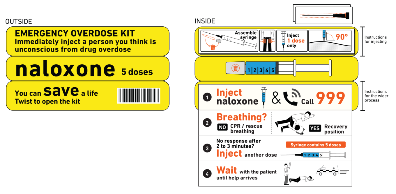
In the transforming stage, we identified the information needed for an emergency response and what should be included in the emergency kit. The instructions are divided into two tracks: one for the primary response, which requires fast thinking and the other for the secondary response, which could take a little more time. The primary response is essentially the first injection while the secondary response covers the wider process such as calling 999 and follow-up actions after the initial injection. Having the two separate instructions makes the priorities clearer. It also allows the tasks to be divided between two or more people.
The information on the package is also minimised to encourage fast action. It is basically a simple message to people that they can save a life. We focused on two essential facts:
- this is an emergency,
- that you ‘think’ the person is suffering from an overdose is good enough: you do not need to be absolutely certain. If you are wrong, the antidote causes no harm.
4.30 pm and on – Sharing and improving
Information design can contribute in many ways to decreasing the number of drug overdose related deaths. There are existing materials we can study on drug overdose. Good examples are also around: materials used to describe stroke symptoms, CPR instructions, the design of Epipen and its instructions.
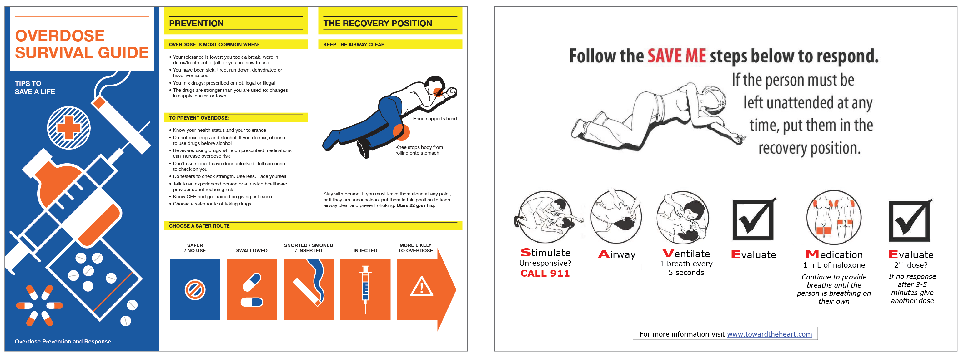
Throughout the day, we focused on one particular set of information, evaluated it, explored alternative ways it could be communicated, and shared our thoughts. It was a really fun day with a very interesting and challenging exercise, I can highly recommend you look out for when the next workshop!
Full report is available to complete our discussions on the Simple Action day: Overdose emergency kits, which is also featured in the Information Design Journal: Waller, R. and VandenBerg S. (2017) A one-day transformation project for overdose emergency kits, Information Design Journal, vol 23 no 3, 319-333.
Related links
Infographic on signs of an opioid overdose form Fraser Health
Drug Overdoes information resources from Exchange Supplies
Drug and alcohol resources and publications from HIT
Honest information about drugs from Talk to Frank
The Information Design Summer School
The Simplification Centre organises the Information Design Summer School every year. It is not only for people with a design background, but for anyone who is interested in learning about information design and using it in their own field. The programme covers a wide range of relevant topics through lectures and group work. Members of the TDL team attended the school – they had a great time, learned loads and came back happy. It is a great opportunity to build information design skills. Don’t miss it!