Through 2022 we are publishing a series of self-directed projects titled ‘TDL-Explains’, where our designers explore new topics in areas where people need to understand information. Each output is created with the intention of improving the lives of the people around us through better design; helping them to make decisions, understand hazards, or to do things better. We welcome feedback from experts in each particular field who can help to improve and develop what we create.
Understanding and improving
The world of information design is constantly evolving. There’s endless opportunity to harness new data, explore exciting ideas and answer difficult questions. We had this in mind when we launched TDL Explains in February. Our first edition, focusing on the topic of Avalanche Awareness, was TDL’s first journey into self-directed work and the analysis of the project was just as important as the creation of the designs.
We learnt the importance of asking for advice from subject matter experts at the ideation phase (not just having them review the designs after they were created). This helps to instil industry expertise into every aspect of the design. Another important lesson was to continue research throughout the project, rather than just allocating time at the beginning. Doing this ensures accuracy of information and allows us to be flexible, instead of being locked in to one vision conceptualised at the start.

These are just a few of the ways we have evolved TDL Explains since its launch. Keep reading to discover Edition 2 – Mindful Wild Swimming – and hear from the project lead designer, Frances, on her experience of creating something that helps to protect people, local communities and the natural environment.
The idea
We never technically start with a ‘blank canvas’ when it comes to planning a TDL Explains project. Firstly, our talented team are always noting good (and bad!) information design they come across in their day to day*. These can spark conversations and ideas which feed into our work. Secondly, we always base our TDL Explains topics on important events or seasonal trends, to ensure the content is relevant and useful for its intended audience.
*Inside scoop: we have a section in our quarterly newsletter for things that TDL loves. You can sign up to receive the newsletter here.
With summer holidays on the horizon and the end of Covid-19 restrictions in the UK, the team started thinking about activities that people might be getting up to in their time off. Another trend we noticed was the a rise in concern for the environment and the desire to spend time outdoors, alongside campaigns by charities such as The Wildlife Trusts and The National Trust to be mindful of natural habitats and wild animals when out in the great outdoors.
Wild swimming came up as a perfect intersection of these two topics – but we needed to explore it further to understand where there might be opportunities to improve understanding of wild swimming or a need for a specific design or output.
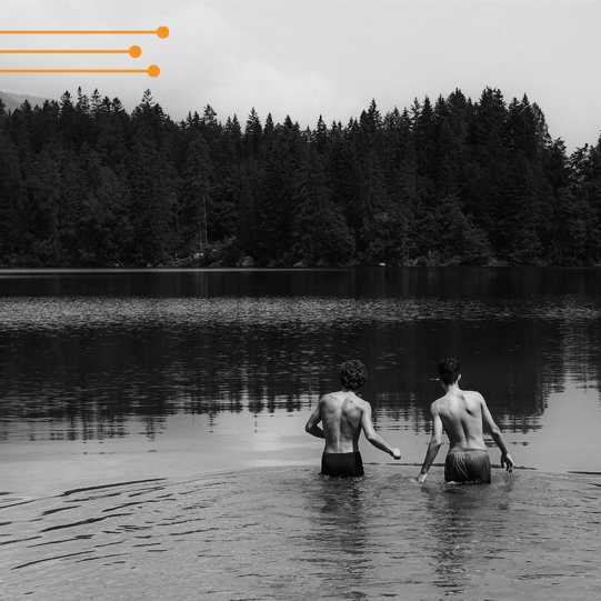
Our first port of call was specialist websites, such as Wild Swimming, the Royal Life Saving Society UK (RLSS), Beyond Swim, Swimming.org and The Swimming Teachers Association (STA). From these expert hubs, we gained an understanding of why people enjoyed swimming in nature, where they went and useful tips for beginners.
We also read news articles from the BBC, looked into data on the GOV.UK website and checked out social media groups for a more in-depth immersion (excuse the pun!) into the subject. This is where we identified an issue; due to a surge in popularity, many wild swim hot spots had become overcrowded and there were safety concerns – both for the swimmers themselves and the natural environment. Due to this, we knew our objective was not to promote wild swimming, but to educate the public on how to swim mindfully.
The research
Now we had our topic and a challenge to solve, it was time to look at what designs were currently out there. We started by investigating safety notices and visual styles for outdoor sports in general. This meant Frances sifted through visuals on kayaking, fishing, horse riding, hiking, mountaineering, rock climbing, surfing and more!
We then focused on wild swimming and reviewed how information about hazards (such as cold water shock or strong currents) were traditionally displayed. We realised how confusing it must be for novice wild swimmers wanting to learn how to stay safe… information was spread across many resources and was often text-heavy (in blog format, for example). The graphics that did exist were often posters or fliers in red / orange / yellow and black colour ways which didn’t make for inviting reading.

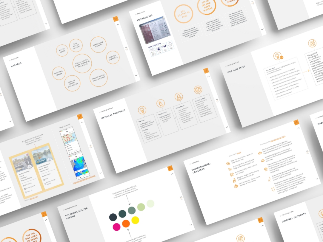
Most existing designs failed to communicate the importance of protecting people and protecting the environment, hence we identified a great opportunity to improve on what was already out there.
Once we had a ‘brief’ for what we wanted to achieve, this was sent out to wild swimming experts such as Daniel Start (editor at Wild Swimming and author of many wild swimming publications). This acted as a sounding board for our progress and ensured we were creating something fit for purpose.
The next challenge for Frances was to collate all of this valuable insight and distil it down into a visual toolkit which would help people to swim more mindfully, therefore reducing the risk of harm to themselves, the environment and local communities.

Our final design
The output
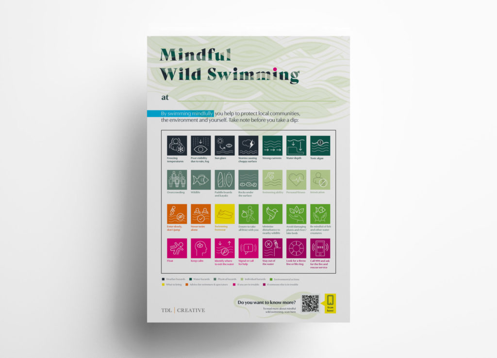
The solution that Frances created is a graphic toolkit which could be utilised by multiple audiences such as councils, government organisations, local businesses located near wild swim hot spots and wild swimmers themselves. This visually engaging toolkit has two uses; it firstly helps to educate people about the risks of wild swimming, and secondly, highlights how wild swimming can affect the natural environment and how swimmers can minimise disruption to nearby plants and wild animals.
Frances also came up with an editable poster that users can tailor to the unique features of wild swim spots, highlighting the dangers specific to that location. For example, one spot might have hidden dips in the water and be prone to toxic algae, whereas a different location might be home to rare species of wildlife and contain lots of rocks in the shallows.
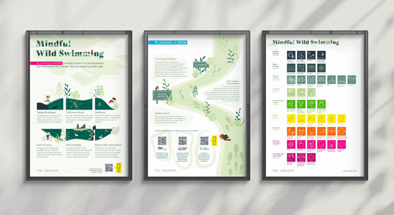
The audience
The end users are inexperienced swimmers. We hope that it will encourage people to take care when in the water, and ensure that they will minimise any disturbance to nature or other people. Councils, associations and local businesses would benefit from using this free toolkit, as the posters could be displayed at any wild swim spots they manage or are near to, promoting safety and awareness of the environment.
Deep dive
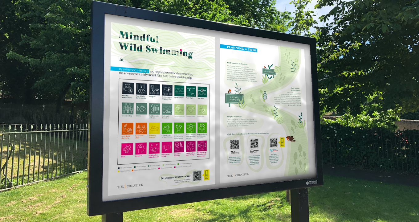
One element that Frances particularly enjoyed creating was the large group of icons.
It was important to ensure they looked like they belonged in the same ‘set’ and that they were eye-catching and colourful, yet easy to understand. Thinking about how to represent a hazard or action with a simple drawing and just a few words was a fun challenge for her!
Feedback and user testing
Thanks to all of our wild swimming enthusiasts who provided the following feedback on the designs:
“I’d recommend labelling all equipment because this can help rescuers know who it belongs to. There’s a few apps and links that are really useful such as Safer Seas and Rivers, Magicseaweed, RNLI and The Coastguard. And finally, there’s an amazing motto that a lot of wild swimmers say; If in doubt, don’t go out!”
“Post-wild swim it’s important to take warm clothing and lots of layers. Also I would suggest to include information about the dangers of swimming in reservoirs – they’re often deep and have strong currents.”
“I love the visuals, they look beautiful. the colours used are gorgeous and eye-catching which is great to convey the message.”

The last word
Our lead designer, Frances, reflects on her time working on the second edition of TDL Explains.
What was the biggest challenge to overcome?
There was a wealth of written information about staying safe whilst swimming but few graphically designed ‘summary’ pieces readily available. Collating, reviewing and categorising all of this data took a lot of time and I would say that was the main challenge. We’ve done the hard work with beginner swimmers in mind, so they don’t have to search for the separate pieces of information across multiple resources themselves.
How does this differ from projects you’ve worked on before?
In my day-to-day work, I’m often following strict brand guidelines, so when the opportunity came up to create something with no rules it was very exciting – and daunting! With so many possible avenues of colours, styles, fonts, formats and layouts it was almost impossible to put something on the page to begin with. However, once the brief was refined, it was easy to start playing around with the layout. Then I started dropping in fonts and colours, and it really started to come alive. After that, everything flowed naturally and it grew its own eye-catching style which I could follow and create the final piece.
Any tips for the lead designer on the next TDL Explains?
I would recommend creating a detailed wireframe with the content way before the designing starts, so there is more time to conceptualise what it may look like with design assets and styles.
To take a lighter look at the final design this project, please see our
TDL Explains: Mindful Wild Swimming portfolio piece
